> For the complete documentation index, see [llms.txt](https://docs.samita.io/llms.txt). Markdown versions of documentation pages are available by appending `.md` to page URLs; this page is available as [Markdown](https://docs.samita.io/badges-and-labels/change-style.md).

# Change badge style

Customize fonts, colors, backgrounds, borders, opacity, and rotation for text and image badges.

Use the **Design** tab to change how a badge looks. Text badges provide font, color, background, border, opacity, and rotation controls. Image badges provide opacity and rotation controls for the selected artwork.

## Open a badge in the editor

{% stepper %}
{% step %}

## Open Badges & Labels

In Shopify admin, open **Sami Product Labels > Badges & Labels**.
{% endstep %}

{% step %}

## Select a badge

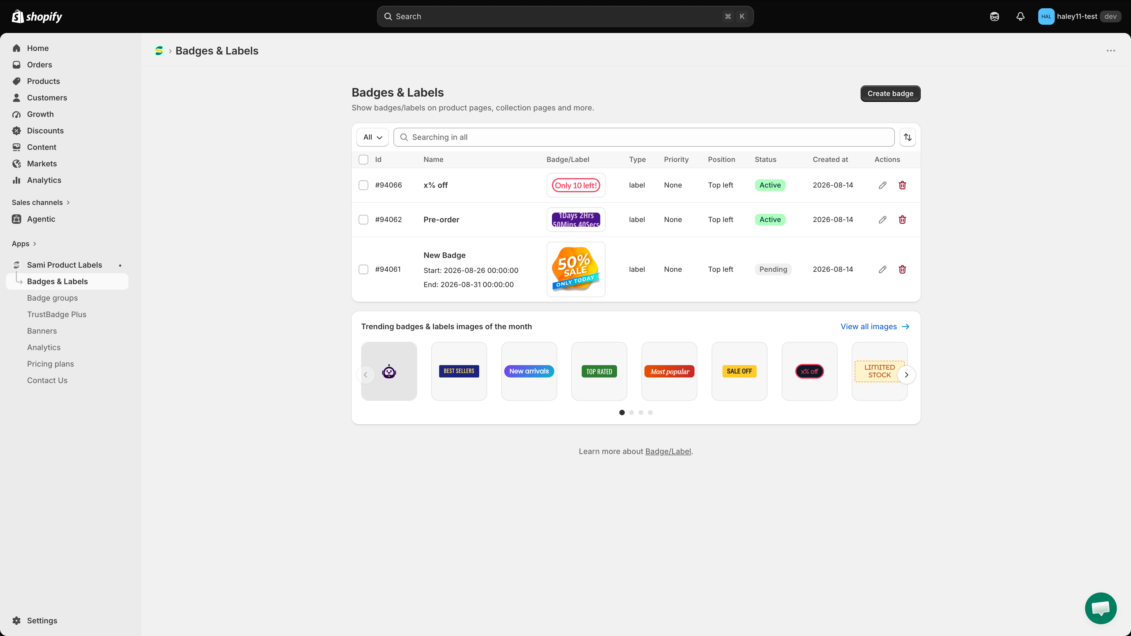
Find the badge you want to update, then click **Edit badge/label** in its row.

To style a new badge instead, click **Create badge**, then choose **Text badge** or **Image badge**.

<figure><img src="https://1598842017-files.gitbook.io/~/files/v0/b/gitbook-x-prod.appspot.com/o/spaces%2F1WRTlT5AcaLSAedbCJyZ%2Fuploads%2Fgit-blob-b3dbcda86c18bc1048bd52e32721684dc9f7c2c1%2Fimage_43.png?alt=media" alt="Badges and Labels list with the Edit badge or label action highlighted"><figcaption><p>Click Edit badge/label for the badge you want to customize.</p></figcaption></figure>
{% endstep %}

{% step %}

## Stay on the Design tab

The editor opens on **Design**. The available sections depend on whether you selected a text badge or an image badge.
{% endstep %}
{% endstepper %}

## Customize a text badge

### Choose a font and text color

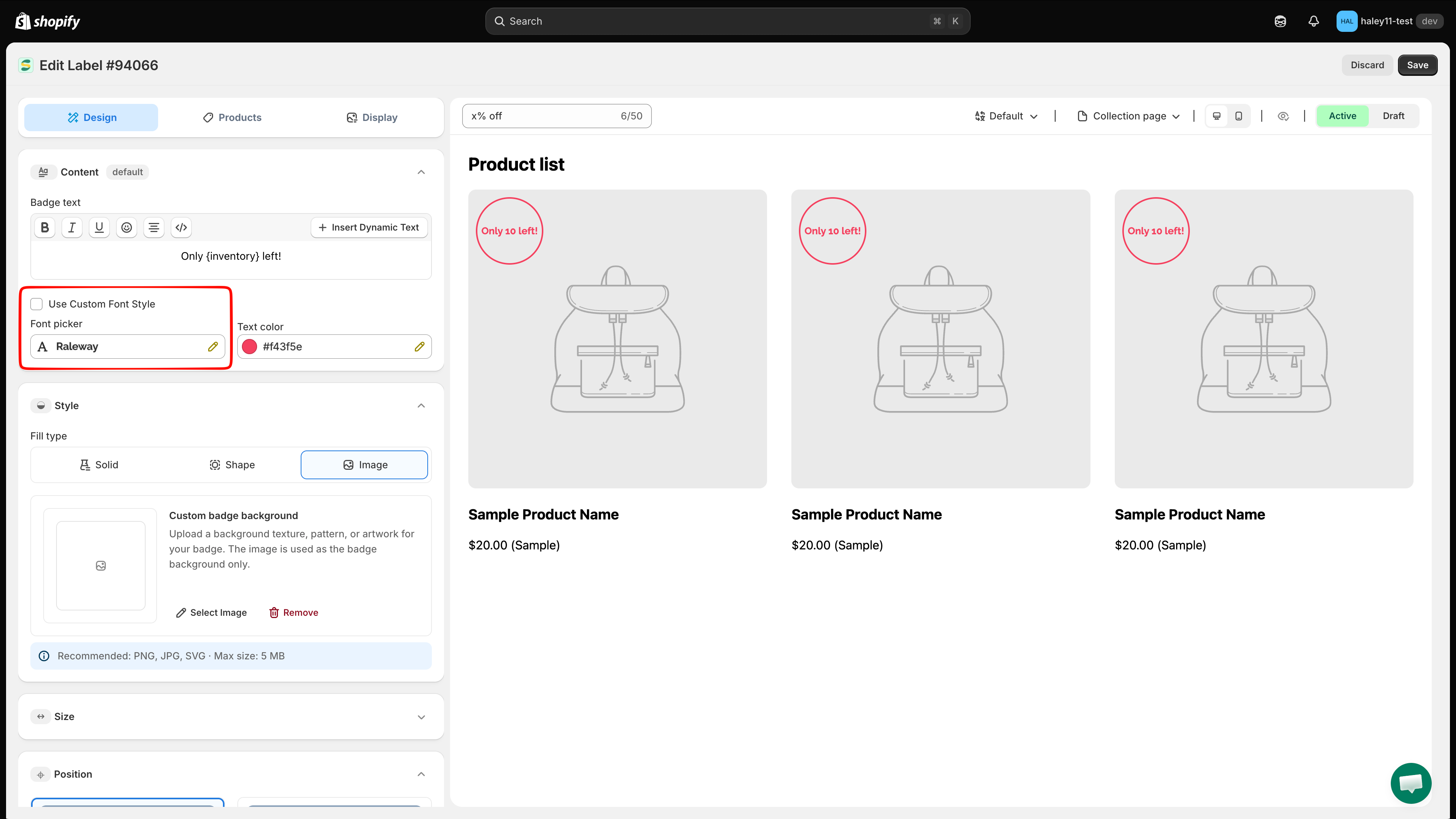
Use the controls below **Badge text** to customize the text:

* **Font picker** — Choose a font from the built-in list.
* **Use Custom Font Style** — Enable this option to enter a font family in **Font**, then choose an available font style or weight, such as Regular or Bold.
* **Text color** — Open the color picker and choose a color that remains readable against the badge background.

<figure><img src="https://1598842017-files.gitbook.io/~/files/v0/b/gitbook-x-prod.appspot.com/o/spaces%2F1WRTlT5AcaLSAedbCJyZ%2Fuploads%2Fgit-blob-4b0bd02b3197c2b0c49d6183fc3e9a0a91d7d9b5%2Fimage_44.png?alt=media" alt="Text badge controls for the font picker, custom font style, and text color"><figcaption><p>Choose a built-in font or enable Use Custom Font Style, then set the text color.</p></figcaption></figure>

Text size and letter spacing are configured in **Size**. See [Change badge size](/badges-and-labels/change-size.md) for those controls.

### Choose a background

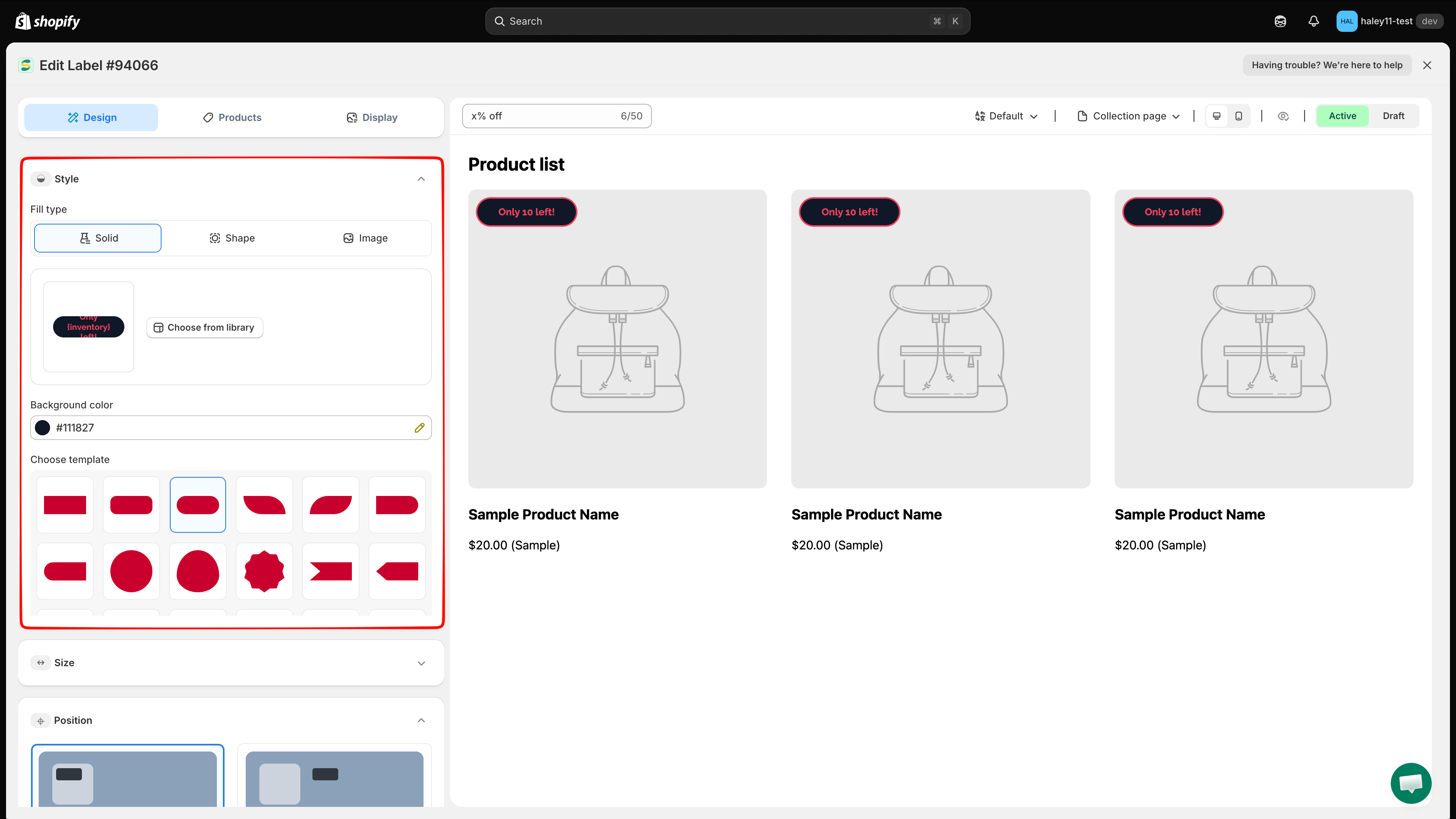
Expand **Style**, then select a **Fill type**:

| Fill type | Use it for                                                          |
| --------- | ------------------------------------------------------------------- |
| **Solid** | A single background color or a color preset.                        |
| **Shape** | A template shape with a solid or gradient color treatment.          |
| **Image** | A texture, pattern, or artwork used as the text badge's background. |

<figure><img src="https://1598842017-files.gitbook.io/~/files/v0/b/gitbook-x-prod.appspot.com/o/spaces%2F1WRTlT5AcaLSAedbCJyZ%2Fuploads%2Fgit-blob-a77c601fbd015d9bca9f27733c889c5c4a007dd8%2Fimage_45.png?alt=media" alt="Style section with Solid, Shape, and Image fill types"><figcaption><p>Expand Style and select the background type for the text badge.</p></figcaption></figure>

#### Use a solid background

Select **Solid**, then choose a **Background color**. You can also select one of the presets under **Choose template**.

#### Use a shape or gradient background

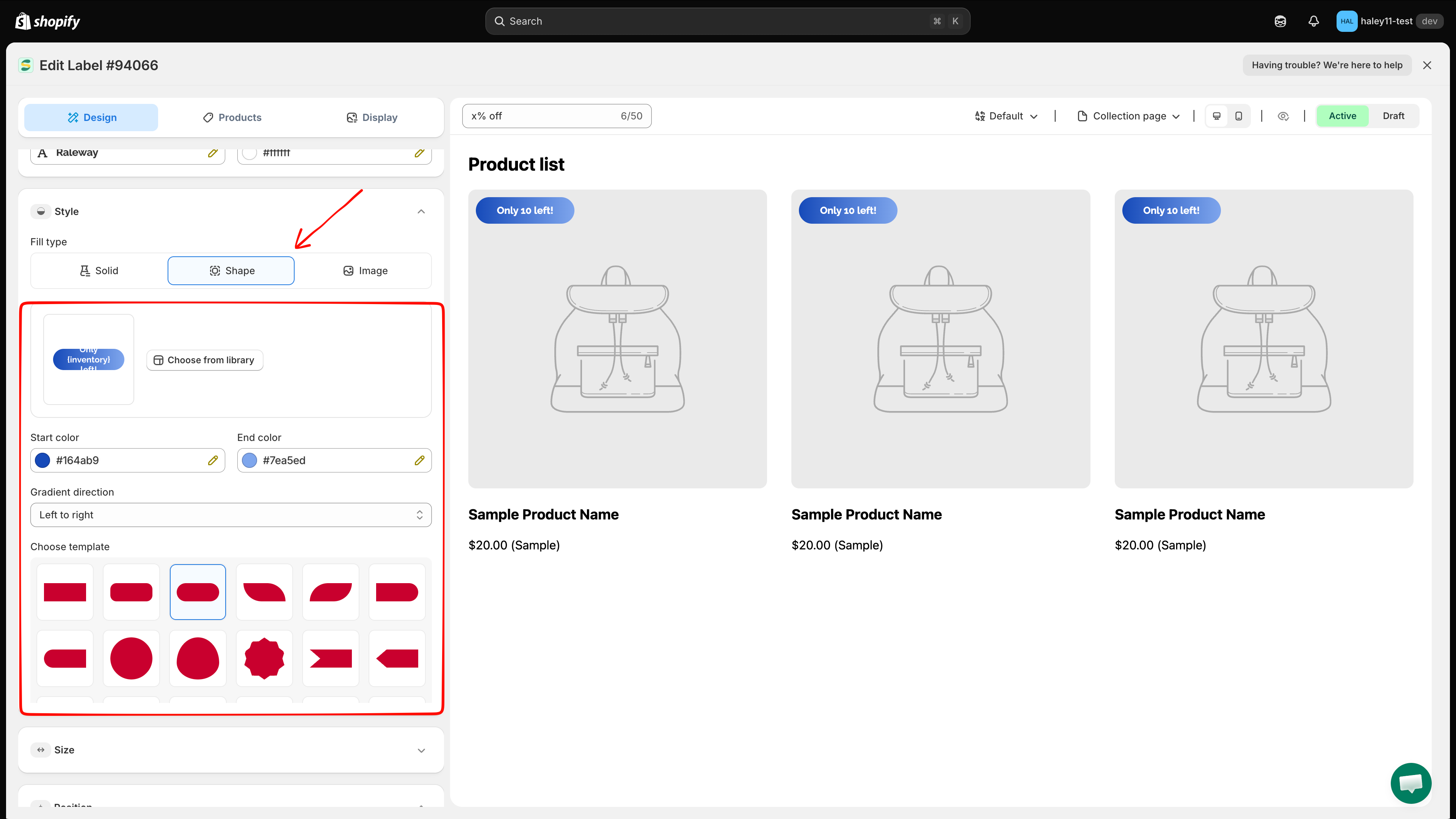
Select **Shape**, then configure the following:

* **Choose from library** — Open the template gallery and filter designs by categories such as Sales, Autotext, Stock, Free shipping, Pre-order, and more.
* **Start color** and **End color** — Use the same color for a flat treatment or two different colors for a gradient.
* **Gradient direction** — Choose Left to right, Top to bottom, Diagonal, or Radial.
* **Choose template** — Apply a shape preset directly from the editor.

<figure><img src="https://1598842017-files.gitbook.io/~/files/v0/b/gitbook-x-prod.appspot.com/o/spaces%2F1WRTlT5AcaLSAedbCJyZ%2Fuploads%2Fgit-blob-8a356488407551c45bb0134a5b8b3dcdaa1ac21a%2Fimage_46.png?alt=media" alt="Shape background controls with the template library, start and end colors, and gradient direction"><figcaption><p>Choose a shape, set its colors, and select the gradient direction.</p></figcaption></figure>

#### Use an image background

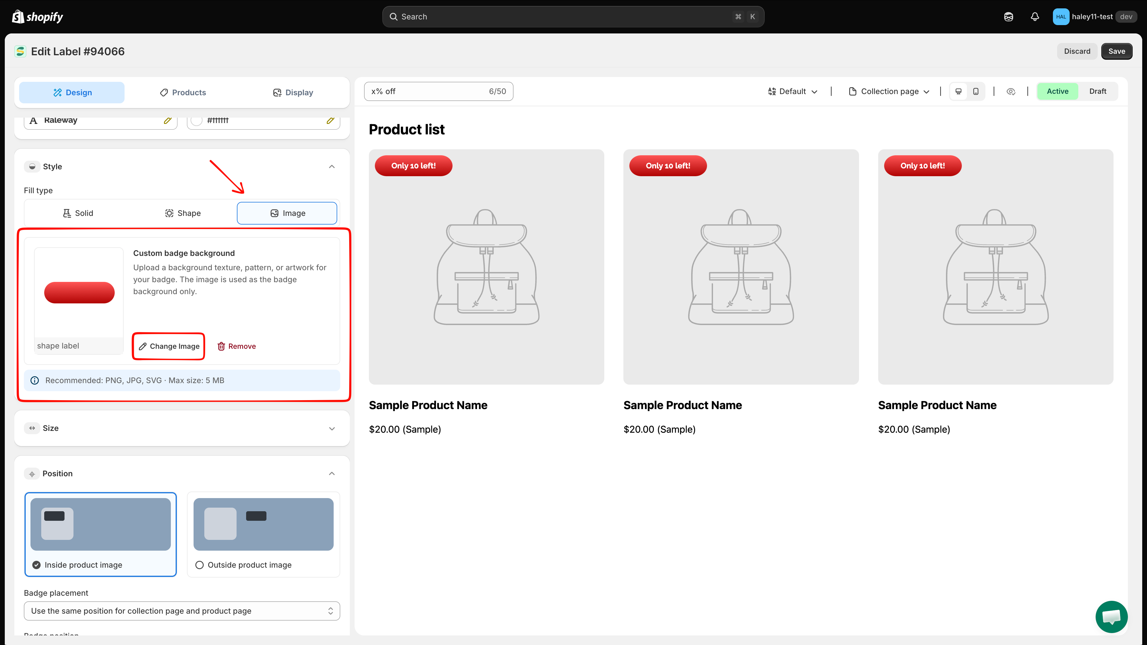
Select **Image**, then click **Select Image** to choose a custom background. The editor accepts PNG, JPG, or SVG files up to 5 MB. Click **Remove** to clear the selected background.

{% hint style="info" %}
This image is used only as the background of a text badge. To display standalone artwork without editable text, use an image badge instead.
{% endhint %}

<figure><img src="https://1598842017-files.gitbook.io/~/files/v0/b/gitbook-x-prod.appspot.com/o/spaces%2F1WRTlT5AcaLSAedbCJyZ%2Fuploads%2Fgit-blob-67211f31f9bba49fcca4706f1a9786f915495f7b%2Fimage_47.png?alt=media" alt="Custom badge background controls with Select Image and Remove buttons"><figcaption><p>Select artwork to use as the background of a text badge.</p></figcaption></figure>

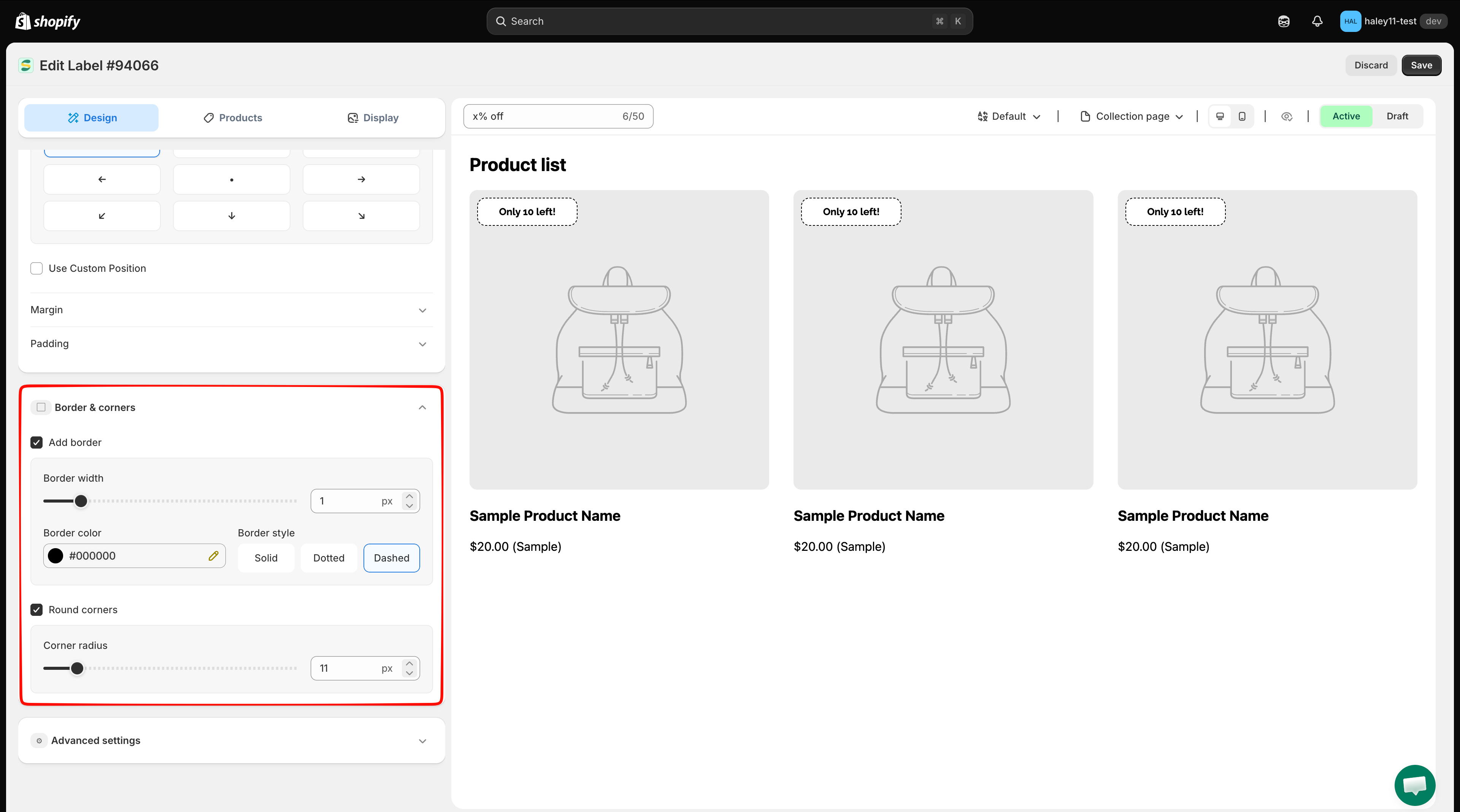
### Add a border or round the corners

Expand **Border & corners**. Both options can be enabled independently:

| Option            | Available controls                                                                                   |
| ----------------- | ---------------------------------------------------------------------------------------------------- |
| **Add border**    | Set **Border width** from 0 to 8 px, choose a **Border color**, and select Solid, Dotted, or Dashed. |
| **Round corners** | Set **Corner radius** from 0 to 100 px.                                                              |

<figure><img src="https://1598842017-files.gitbook.io/~/files/v0/b/gitbook-x-prod.appspot.com/o/spaces%2F1WRTlT5AcaLSAedbCJyZ%2Fuploads%2Fgit-blob-84d4863aaff7e439ef5c434159cbc427f3e5eba0%2Fimage_48.png?alt=media" alt="Border and corners section with border width, color, style, and corner radius controls"><figcaption><p>Add a border, round the corners, or use both settings together.</p></figcaption></figure>

## Style an image badge

Image badges do not show the text badge's font, background, or **Border & corners** controls. Use **Content** at the top of the **Design** tab to change the badge artwork, then use **Advanced settings** to adjust its opacity or rotation.

For image dimensions and placement, see [Change badge size](/badges-and-labels/change-size.md) and [Change badge position](/badges-and-labels/change-position.md).

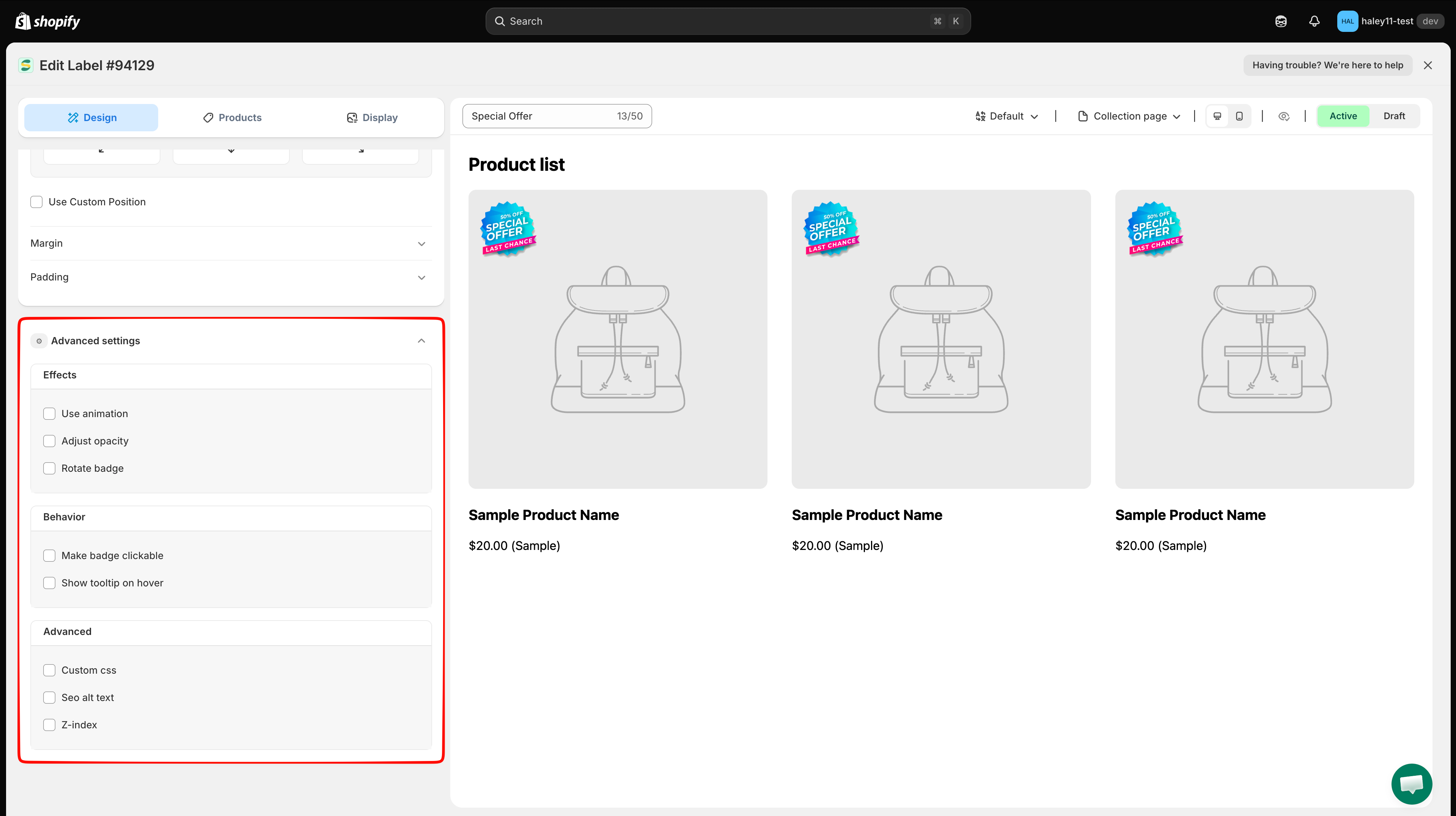
## Adjust opacity or rotation

These effects are available for both text badges and image badges:

1. Expand **Advanced settings**.
2. Under **Effects**, enable the option you need.
3. Adjust the value while checking the live preview.

| Effect             | Range      |
| ------------------ | ---------- |
| **Adjust opacity** | 0% to 100% |
| **Rotate badge**   | 0° to 360° |

<figure><img src="https://1598842017-files.gitbook.io/~/files/v0/b/gitbook-x-prod.appspot.com/o/spaces%2F1WRTlT5AcaLSAedbCJyZ%2Fuploads%2Fgit-blob-54a531ecf7f20112c03dfc627849ecea3e5653c5%2Fimage_49.png?alt=media" alt="Advanced settings Effects section with Adjust opacity and Rotate badge"><figcaption><p>Enable Adjust opacity or Rotate badge, then set the effect value.</p></figcaption></figure>

{% hint style="info" %}
The **Effects** section also includes **Use animation**. See [Add animation to a badge](/badges-and-labels/add-animation.md) for the complete animation workflow.
{% endhint %}

## Preview and save

Use the preview toolbar to check the badge on **Collection page** and **Product page**, then switch between **Desktop view** and **Mobile view**. When the badge looks correct in every required preview, click **Save**.

{% hint style="warning" %}
Check text contrast after changing colors or opacity. A style that is readable on one product image may be difficult to read on another.
{% endhint %}

## Next steps

* [Change badge size](/badges-and-labels/change-size.md) — Resize the badge and adjust text size or letter spacing.
* [Change badge position](/badges-and-labels/change-position.md) — Move the badge and adjust its margin or padding.
* [Add animation to a badge](/badges-and-labels/add-animation.md) — Apply an animation effect and configure its speed and repeat count.
* [Use custom CSS](/badges-and-labels/custom-css.md) — Fine-tune the badge with custom CSS.

{% hint style="success" %}
**Need support?**

If you run into any difficulty while following these steps, contact us at <support@samita.io>.
{% endhint %}


---

# Agent Instructions
This documentation is published with GitBook. GitBook is the documentation platform designed so that both humans and AI agents can read, navigate, and reason over technical content effectively. Learn more at gitbook.com.

## Querying This Documentation
If you need additional information that is not directly available in this page, you can query the documentation dynamically by asking a question.

Perform an HTTP GET request on the current page URL with the `ask` query parameter, and the optional `goal` query parameter:

```
GET https://docs.samita.io/badges-and-labels/change-style.md?ask=<question>&goal=<endgoal>
```

`ask` is the immediate question: it should be specific, self-contained, and written in natural language.
`goal` is optional and describes the broader end goal you are ultimately trying to accomplish on behalf of the user. GitBook uses it to tailor the answer towards what is most useful for that goal.

The response will contain a direct answer to the question and relevant excerpts and sources from the documentation.

Use this mechanism when the answer is not explicitly present in the current page, you need clarification or additional context, or you want to retrieve related documentation sections.