For the complete documentation index, see llms.txt. This page is also available as Markdown.

Control display by device and page

Control which pages and devices your badge appears on, exclude theme elements, and decide which badge wins when several apply to the same product.

The Display tab of the badge editor decides where and when a badge shows, after the Products tab has decided which products it applies to.

The tab is a list of collapsible sections:

Section
What it controls
Documented in

Customer conditions

Which shoppers see the badge (logged in, tags, specific customers)

Page conditions

Which page types the badge appears on

This page

Language conditions

The storefront language the visitor is browsing in

Country conditions

The visitor's country

Other conditions

Product image, device, and excluded theme elements

This page

Visibility Date & Countdown

Start/end dates and countdown timers

Priority conditions

Which badge wins when several apply to one product

This page

Display tab of the badge editor with all sections collapsed
The Display tab. Sections with a chevron expand; sections with a switch are turned on first.
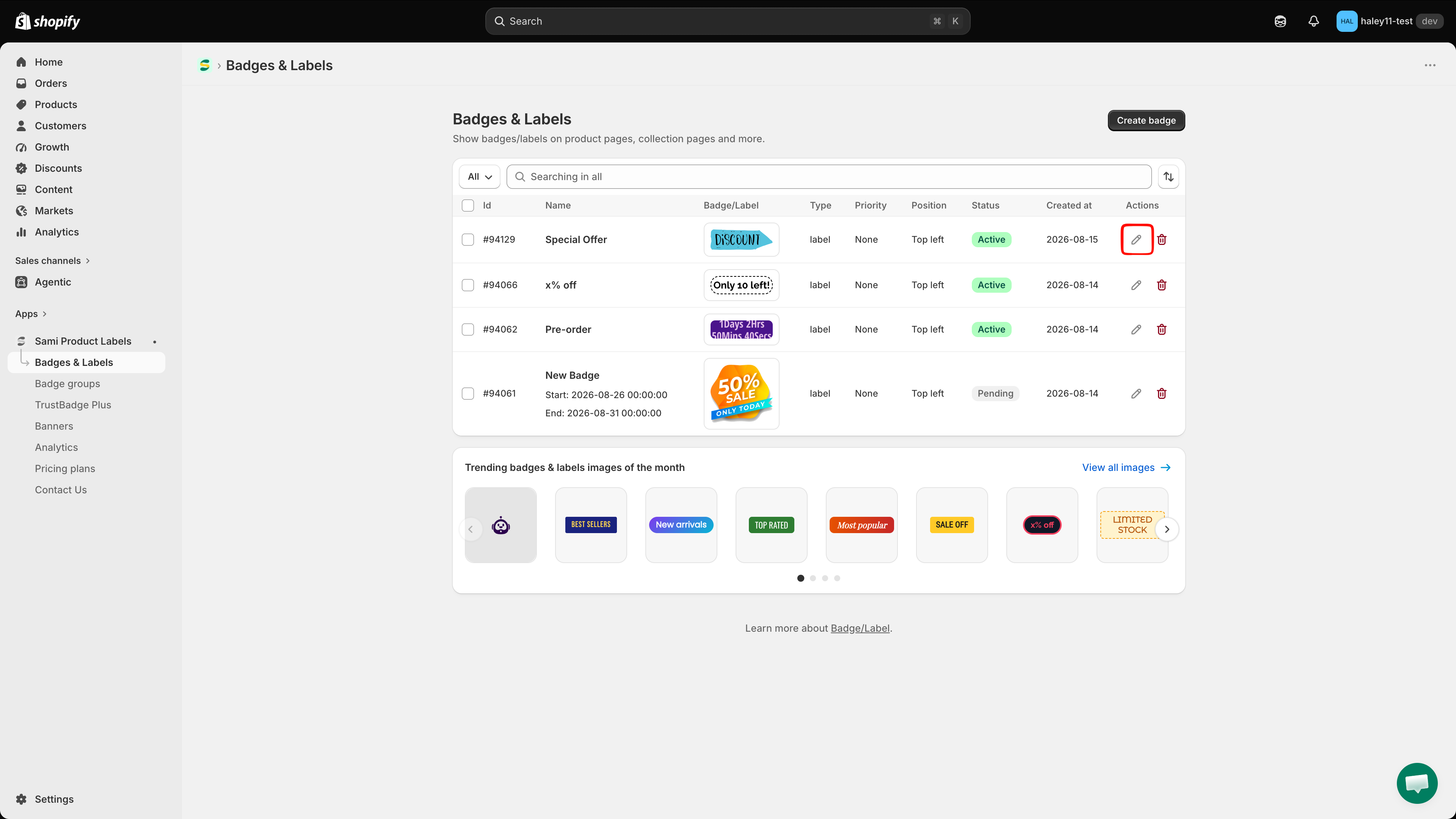
Sections with a chevron (⌄) simply expand. Sections with a switch (Language, Country, Priority) must be turned on before their fields appear.

Open the Display tab

1

Open the app

In your Shopify admin, go to AppsSami Product Labels.

2

Open Badges & Labels

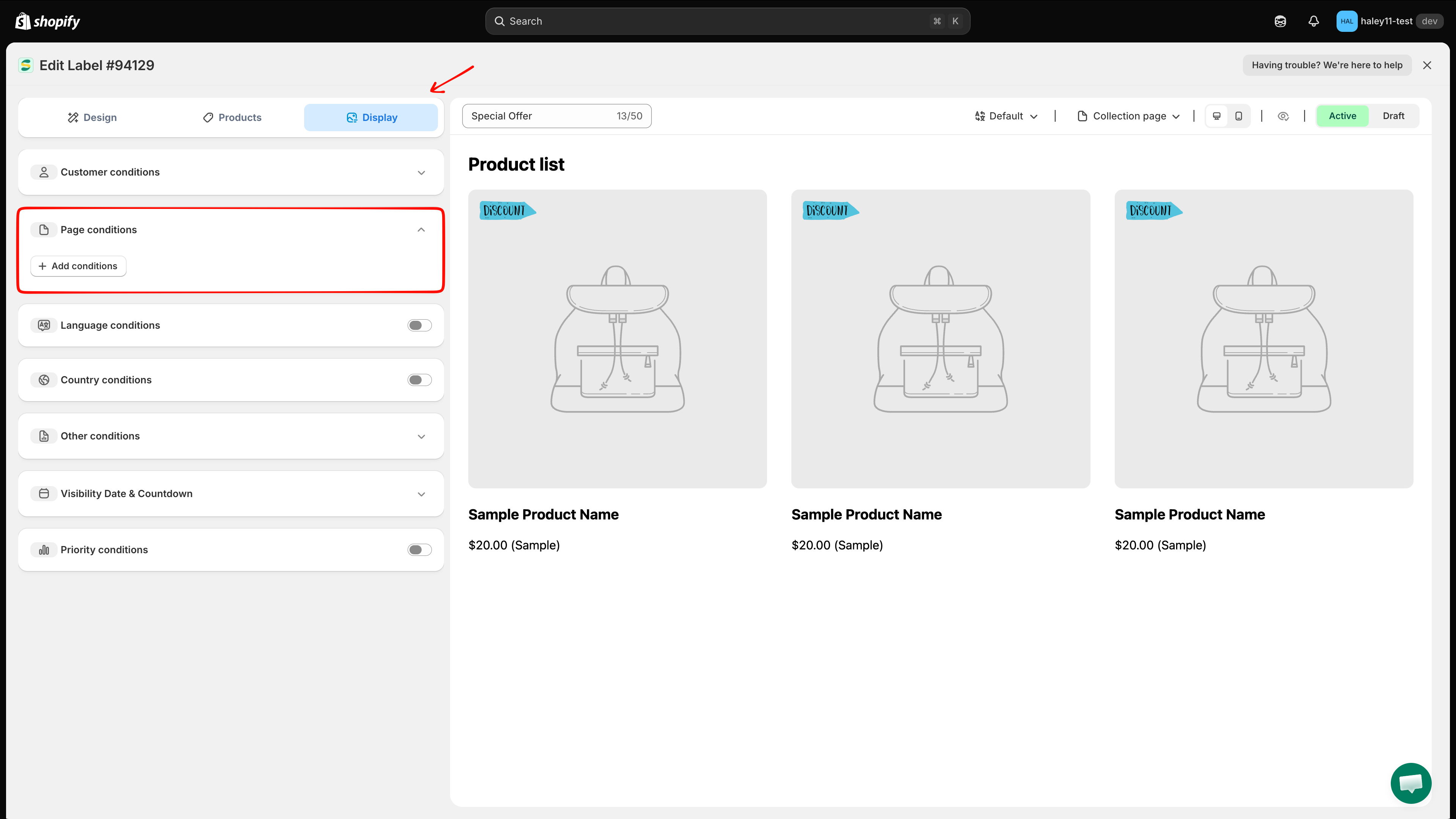
In the app's left menu, click Badges & Labels. The list shows every badge with its Id, name, preview, type, priority, position, and status.

Badges & Labels list with the edit pencil highlighted
The Badges & Labels list. Click the pencil icon in the Actions column to edit a badge.
3

Edit the badge

Click the pencil icon in the Actions column of the badge you want to configure. The editor opens with three tabs: Design, Products, Display.

4

Go to Display

Click the Display tab.

The Save and Discard buttons in the top-right corner only appear once you change something. If you want to abandon your edits, click DiscardDiscard changes.

Page conditions

By default a badge shows on every page where the product appears. Add a page condition to limit it to certain page types.

How to add a page condition

1

Expand Page conditions

Click the Page conditions row to expand it. An + Add conditions button appears.

Page conditions section expanded showing the Add conditions button
An empty Page conditions section — no rule yet, so the badge shows everywhere.
2

Click + Add conditions

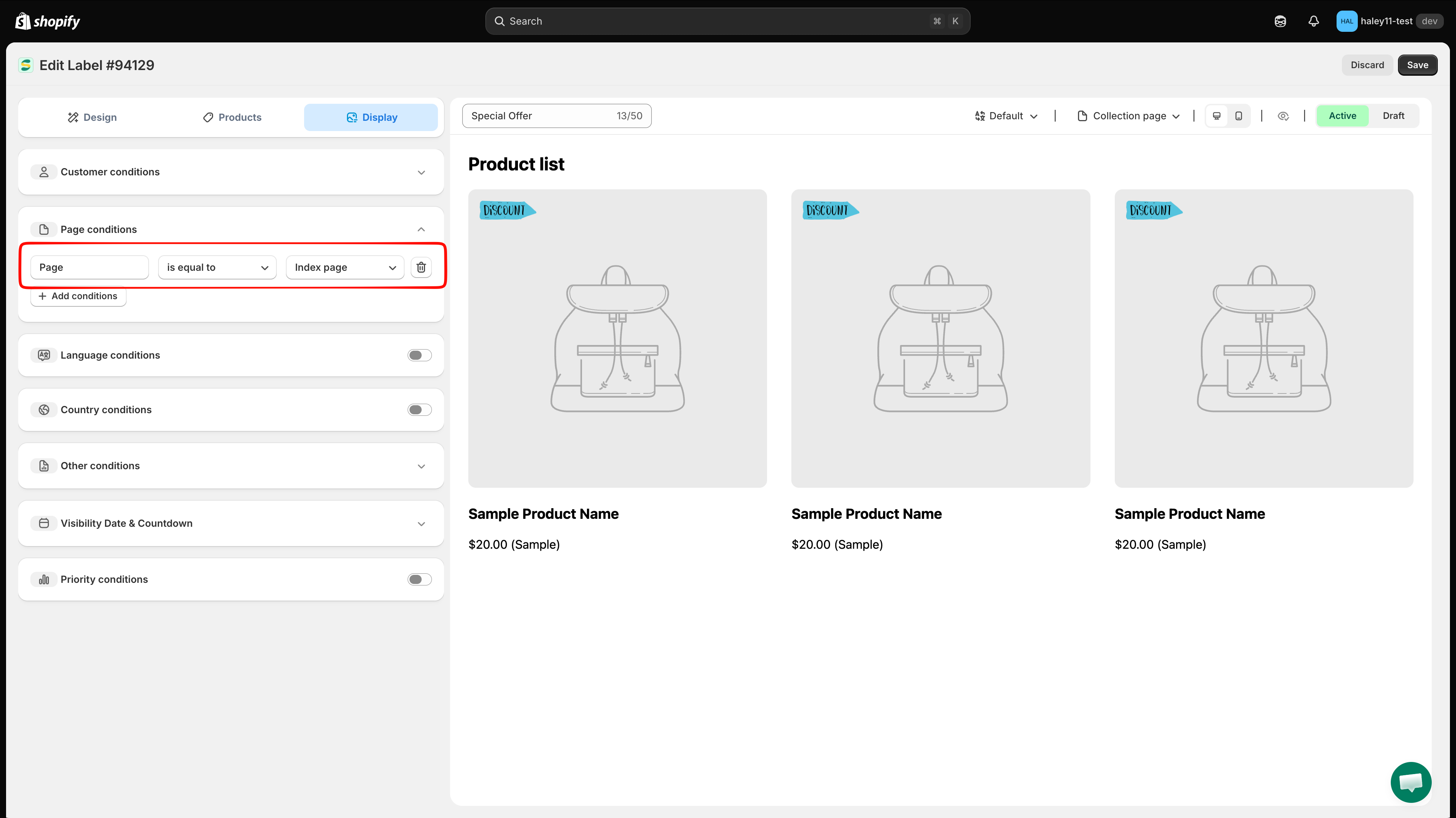
A condition row appears with three fields: Page (fixed), an operator, and a page type. The defaults are Page is equal to Index page.

A page condition row with Page, is equal to, and Index page
Each click on + Add conditions adds one row. Use the trash icon at the end of a row to remove it.
3

Choose the operator

  • is equal to — show the badge only on the selected page type.

  • is not equal to — show the badge everywhere except the selected page type.

4

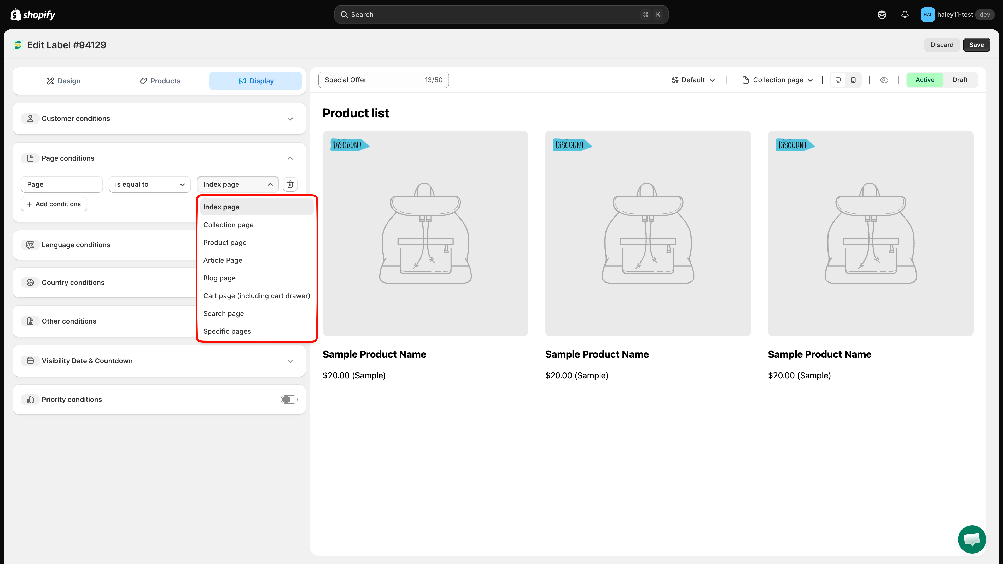
Choose the page type

Option
Where the badge appears

Index page

Your storefront home page

Collection page

Collection / category listing pages

Product page

Individual product pages

Article Page

Blog article pages

Blog page

Blog listing pages

Cart page (including cart drawer)

The cart page and the slide-out cart drawer

Search page

Search results pages

Specific pages

Only the exact URL you enter (see next step)

Page type dropdown listing all eight options
The eight page types available for a page condition.
5

For Specific pages, enter the URL

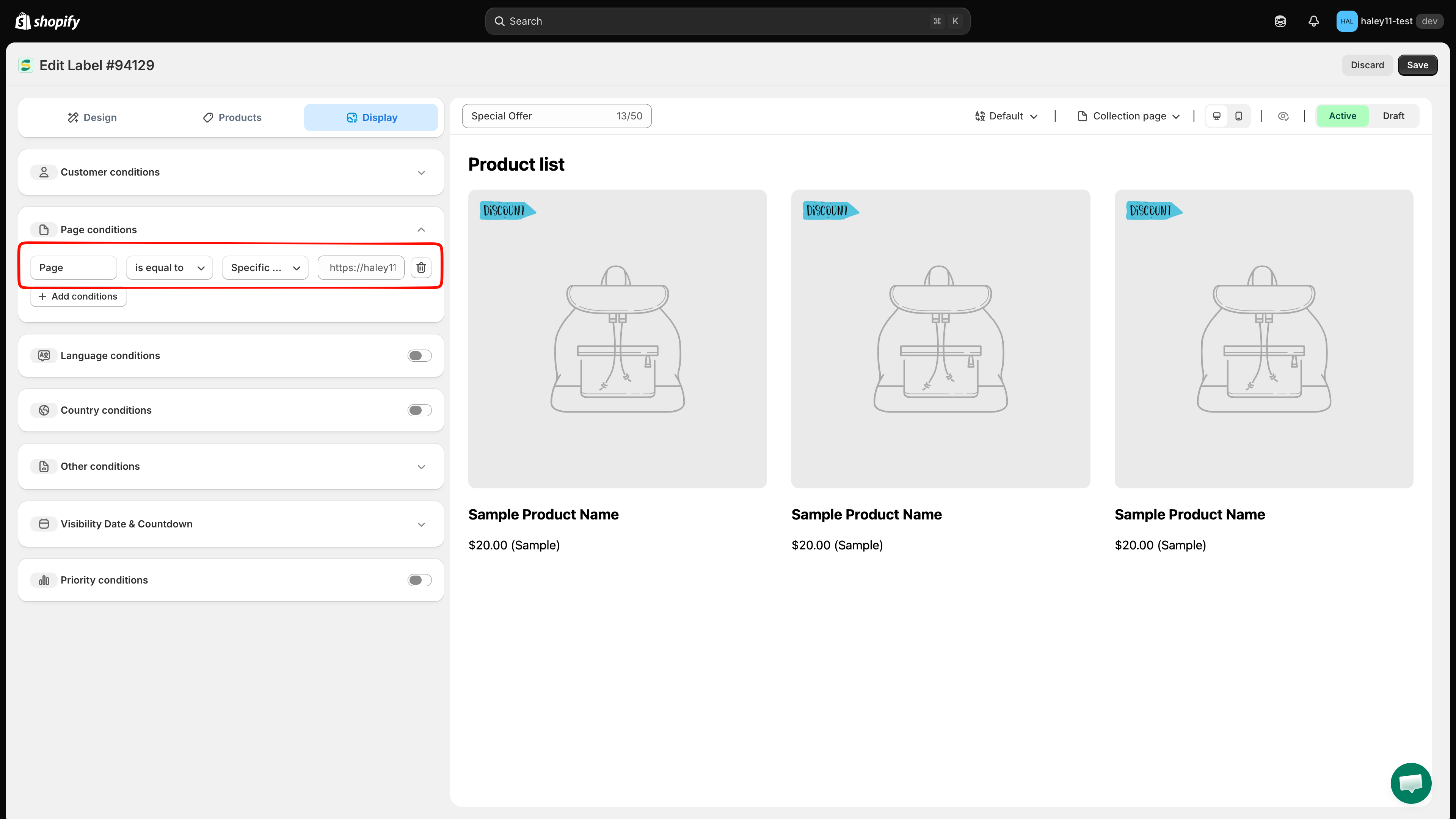
Choosing Specific pages adds a fourth field. Enter the full storefront URL of the page, for example https://your-store.myshopify.com/pages/summer-sale. The placeholder shows your own store's URL as a guide.

Specific pages selected with the URL field beside it
Specific pages adds a URL field — paste the full page URL, not just the path.
6

Save

Click Save in the top-right corner.

Other conditions

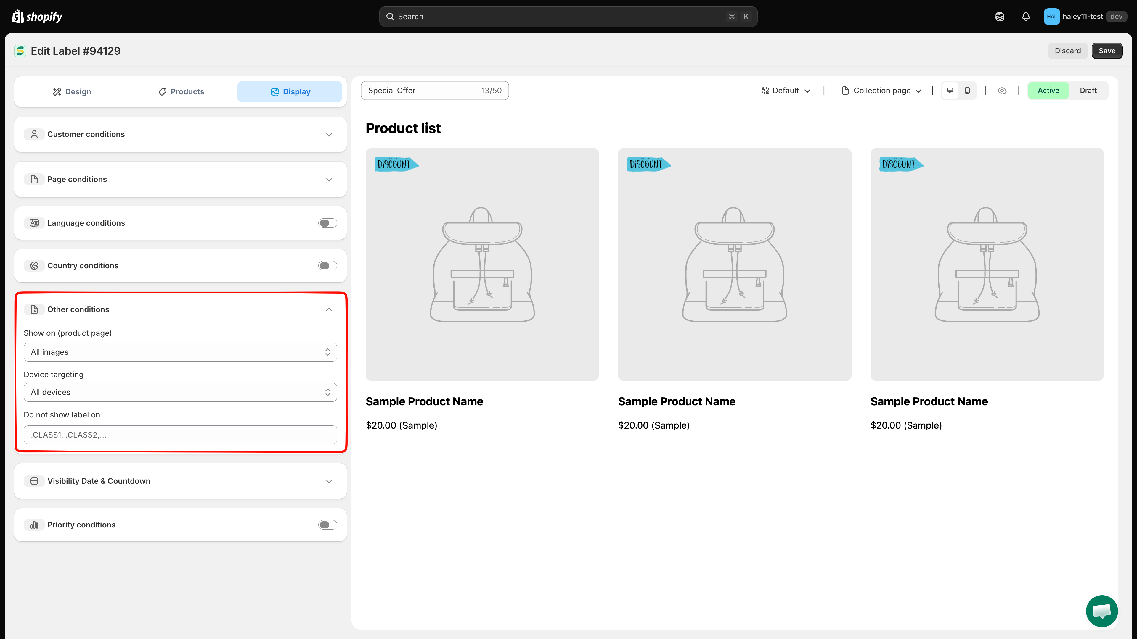
Expand Other conditions to control which product image carries the badge, which devices see it, and which theme elements to skip.

Setting
Options
Behavior

Show on (product page)

All images / First image

Show the badge on every gallery image, or only on the first (main) product image.

Device targeting

All devices / Desktop / Mobile

Limit the badge to desktop or mobile shoppers, or show it on all devices.

Do not show label on

CSS class list — .CLASS1, .CLASS2,...

The badge is not rendered on any element matching these classes. Useful when a slider, quick-view, or upsell section in your theme doesn't suit badge placement.

Other conditions section with Show on, Device targeting, and Do not show label on fields
Image, device, and exclusion settings all live under Other conditions.
Do not show label on expects CSS class selectors separated by commas, each starting with a dot — for example .product-card__slider, .quick-view. Inspect the element in your theme to find the class name.

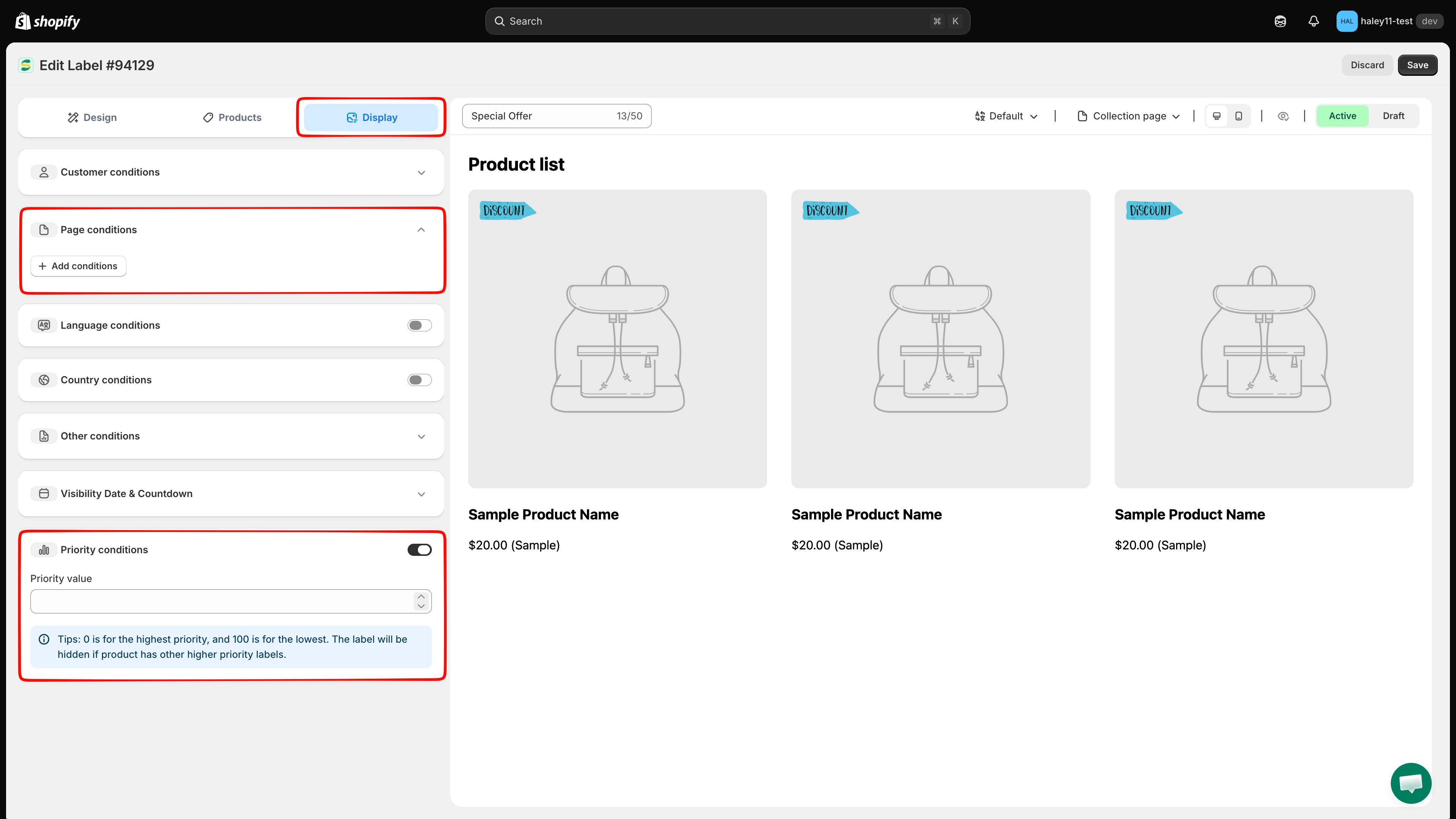
Priority conditions

When several badges match the same product, priority decides which one is displayed.

1

Turn on Priority conditions

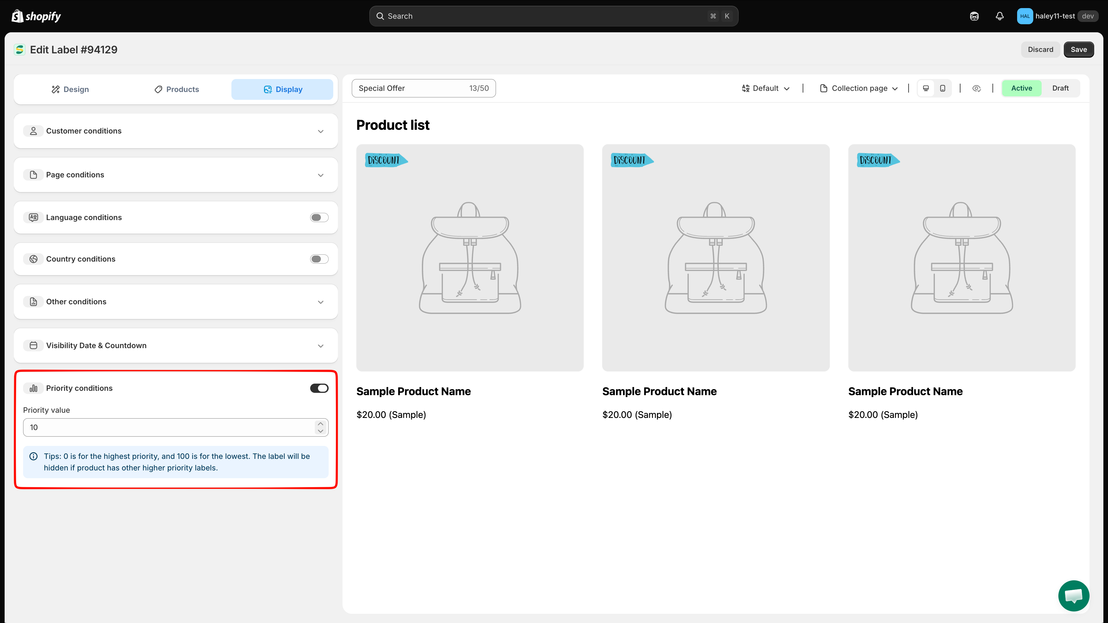
Click the switch on the Priority conditions row. A Priority value field appears.

2

Enter a priority value

Type a number from 0 to 100. 0 is the highest priority, 100 is the lowest. The app shows the same tip under the field.

Priority conditions turned on with the Priority value field and tip
Lower number = higher priority. A badge is hidden if the product already has a higher-priority badge.
3

Save

Click Save. The value now shows in the Priority column of the Badges & Labels list, so you can compare all your badges at a glance.

Priority example

Badge
Priority value
Result on a product matching both

Sale off

0

Shown

Best seller

10

Hidden

Next steps

Last updated

Was this helpful?