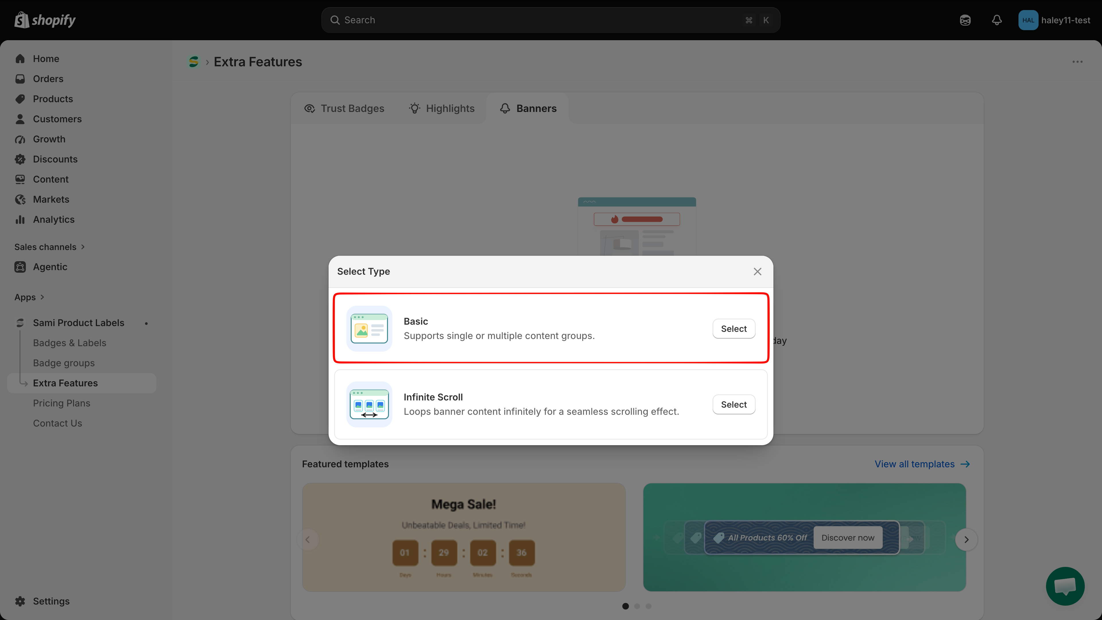
Create a basic banner
Build a basic banner from content elements, style the bar, add a close button or click-through link, and choose where it appears.
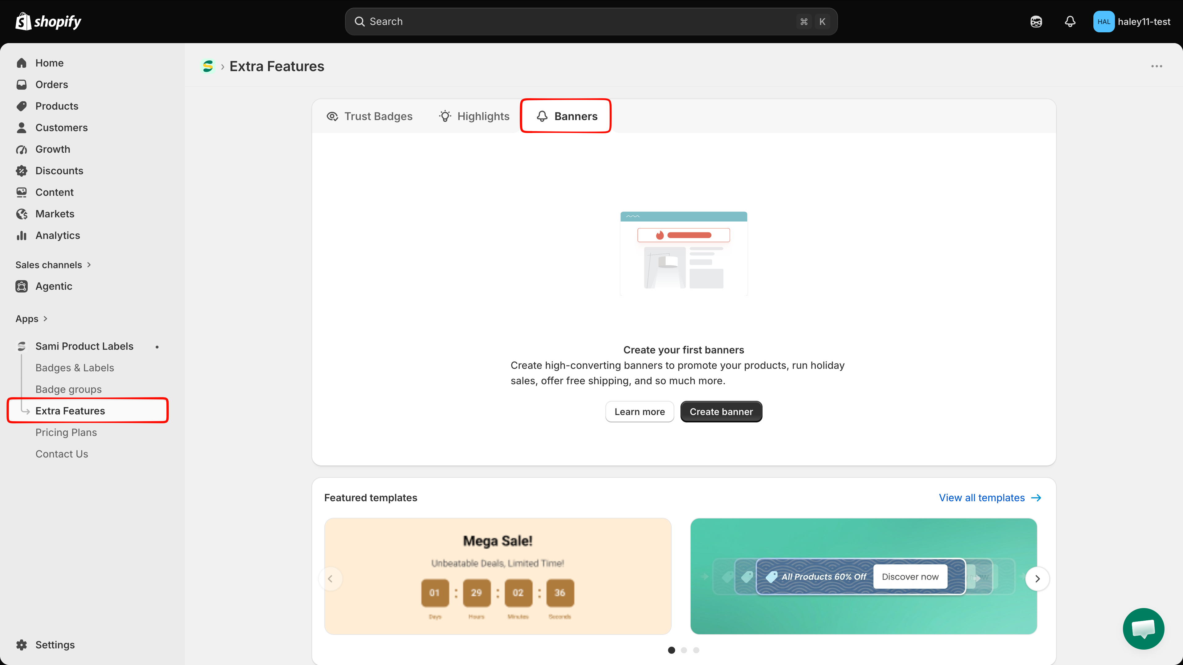
A basic banner is a bar you build from content elements — headings, messages, buttons, countdowns, images — grouped into one or more sections. The editor has two tabs: Design (content and styling) and Placement (where and to whom the bar appears).
Name the banner
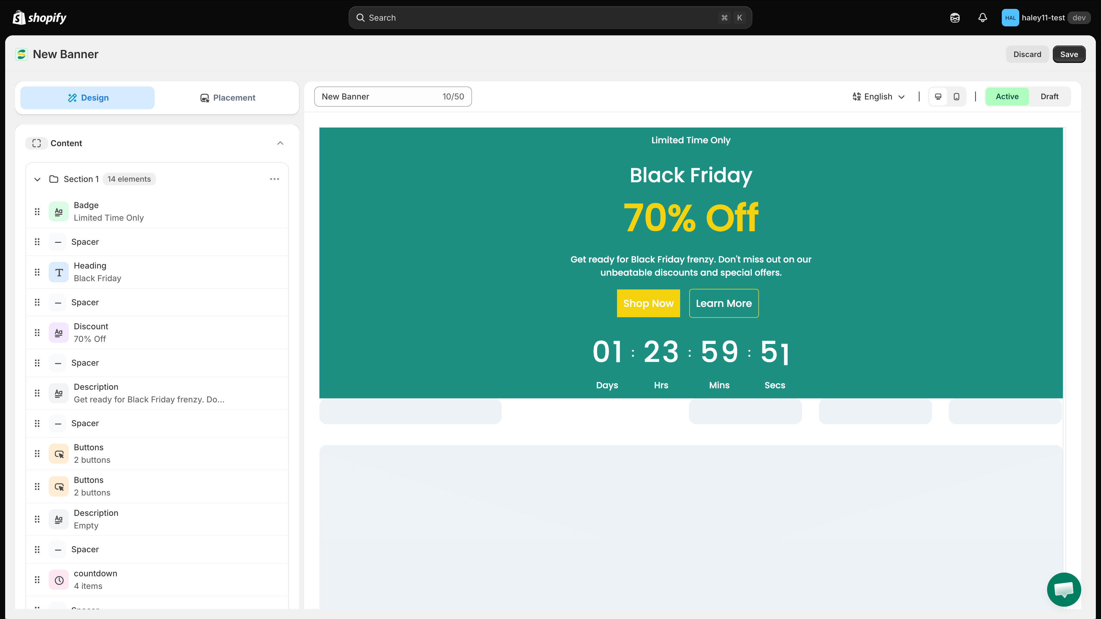
The full-screen editor opens on the Design tab. Replace New Banner in the name field above the preview with a name of up to 50 characters. This name is internal — it identifies the banner in your list and is never shown to customers.
Next to the name you also get a language selector, desktop and mobile preview toggles, and the Active / Draft status switch.

Build the content
Under Content, Section 1 lists the elements that make up the bar. Click any element to edit its text and styling, drag the handle on the left to reorder, or use the icons on the right of a row to hide, duplicate, or delete it.
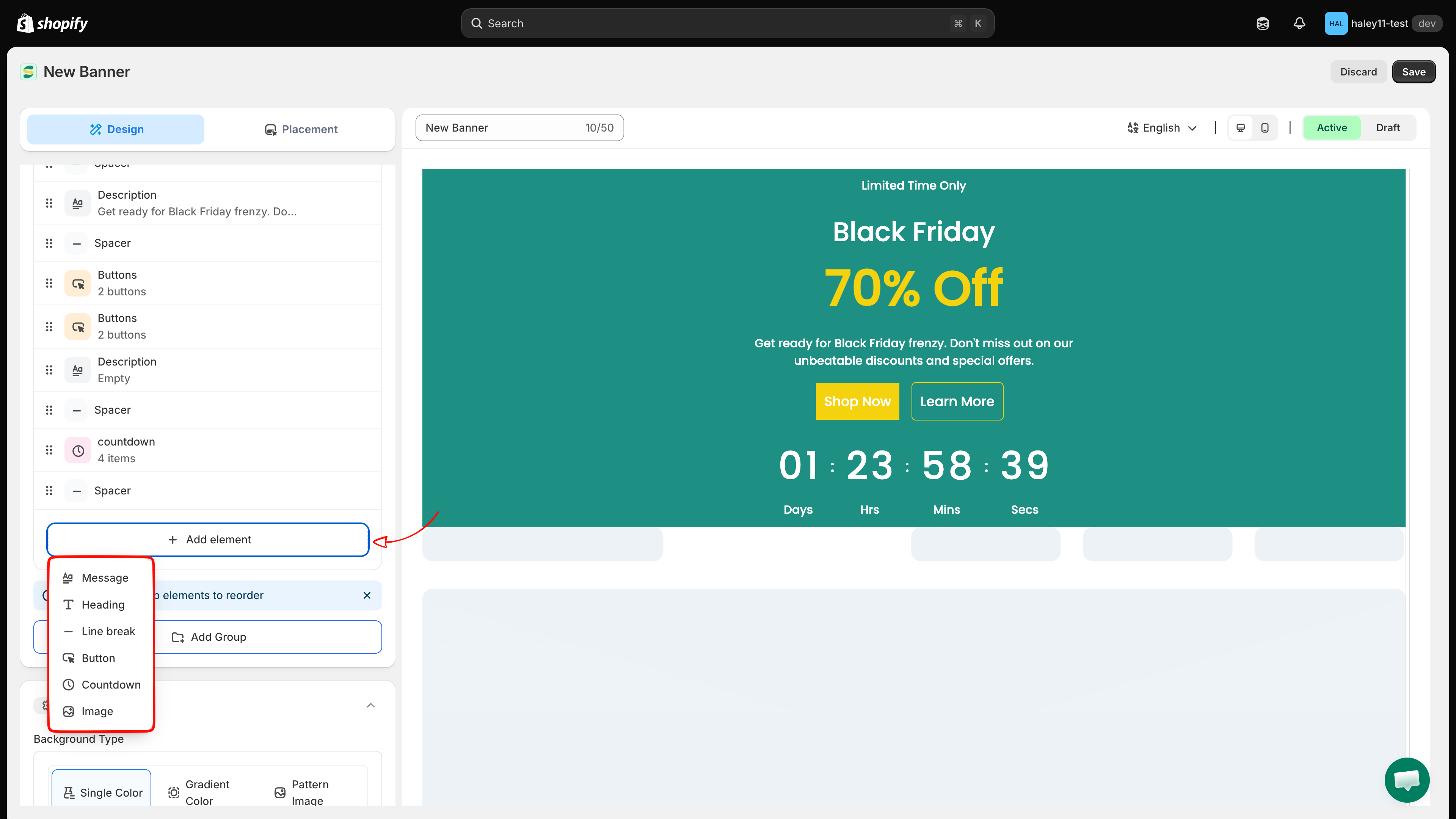
Click Add element to add a new one:
Message
A line of body text.
Heading
A large headline.
Line break
Vertical spacing between elements.
Button
A call-to-action button with its own link.
Countdown
A days / hours / minutes / seconds timer.
Image
An image or logo.

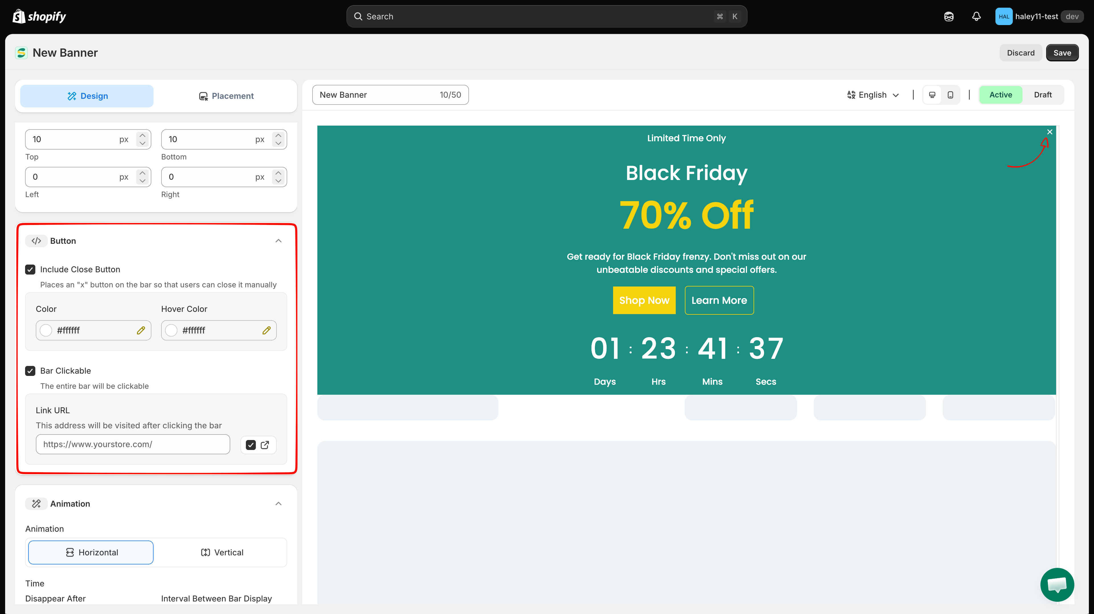
Add a close button or make the bar clickable
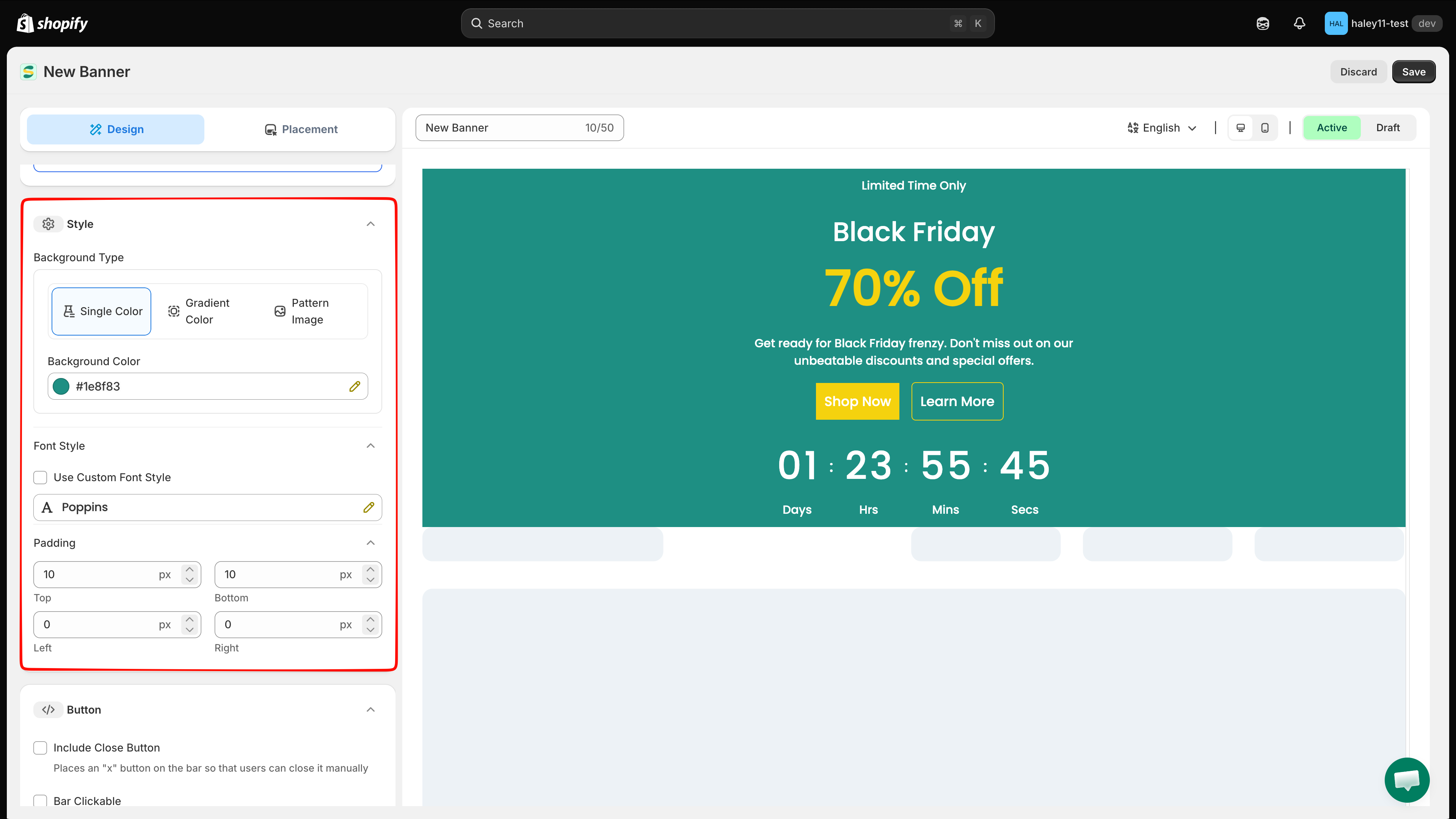
Both options live in the Button panel and are off by default:
Tick Include Close Button to place an "x" on the bar so customers can dismiss it. Two fields appear: Color and Hover Color.
Tick Bar Clickable to make the whole bar a link. A Link URL field appears — enter the destination, and use the toggle beside it to open the link in a new tab.

Set the animation timing
In the Animation panel, choose a Horizontal or Vertical transition, then set the timings in seconds:
Disappear After
How long the bar stays on screen before hiding.
Interval Between Bar Display
The gap before the bar reappears.
Time For The Bar To Fade In
The length of the fade-in animation.
Time Per Group
How long each section shows before rotating to the next.
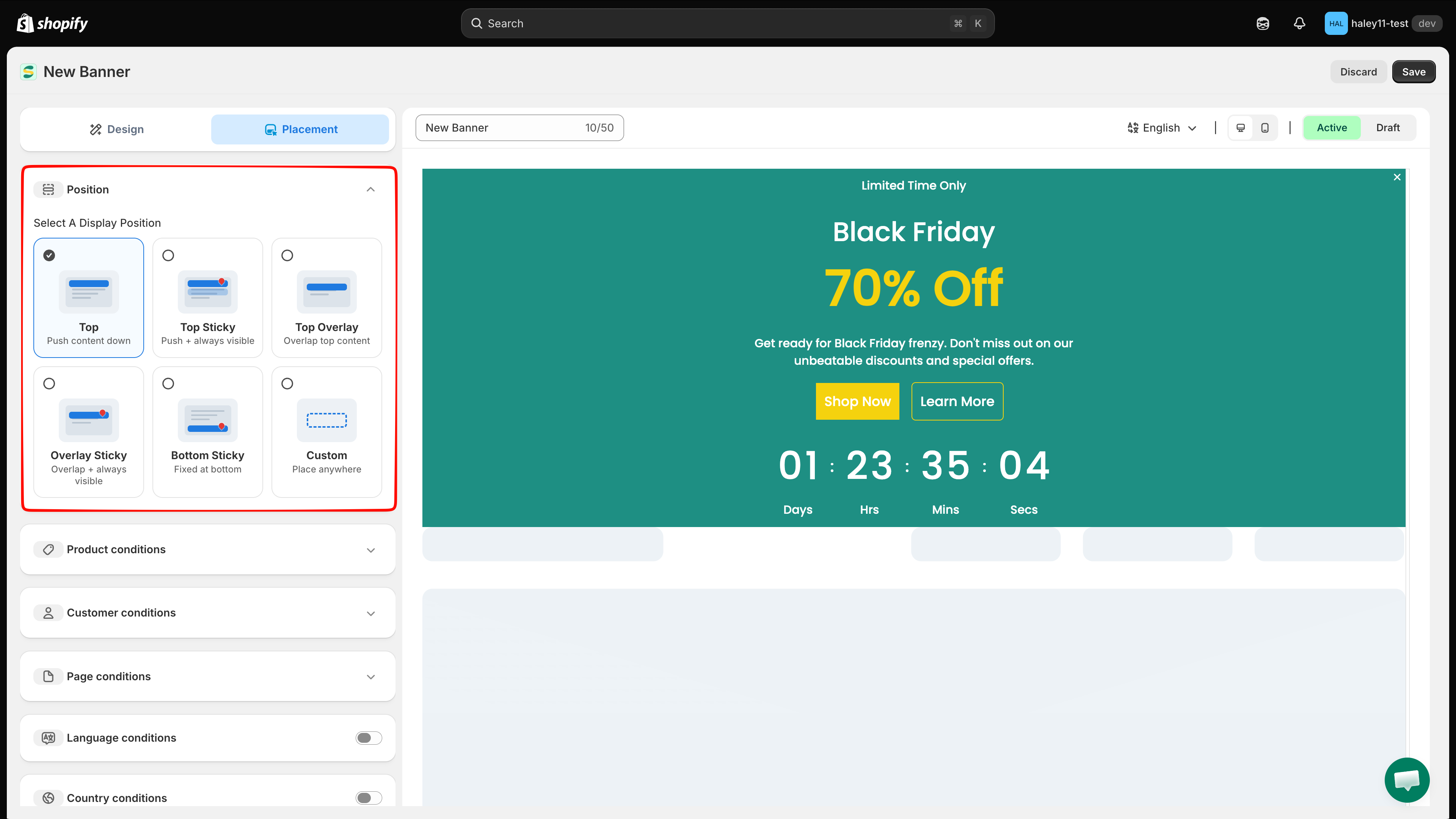
Choose where the banner appears
Switch to the Placement tab and pick a display position:
Top
Pushes page content down.
Top Sticky
Pushes content down and stays visible while scrolling.
Top Overlay
Overlaps the top of the page content.
Overlay Sticky
Overlaps content and stays visible while scrolling.
Bottom Sticky
Fixed at the bottom of the page.
Custom
Place the bar anywhere using a shortcode.
Below the position picker, narrow the audience with Product conditions, Customer conditions, Page conditions, Language conditions, Country conditions, Other conditions, and Visibility date. The Shortcode panel gives you the snippet to paste into your theme when you choose Custom.
See Configure display conditions for the full breakdown of each condition type.

Save and activate
Set the status switch above the preview to Active, then click Save in the top-right corner. Leave it on Draft to keep working without publishing.
Banners only render on your storefront if the app embed is enabled in your theme. See Enable the app in your theme.
Next steps
Configure display conditions — set up detailed targeting rules for your banner.
Create an infinite scroll banner — try a ticker-style scrolling bar instead.
Need support?
If you run into any difficulty while following these steps, contact us at support@samita.io.
Last updated
Was this helpful?