> For the complete documentation index, see [llms.txt](https://docs.samita.io/llms.txt). Markdown versions of documentation pages are available by appending `.md` to page URLs; this page is available as [Markdown](https://docs.samita.io/extra-features/create-highlight.md).

# Create a highlight

Step-by-step guide to creating a highlight block in Sami Product Labels.

A highlight block is a grid of feature items — each with an image, a title, and a description — that you place on your product pages to showcase benefits and selling points. The editor has two tabs: **Design** (content and styling) and **Placement** (where and to whom it appears).

{% stepper %}
{% step %}

## Open the Highlights tab

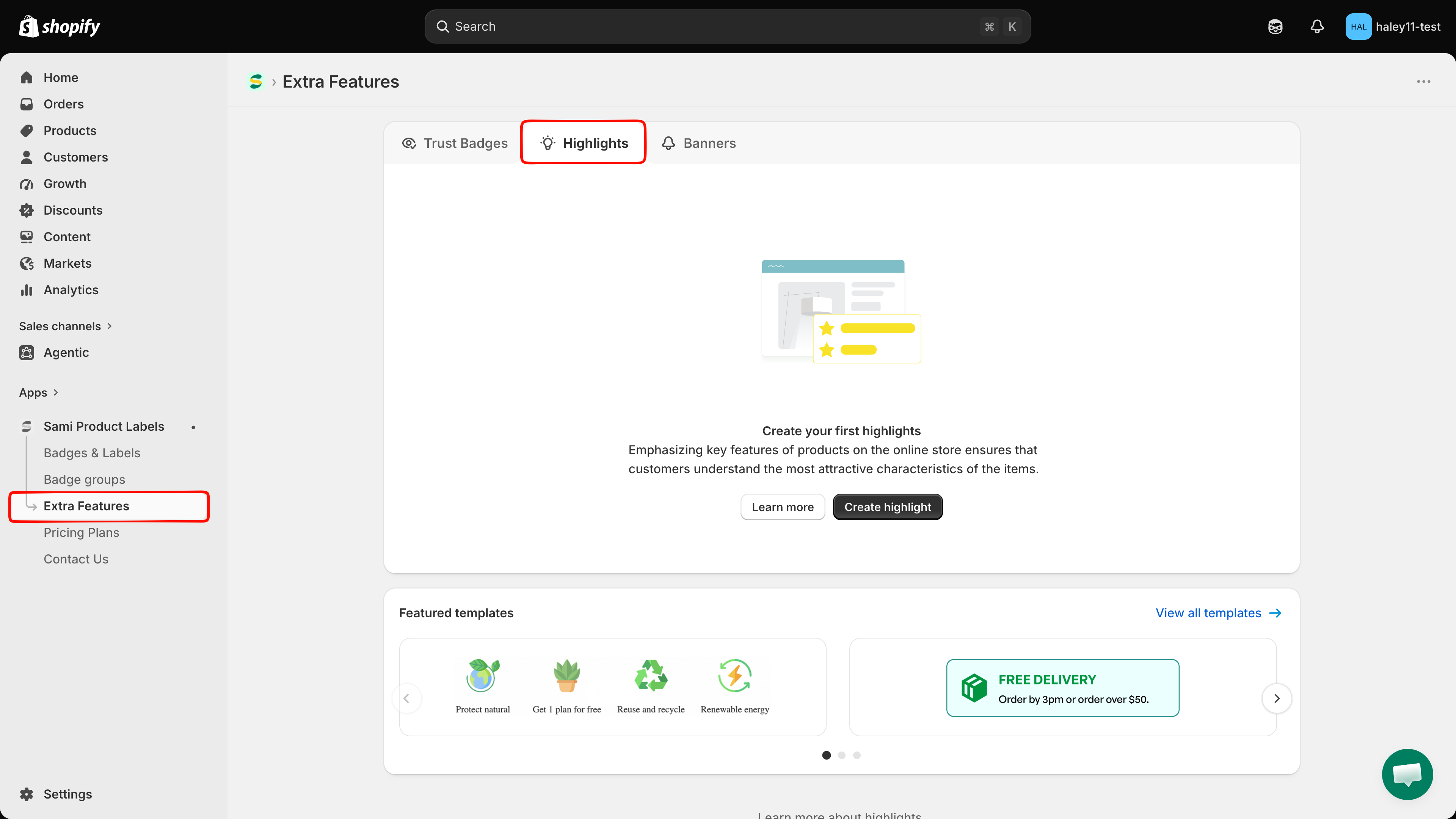
In your Shopify admin, open the **Sami Product Labels** app, click **Extra Features** in the app sidebar, then switch to the **Highlights** tab.

<figure><img src="https://1598842017-files.gitbook.io/~/files/v0/b/gitbook-x-prod.appspot.com/o/spaces%2F1WRTlT5AcaLSAedbCJyZ%2Fuploads%2Fgit-blob-fda0bc1d1219dbe4505b1c9a4b398ff0dedca73f%2Fimage_218.png?alt=media" alt="Extra Features page with the Highlights tab selected"><figcaption><p>The Highlights tab lists every highlight block you have created.</p></figcaption></figure>
{% endstep %}

{% step %}

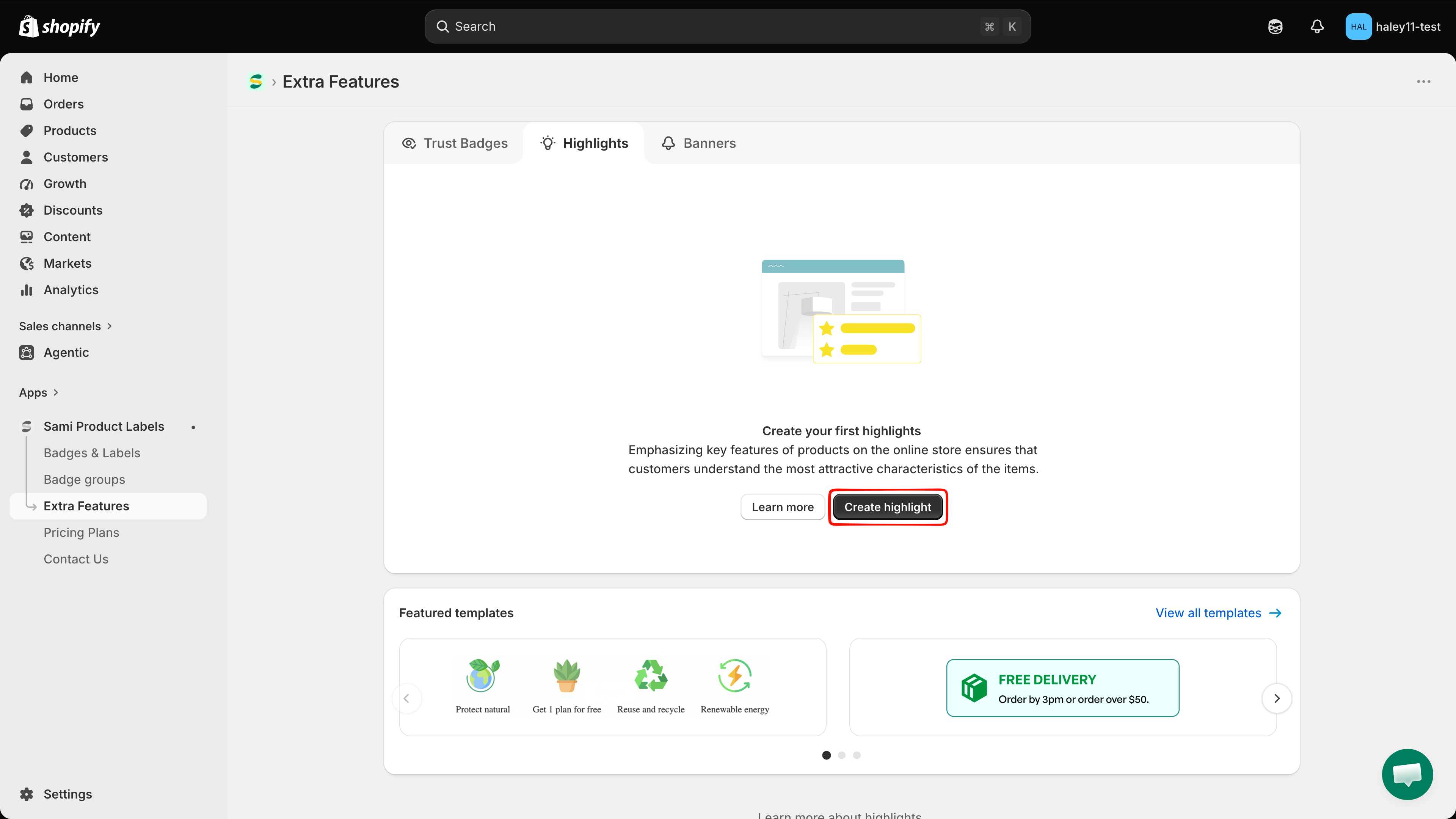
## Click Create highlights

Click **Create highlights**. The full-screen editor opens on the **Design** tab.

{% hint style="info" %}
Scroll to **Featured templates** and click **View all templates** to start from a ready-made block such as *Free Delivery* instead of building one from scratch.
{% endhint %}

<figure><img src="https://1598842017-files.gitbook.io/~/files/v0/b/gitbook-x-prod.appspot.com/o/spaces%2F1WRTlT5AcaLSAedbCJyZ%2Fuploads%2Fgit-blob-15168729bcc871b003c3bc3e42532b196b4484cd%2Fimage_219.png?alt=media" alt="Create highlights button and the Featured templates section"><figcaption><p>Create a highlight from scratch, or start from a featured template.</p></figcaption></figure>
{% endstep %}

{% step %}

## Name the highlight

The name field sits above the preview. Replace **New Highlight** with a name of up to 50 characters. This name is internal — it identifies the block in your list and is not shown to customers.
{% endstep %}

{% step %}

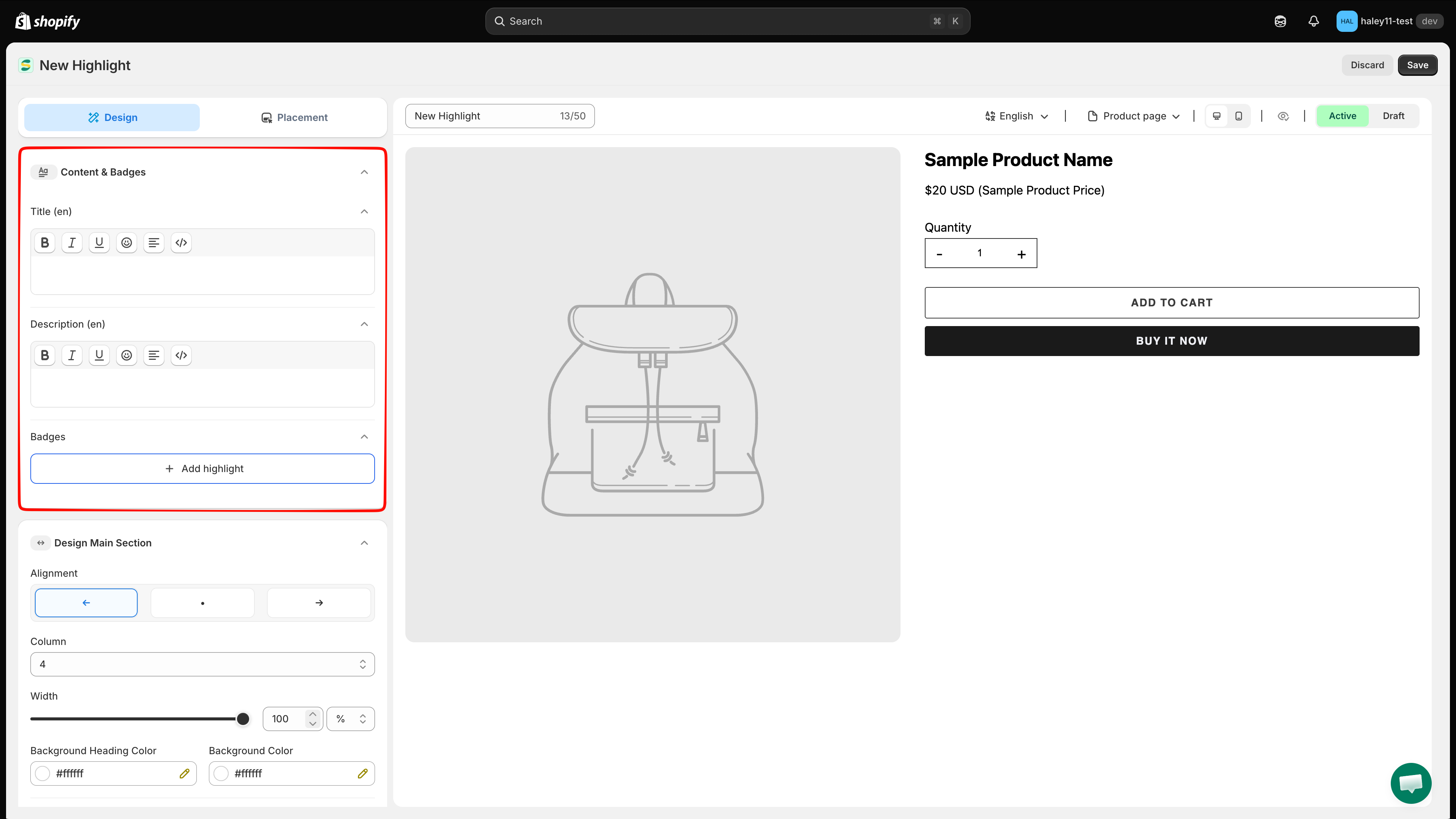
## Add a heading and description

In **Content & Badges**, fill in **Title** and **Description** — these are the heading and intro text for the whole block, for example "Why Choose Us". Both are rich-text editors with **bold**, *italic*, underline, emoji, alignment, and an HTML view (`</>`), and both are per-language, so the label shows the active language, for example `Title (en)`.

Both are optional; leave them empty to show the items only.

<figure><img src="https://1598842017-files.gitbook.io/~/files/v0/b/gitbook-x-prod.appspot.com/o/spaces%2F1WRTlT5AcaLSAedbCJyZ%2Fuploads%2Fgit-blob-d30f0084423f1ce327daa6319d20e1eb6dd79449%2Fimage_142.png?alt=media" alt="Title and Description rich-text editors in the Content and Badges section"><figcaption><p>The block heading and description are rich-text fields, edited per language.</p></figcaption></figure>
{% endstep %}

{% step %}

## Add highlight items

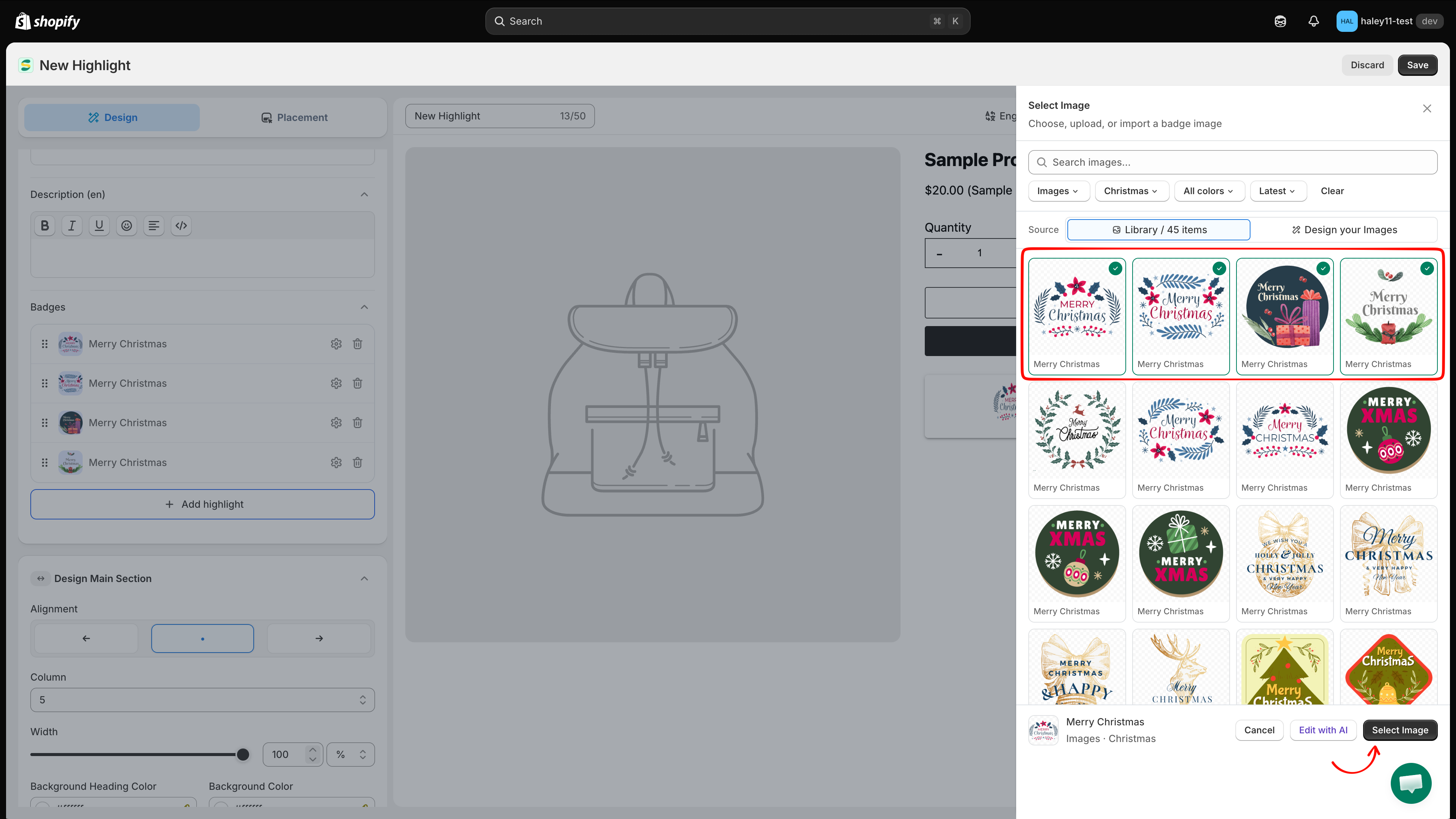
Under **Badges**, click **Add highlight**, then choose:

| Option                 | What it does                                               |
| ---------------------- | ---------------------------------------------------------- |
| **Select badge image** | Opens the image picker to add one or more items.           |
| **Line break**         | Inserts a break so the following items start on a new row. |

In the picker, the **Library** holds 1,800+ images. Search by name, or narrow the list with the **Images**, **Free Labels**, **All colors**, and **Latest** filters (**Clear** resets them). Click the images you want, then click **Select Image**. You can also switch the source to **Design your Images** to use your own, or click **Edit with AI** to modify the selected image.

<figure><img src="https://1598842017-files.gitbook.io/~/files/v0/b/gitbook-x-prod.appspot.com/o/spaces%2F1WRTlT5AcaLSAedbCJyZ%2Fuploads%2Fgit-blob-557a6bc417855ffc87bc8150ee55fbe58277743e%2Fimage_143.png?alt=media" alt="Select Image panel with the library filters and search box"><figcaption><p>Filter or search the library, then pick the images for your highlight items.</p></figcaption></figure>
{% endstep %}

{% step %}

## Write the title and description for each item

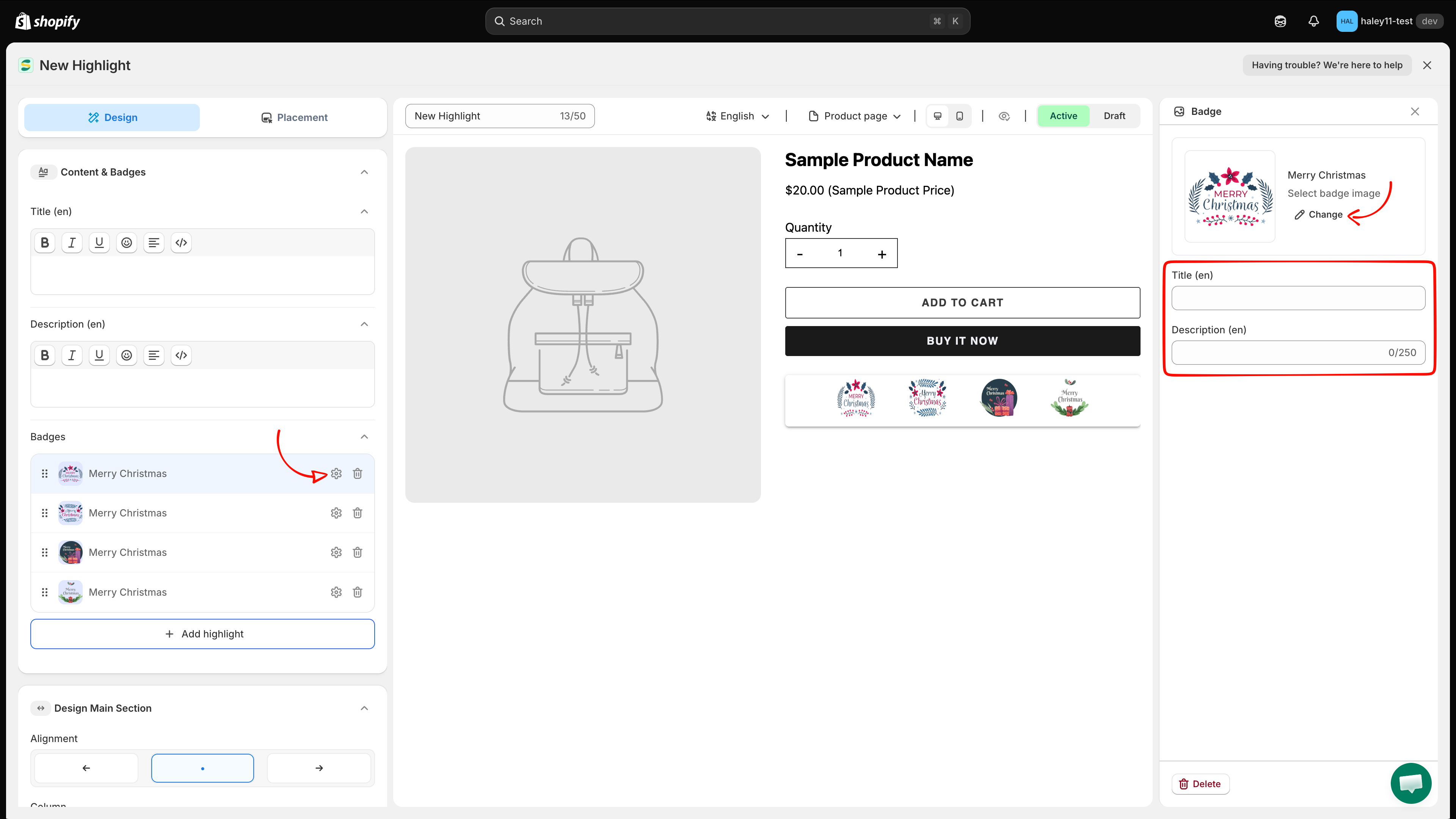
Each item appears as a row in the **Badges** list. Click a row's gear icon to open its panel, where you can set:

* **Image** — click **Change** to swap it for another one.
* **Title** — the short heading for that feature, per language.
* **Description** — up to 250 characters, per language.

Use **Delete** in the panel to remove the item, and drag a row by its handle to reorder the grid.

<figure><img src="https://1598842017-files.gitbook.io/~/files/v0/b/gitbook-x-prod.appspot.com/o/spaces%2F1WRTlT5AcaLSAedbCJyZ%2Fuploads%2Fgit-blob-0308fb8bdb7ffbf2f6b66ca9b7e30921c803d4cd%2Fimage_144.png?alt=media" alt="Highlight item panel with image, title, and description fields"><figcaption><p>Each item gets its own image, title, and description.</p></figcaption></figure>
{% endstep %}

{% step %}

## Set the grid and block styling

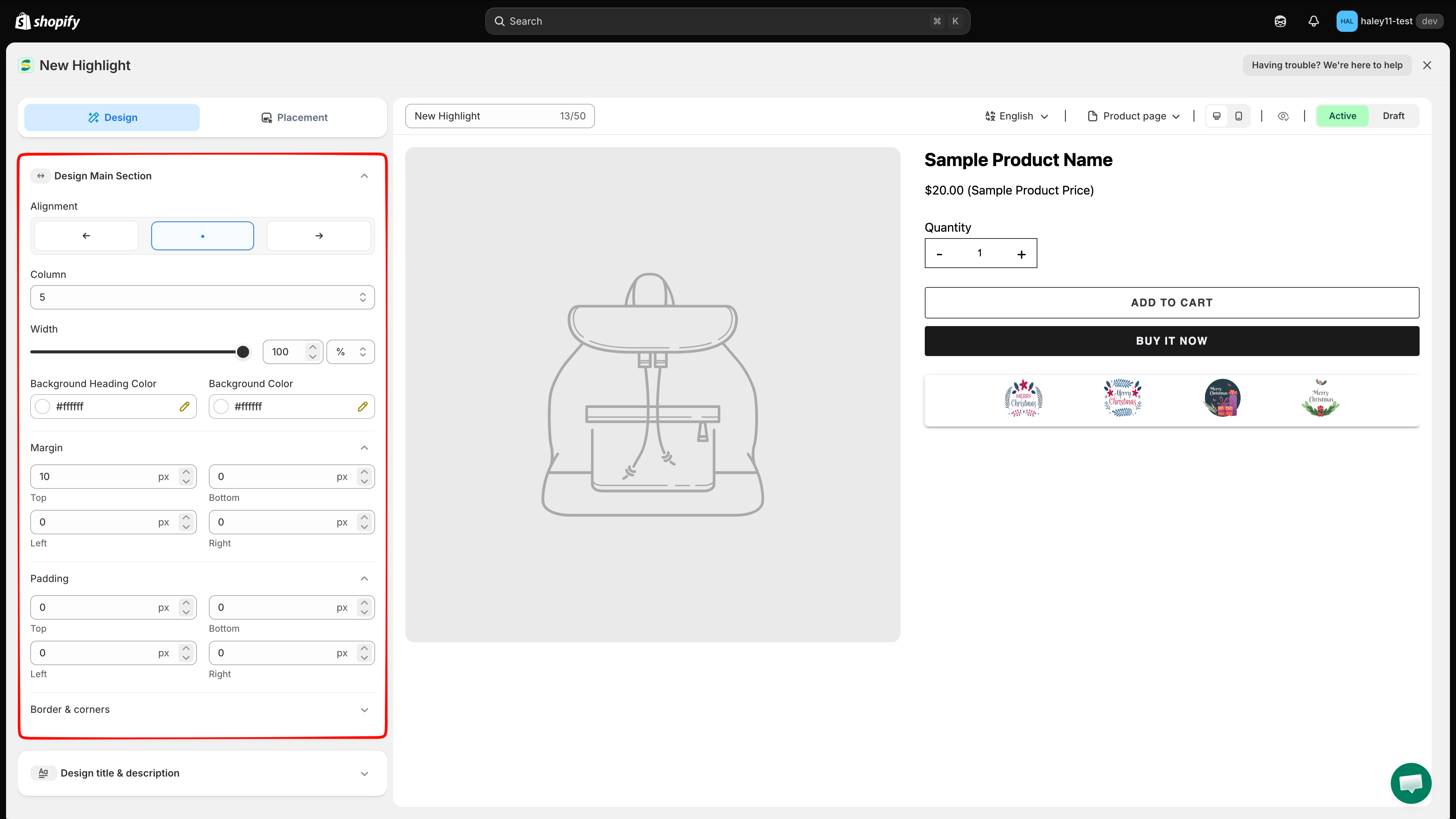
Open **Design Main Section** to control the block as a whole:

| Setting                      | What it does                                   |
| ---------------------------- | ---------------------------------------------- |
| **Alignment**                | Left, center, or right.                        |
| **Column**                   | How many items appear per row.                 |
| **Width**                    | The block width, in `%` or `px`.               |
| **Background Heading Color** | Background behind the heading and description. |
| **Background Color**         | Background of the items area.                  |
| **Margin** / **Padding**     | Spacing outside and inside the block.          |
| **Border & corners**         | Border style, color, and corner radius.        |

<figure><img src="https://1598842017-files.gitbook.io/~/files/v0/b/gitbook-x-prod.appspot.com/o/spaces%2F1WRTlT5AcaLSAedbCJyZ%2Fuploads%2Fgit-blob-ead4263e38f687b75af1f6d0f6e64d06e62f9a2f%2Fimage_145.png?alt=media" alt="Design Main Section with alignment, column, width, and background colors"><figcaption><p>Design Main Section controls the grid and the block container.</p></figcaption></figure>
{% endstep %}

{% step %}

## Style the highlight items

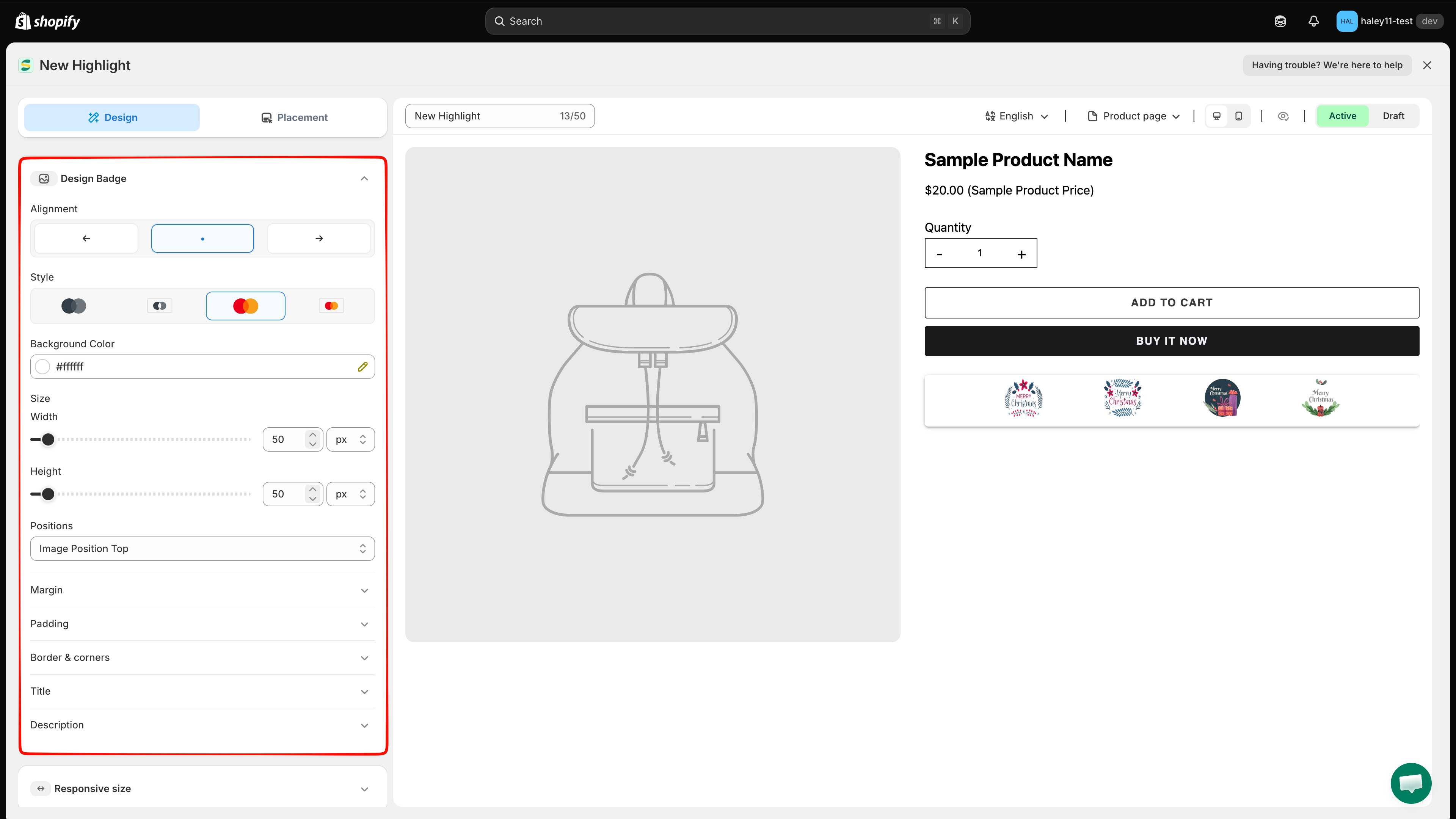
Open **Design Badge** to style the items themselves:

| Setting                                         | What it does                                                                                       |
| ----------------------------------------------- | -------------------------------------------------------------------------------------------------- |
| **Alignment**                                   | How each item's content is aligned.                                                                |
| **Style**                                       | Four image styles: monochrome, monochrome on a card, original color, and original color on a card. |
| **Background Color**                            | Background of each item.                                                                           |
| **Size**                                        | **Width** and **Height** of the image, in `px` or `%` (50 px by default).                          |
| **Positions**                                   | Where the image sits relative to the text, for example **Image Position Top**.                     |
| **Margin** / **Padding** / **Border & corners** | Spacing and border for each item.                                                                  |
| **Title** / **Description**                     | Font, color, size, and line height for the item text.                                              |

<figure><img src="https://1598842017-files.gitbook.io/~/files/v0/b/gitbook-x-prod.appspot.com/o/spaces%2F1WRTlT5AcaLSAedbCJyZ%2Fuploads%2Fgit-blob-cac12ead2b4ac3d15bf83f78349d6782d4da628f%2Fimage_146.png?alt=media" alt="Design Badge section with alignment, style, size, and positions"><figcaption><p>Design Badge styles the individual highlight items.</p></figcaption></figure>
{% endstep %}

{% step %}

## Style the block heading (optional)

Open **Design title & description**. **Design Title** and **Design Description** each have their own font, color, size, and line height for the block-level heading and intro text.
{% endstep %}

{% step %}

## Set responsive sizes and custom CSS (optional)

* **Responsive size** — override the sizing on tablet and mobile.
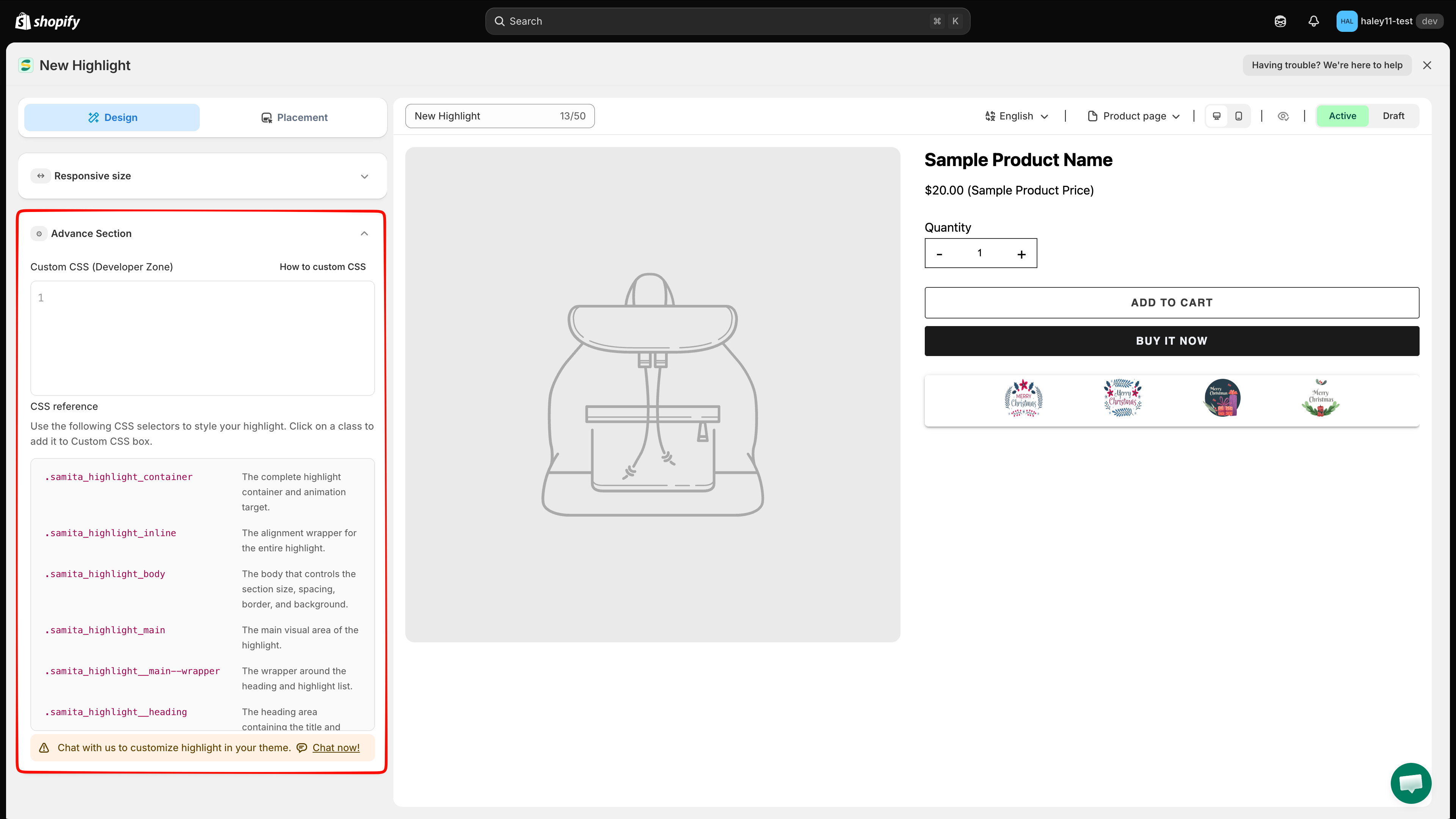
* **Advance Section** — add **Custom CSS (Developer Zone)**. The **CSS reference** below the editor lists the selectors you can target, such as `.samita_highlight_container`; click one to insert it.

<figure><img src="https://1598842017-files.gitbook.io/~/files/v0/b/gitbook-x-prod.appspot.com/o/spaces%2F1WRTlT5AcaLSAedbCJyZ%2Fuploads%2Fgit-blob-1bf3d88f14599562789b27858743d03a6a6f02f9%2Fimage_147.png?alt=media" alt="Advance Section with the custom CSS editor and the CSS reference list"><figcaption><p>The CSS reference lists the selectors available for custom styling.</p></figcaption></figure>
{% endstep %}

{% step %}

## Choose where the highlight appears

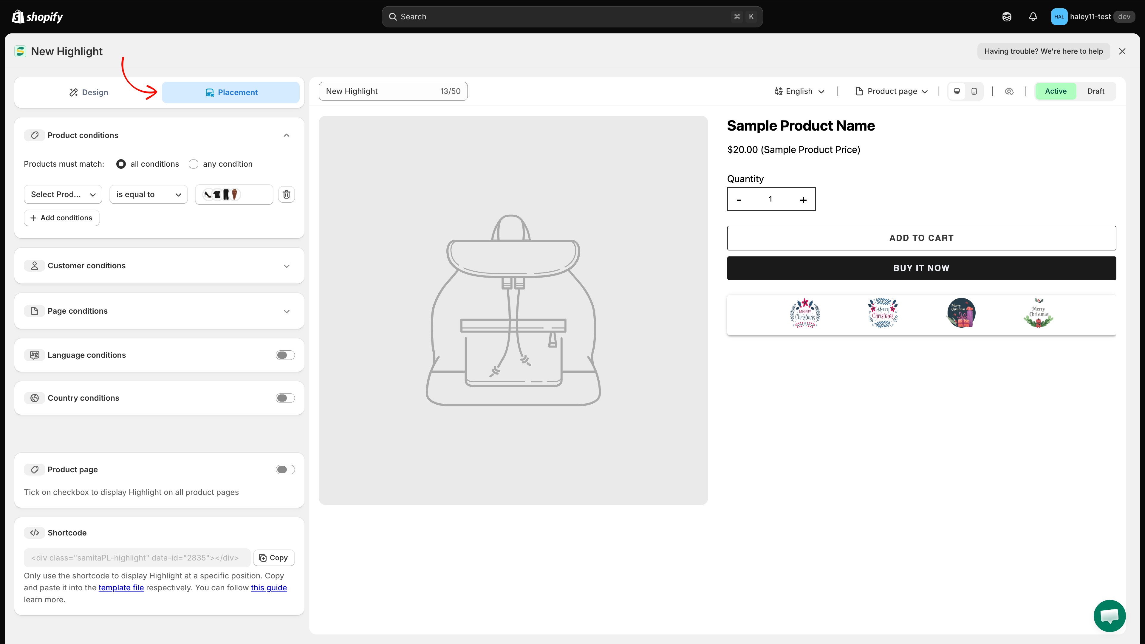
Switch to the **Placement** tab:

* **Product page** — turn on to display the block at the app's built-in position on every product page.
* **Shortcode** — copy the snippet and paste it into your theme to place the block at an exact position.
* **Conditions** — **Product**, **Customer**, **Page**, **Language**, and **Country** conditions narrow down who sees the block and where.

{% hint style="info" %}
See [Target highlight display](/extra-features/target-highlight-display.md) for how the condition sets work.
{% endhint %}

<figure><img src="https://1598842017-files.gitbook.io/~/files/v0/b/gitbook-x-prod.appspot.com/o/spaces%2F1WRTlT5AcaLSAedbCJyZ%2Fuploads%2Fgit-blob-b088d47d53607f7a4f121ba65f6e354318c63ac2%2Fimage_148.png?alt=media" alt="Placement tab with condition sections, the Product page toggle, and the shortcode"><figcaption><p>The Placement tab combines display conditions, the product page toggle, and the shortcode.</p></figcaption></figure>
{% endstep %}

{% step %}

## Preview and save

Above the preview you can switch the **language**, choose which page to preview, toggle **desktop / mobile**, and hide the sample product with the eye icon. Set the block to **Active** or **Draft**, then click **Save** in the top right. Use **Discard** to drop unsaved changes.
{% endstep %}
{% endstepper %}

{% hint style="info" %}
The FREE plan includes 2 highlights, and deleted ones still count toward that limit. Upgrade to GOLD or DIAMOND for unlimited highlights.
{% endhint %}

## Next steps

* [Place a highlight with shortcode](/extra-features/place-highlight-with-shortcode.md) — position the block at a custom location in your theme.
* [Target highlight display](/extra-features/target-highlight-display.md) — control which pages and customers see your highlights.
* [Highlight overview](/extra-features/highlight-overview.md) — what highlights are and when to use them.
* [Create a trust badge](/extra-features/create-trust-badge.md) — add payment and security icons to your product pages.

{% hint style="success" %}
**Need support?**

If you run into any difficulty while following these steps, contact us at <support@samita.io>.
{% endhint %}


---

# Agent Instructions
This documentation is published with GitBook. GitBook is the documentation platform designed so that both humans and AI agents can read, navigate, and reason over technical content effectively. Learn more at gitbook.com.

## Querying This Documentation
If you need additional information that is not directly available in this page, you can query the documentation dynamically by asking a question.

Perform an HTTP GET request on the current page URL with the `ask` query parameter, and the optional `goal` query parameter:

```
GET https://docs.samita.io/extra-features/create-highlight.md?ask=<question>&goal=<endgoal>
```

`ask` is the immediate question: it should be specific, self-contained, and written in natural language.
`goal` is optional and describes the broader end goal you are ultimately trying to accomplish on behalf of the user. GitBook uses it to tailor the answer towards what is most useful for that goal.

The response will contain a direct answer to the question and relevant excerpts and sources from the documentation.

Use this mechanism when the answer is not explicitly present in the current page, you need clarification or additional context, or you want to retrieve related documentation sections.