> For the complete documentation index, see [llms.txt](https://docs.samita.io/llms.txt). Markdown versions of documentation pages are available by appending `.md` to page URLs; this page is available as [Markdown](https://docs.samita.io/sami-b2b-onboarding/application-forms/design-the-form.md).
# Design the form
Change your form's font, width, field style, colors and logo so it matches your store.
The **Appearance** settings in Sami B2B Onboarding change how the whole form looks: its font, size, width, field style and colors. They apply to one form, so each of your forms can have its own look, and they never change your theme.
## Open the Appearance settings
{% stepper %}
{% step %}
### Open the form
Go to **Forms** and click **Edit** beside the form. The builder opens.
{% endstep %}
{% step %}
### Open Appearance
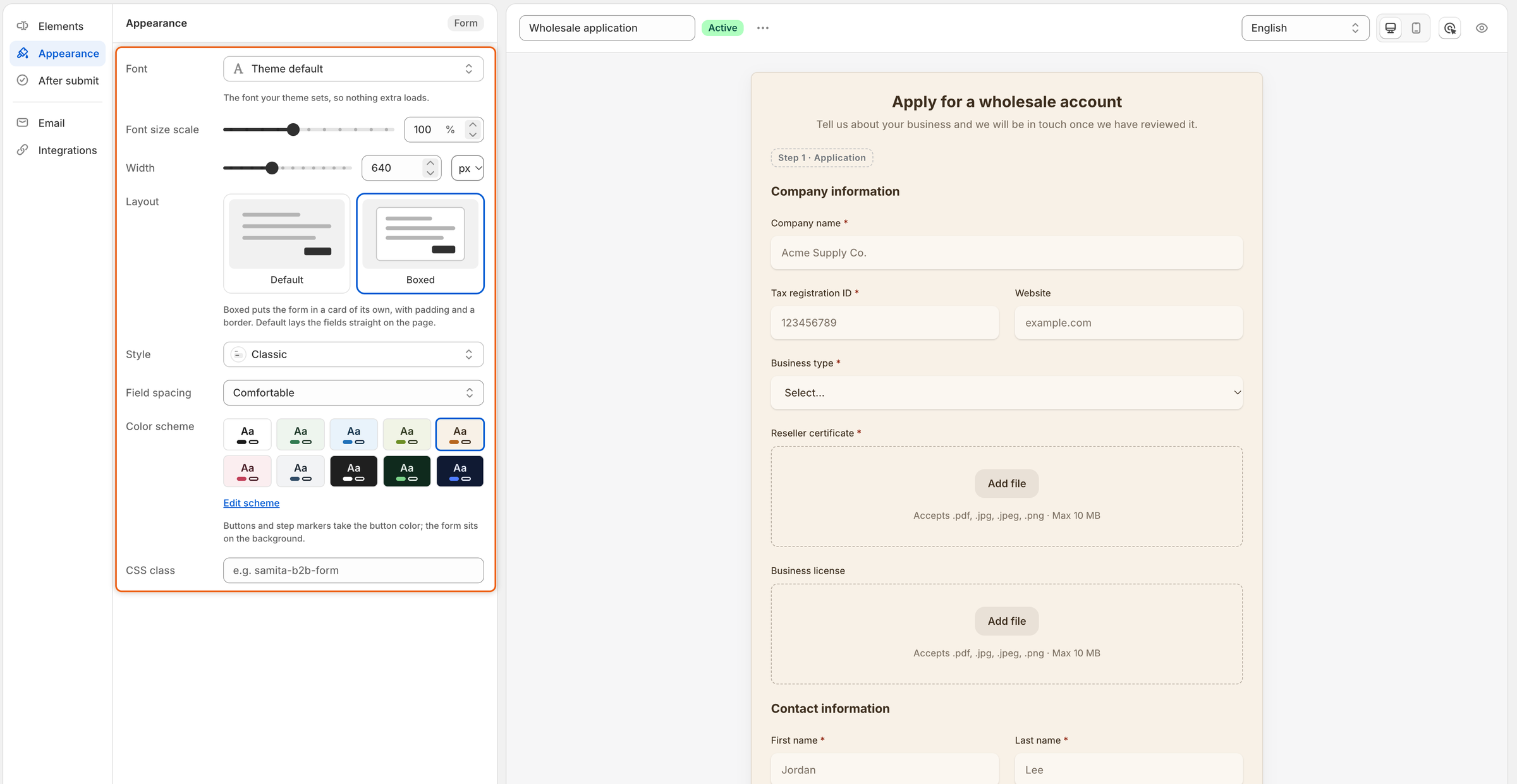
In the rail on the left, click **Appearance**. The panel lists every setting below, and the preview in the middle changes as you change them.
Every Appearance setting changes the preview straight away.
{% endstep %}
{% step %}
### Save
When the form looks right, click **Save** in the save bar. If the form is published, buyers see the new look the next time they open it.
{% endstep %}
{% endstepper %}
## Appearance settings
| Setting | What it changes | Default |
| ------------------- | ------------------------------------------------------------------------------------------------------------------------------------------------- | ----------------- |
| **Font** | The typeface of the whole form. Opens the **Select font** panel. | **Theme default** |
| **Font size scale** | The size of all the form's text, from 80% to 130% of your theme's size, in steps of 5%. | 100% |
| **Width** | The form's widest size, in **px** (320 to 1200) or **%** of the space it sits in (30 to 100). The form is centered, and narrows on small screens. | 640 px |
| **Layout** | **Default** lays the fields straight on the page. **Boxed** puts the form in a card of its own, with padding and a border. | **Default** |
| **Style** | The look of every field box. See [Field styles](#field-styles). | **Classic** |
| **Field spacing** | The space between fields: **Comfortable** or **Compact**. | **Comfortable** |
| **Color scheme** | The form's background, text and button colors. See [Colors](#colors). | **Default** |
| **CSS class** | Adds a class name of your own to the form, so styles in your theme can target it, for example `wholesale-form`. | Empty |
When you switch **Width** between **px** and **%**, it starts again at 640 px or 100%.
## Pick a font
{% stepper %}
{% step %}
### Open the font list
In **Appearance**, click the **Font** box. The **Select font** panel opens.
{% endstep %}
{% step %}
### Find a font
Type in **Search**, or scroll. The list has two groups:
* **System fonts**: **Theme default**, the font your theme already uses, then **System UI**, **Helvetica**, **Arial**, **Georgia**, **Times New Roman** and **Monospace**. Nothing extra loads for these.
* **Other fonts**: nearly 1,000 web fonts. Each one is shown in its own typeface. They load from Google Fonts on your storefront, which can make the page a little slower to load.
{% endstep %}
{% step %}
### Pick it and its weight
Click a font. The preview changes at once. If the font comes in several weights, pick one in the **Weight** list at the bottom of the panel, for example **Regular**, **Bold** or **Italic**. Click **Done**.
The note under **Font** confirms what you picked, for example **Bold. Loads from Google Fonts on the storefront.**
{% endstep %}
{% endstepper %}
## Field styles
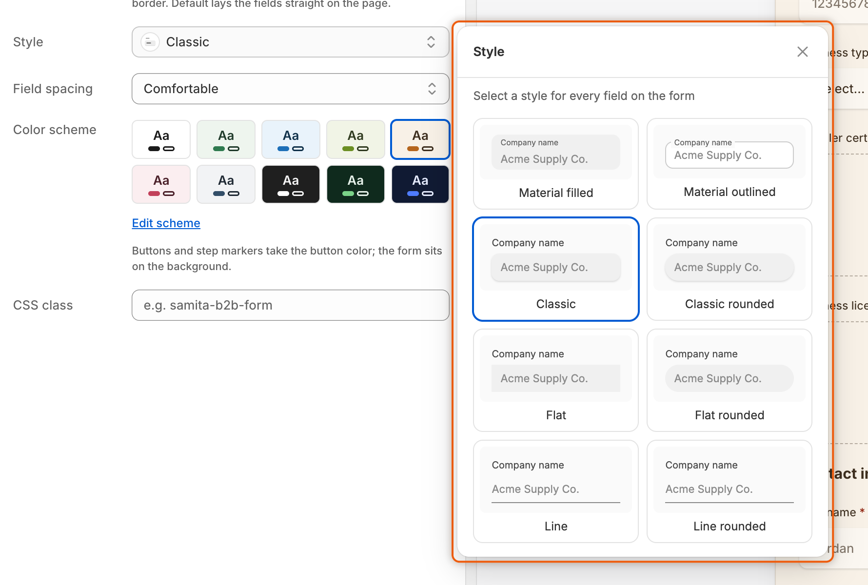
Click the **Style** box to see all eight styles, each drawn as a sample **Company name** field. Click one to apply it to every field on the form.
| Style | What a field looks like |
| --------------------- | --------------------------------------------------------------------- |
| **Material filled** | A grey box with the label inside it, at the top. |
| **Material outlined** | A bordered box with the label sitting on its top edge. |
| **Classic** | A soft grey box with a light shadow and rounded corners. The default. |
| **Classic rounded** | Classic, with fully round one-line boxes. |
| **Flat** | A grey box with square corners and no shadow. |
| **Flat rounded** | Flat, with fully round one-line boxes. |
| **Line** | Only a line under the answer. |
| **Line rounded** | Looks the same as **Line**: an underline has no corners to round. |
In the rounded styles, boxes that hold several lines, such as **Long text**, keep softly rounded corners rather than going fully round.
Each card shows how a field looks in that style.
## Colors
The **Color scheme** row shows ten ready-made schemes: **Default**, **Forest Light**, **Cool Ocean**, **Matcha Calm**, **Warm Sand**, **Blush**, **Slate**, **Charcoal**, **Forest Dark** and **Midnight**. Each swatch shows its background, text and button colors. Click one to use it.
* **Default** takes the page's own colors, so the form matches your theme. To change those colors, change your theme's settings.
* Any other scheme paints the form's own background behind it. Buttons and step markers take the scheme's button color.
### Make your own colors
{% stepper %}
{% step %}
### Open the scheme
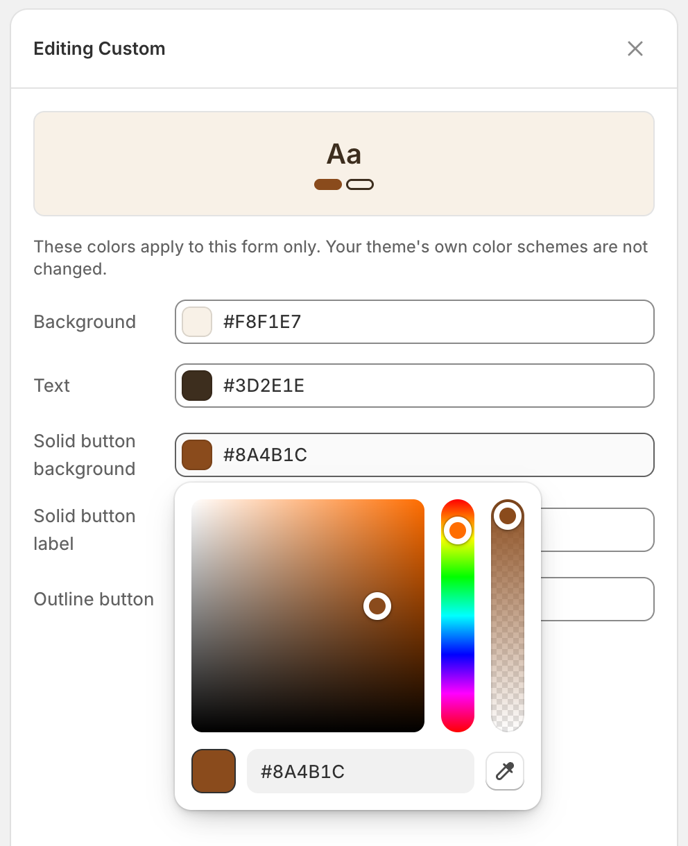
Under the swatches, click **Edit scheme**. The **Editing** panel opens for the scheme you picked, for example **Editing Warm Sand**.
{% endstep %}
{% step %}
### Change the colors
Click a color to open the color picker. Drag in the square and the color strips, type a hex code, or use the eyedropper to pick a color from your screen if your browser offers it. The colors you can set:
| Color | What it paints |
| --------------------------- | ----------------------------------------------------------------------- |
| **Background** | Behind the form. |
| **Text** | Labels, headings and answers. |
| **Solid button background** | The main buttons, such as **Submit application**, and the step markers. |
| **Solid button label** | The text on those buttons. |
| **Outline button** | The border of outline buttons, such as **Back**. |
**Background**, **Text** and **Outline button** can read **Theme color**, which means the form uses your theme's color there.
As soon as you change a color, the scheme becomes **Custom** and a **Custom** swatch is added to the row. These colors apply to this form only. Your theme's own color schemes don't change.
Change any color and the form gets a Custom scheme of its own.
{% endstep %}
{% step %}
### Close or reset
Close the panel to keep your colors. To go back to your theme's colors, click **Remove color scheme** at the bottom of the panel: the form returns to **Default**.
{% endstep %}
{% endstepper %}
## Add your logo
The logo sits in the form's header, above its heading.
{% stepper %}
{% step %}
### Open the header
In the rail, click **Elements**, then click **Header** at the top of the list.
{% endstep %}
{% step %}
### Upload the logo
Turn on **Show store logo**, then click **Upload image** and choose the file. It must be a .jpg, .png or .svg image of 1 MB or less. A size of about 200×60 px fits best.
To change it later, click **Replace image**. To take it off, click **Remove**.
{% endstep %}
{% step %}
### Save
Click **Save** in the save bar.
{% endstep %}
{% endstepper %}
## Check the design
The preview in the builder draws your form with the same code your storefront uses, so the layout, field style, spacing and scheme you see are what buyers get.
* Use the **Desktop preview** and **Mobile preview** buttons above the preview to check both screen sizes.
* Settings you leave to your theme, **Theme default** for the font and **Default** for the colors, take your theme's font and colors on the storefront. To see them, click **Preview** (the eye button) in the toolbar. It opens the form's page on your store in a new tab, as it was last saved.
## Next steps
* [Build your form](/sami-b2b-onboarding/application-forms/build-your-form.md) — set each field's width, label and placeholder.
* [After the buyer submits](/sami-b2b-onboarding/application-forms/after-the-buyer-submits.md) — write the thank-you screen buyers see after this form.
* [Add a form to your store](/sami-b2b-onboarding/add-a-form-to-your-store/add-a-form-to-your-store.md) — put the finished form on a page, in a theme section or anywhere with HTML.
---
# Agent Instructions
This documentation is published with GitBook. GitBook is the documentation platform designed so that both humans and AI agents can read, navigate, and reason over technical content effectively. Learn more at gitbook.com.
## Querying This Documentation
If you need additional information that is not directly available in this page, you can query the documentation dynamically by asking a question.
Perform an HTTP GET request on the current page URL with the `ask` query parameter, and the optional `goal` query parameter:
```
GET https://docs.samita.io/sami-b2b-onboarding/application-forms/design-the-form.md?ask=&goal=
```
`ask` is the immediate question: it should be specific, self-contained, and written in natural language.
`goal` is optional and describes the broader end goal you are ultimately trying to accomplish on behalf of the user. GitBook uses it to tailor the answer towards what is most useful for that goal.
The response will contain a direct answer to the question and relevant excerpts and sources from the documentation.
Use this mechanism when the answer is not explicitly present in the current page, you need clarification or additional context, or you want to retrieve related documentation sections.