> For the complete documentation index, see [llms.txt](https://docs.samita.io/llms.txt). Markdown versions of documentation pages are available by appending `.md` to page URLs; this page is available as [Markdown](https://docs.samita.io/b2b-lock-password-protect/design-and-customization/colors-and-templates.md).

# Colors and templates

Style a single lock's colors, buttons, and templates, and preview the result live before you save.

Every lock in Sami B2B Lock, Password Protect keeps its own design settings — colors, button style, and a couple of display toggles — completely separate from every other lock. That means your passcode-protected wholesale catalog can look nothing like your "sign in to see this collection" message, even though both are built with the same app. Nothing you do on this page affects any other lock.

{% hint style="info" %}
New locks start out using your store's default colors (set on the app's general template settings), but any change you make here only applies to the lock you're currently editing.
{% endhint %}

## Open a lock's design panel

1. Open the app and go to **Locks**, then open the lock you want to restyle (or create a new one).
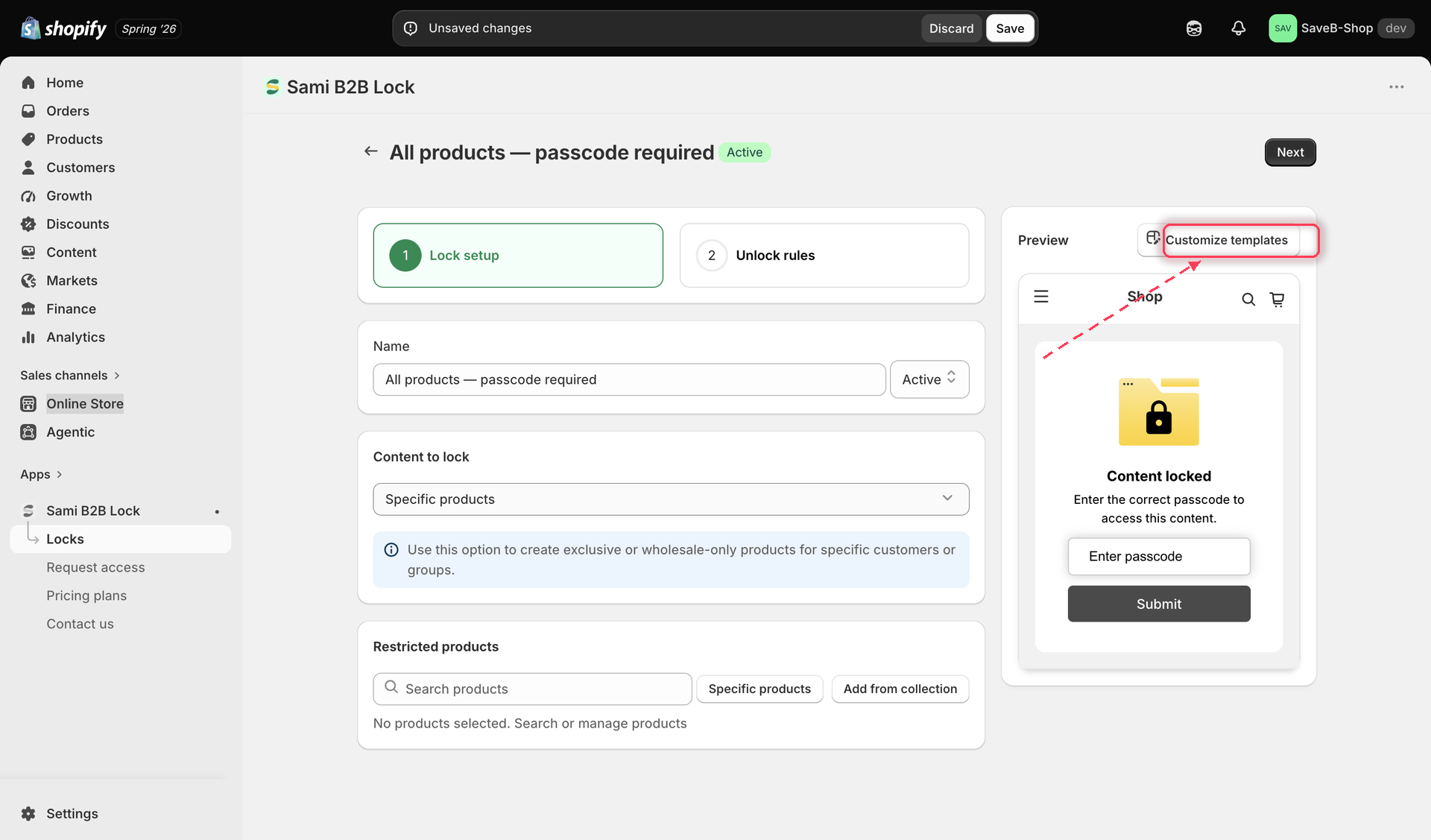
2. On the **Lock setup** tab, find the **Preview** card on the right and click **Customize templates**.

<figure><img src="https://27754559-files.gitbook.io/~/files/v0/b/gitbook-x-prod.appspot.com/o/spaces%2FF4qMYopXntYz9YgUqZSo%2Fuploads%2Fgit-blob-0c1c7a08170594e23f69cefbe50b9fa540ac3cfa%2Fscreenshot-design-open-editor.png?alt=media" alt="The Customize templates button in the lock editor&#x27;s Preview card"><figcaption><p>Click Customize templates in the lock editor's Preview card.</p></figcaption></figure>

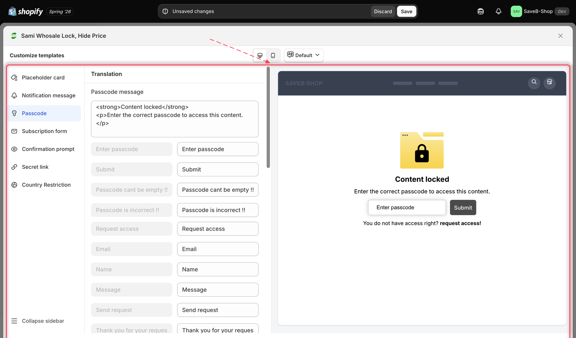
3. This opens the full-screen **Customize templates** panel. The left sidebar lists the screens this lock can show a shopper — **Placeholder card**, **Notification message**, **Passcode**, **Subscription form**, **Confirmation prompt**, **Secret link**, and **Country Restriction** — plus a **Collapse sidebar** control at the bottom. Click a screen to load its Translation and Design settings in the middle column, with a live preview on the right.

<figure><img src="https://27754559-files.gitbook.io/~/files/v0/b/gitbook-x-prod.appspot.com/o/spaces%2FF4qMYopXntYz9YgUqZSo%2Fuploads%2Fgit-blob-f0360abed90239220d18d5630baa0aba5431fe1b%2Fscreenshot-design-customize-templates-panel.png?alt=media" alt="Customize templates panel showing the screen list on the left, Design section in the middle, and live preview on the right"><figcaption><p>The Customize templates panel: pick a screen on the left, style it in the middle, and check the result on the right.</p></figcaption></figure>

4. In the middle column, scroll past the **Translation** section (covered in [Translate lock messages](/b2b-lock-password-protect/design-and-customization/translate-messages.md)) to the **Design** section below it. Everything in this guide lives in that Design section.

{% hint style="info" %}
Only the screens that are actually relevant to this lock's rules and content type show up in the list. For example, the Passcode screen only appears if this lock uses the Passcode access rule, and Subscription form only appears if it uses Subscribe to unlock.
{% endhint %}

## Colors

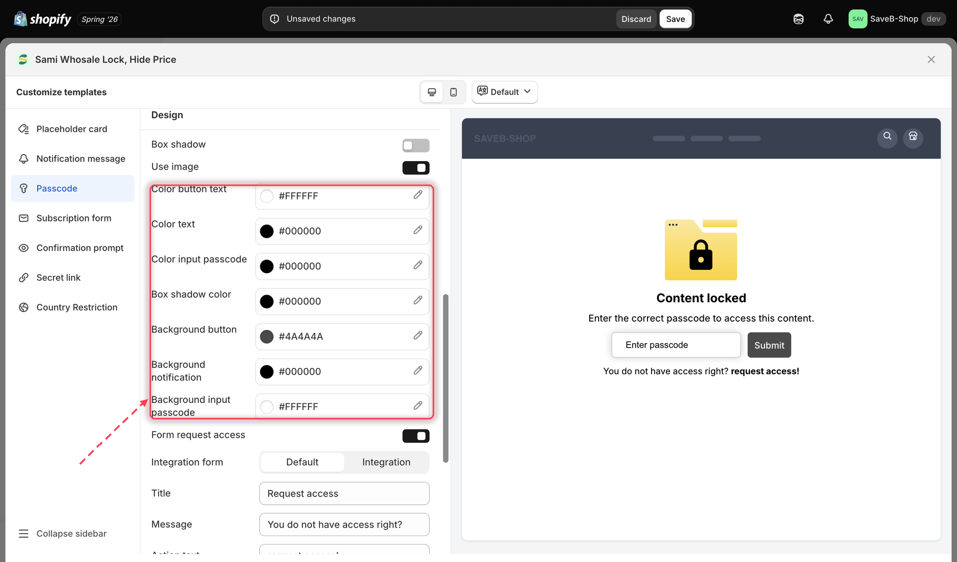
Each colour is a swatch with its hex value next to it. Click the swatch (or the pencil icon) to open the picker, choose or type a colour, and the live preview on the right updates immediately.

For the **Passcode** screen, for example, you get:

| Field                         | Styles                                         |
| ----------------------------- | ---------------------------------------------- |
| **Color button text**         | The label on the Submit button                 |
| **Color text**                | The lock message text                          |
| **Color input passcode**      | Text the shopper types into the passcode field |
| **Box shadow color**          | The card's drop shadow, when Box shadow is on  |
| **Background button**         | The Submit button's fill                       |
| **Background notification**   | The lock card's background                     |
| **Background input passcode** | The passcode field's fill                      |

<figure><img src="https://27754559-files.gitbook.io/~/files/v0/b/gitbook-x-prod.appspot.com/o/spaces%2FF4qMYopXntYz9YgUqZSo%2Fuploads%2Fgit-blob-65d97af6eea5ae50bb80dfb15b0f21656b14fbc3%2Fscreenshot-design-notification-colors.png?alt=media" alt="The Design section&#x27;s colour pickers, each showing a swatch and its hex value"><figcaption><p>Each colour shows a swatch and hex value; click to open the picker.</p></figcaption></figure>

{% hint style="info" %}
The exact set of colours changes with the screen you've selected — a screen with no input field, for instance, has no input colours. Select each screen your lock actually uses and style it on its own.
{% endhint %}

## Box shadow and logo image toggles

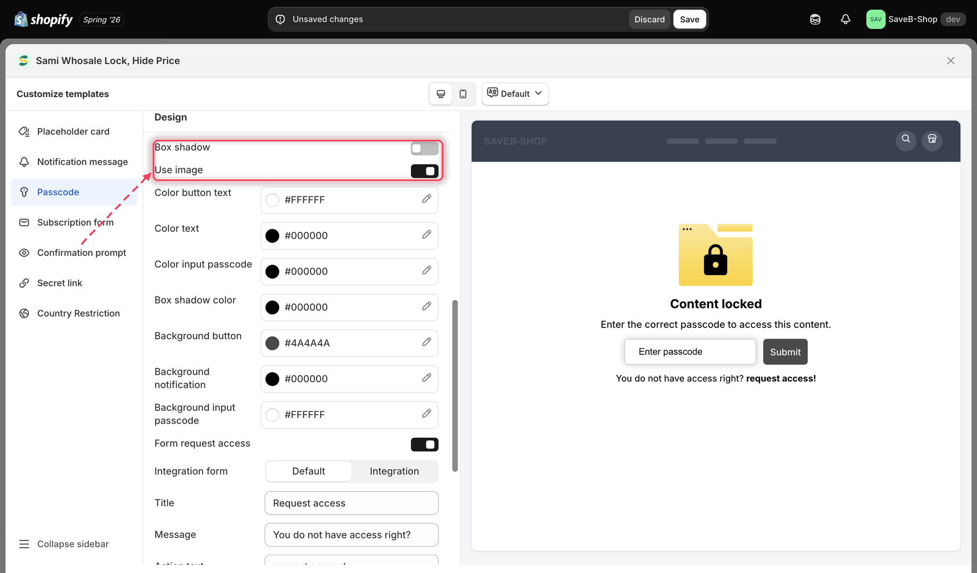
Two toggles sit at the very top of the **Design** section, above the colour pickers:

* **Box shadow** — adds a drop shadow around the lock card (its colour is set by **Box shadow color** below).
* **Use image** — shows the lock illustration on the card. Turn it off for a text-only card.

<figure><img src="https://27754559-files.gitbook.io/~/files/v0/b/gitbook-x-prod.appspot.com/o/spaces%2FF4qMYopXntYz9YgUqZSo%2Fuploads%2Fgit-blob-2b8b06e240a31c76e36a6b32db42e899e0dc135f%2Fscreenshot-design-box-shadow-logo-toggle.png?alt=media" alt="Box shadow and Use image toggles above the notification color pickers"><figcaption><p>Turn on Box shadow or Use image to change how the notification card is presented.</p></figcaption></figure>

## Placeholder card

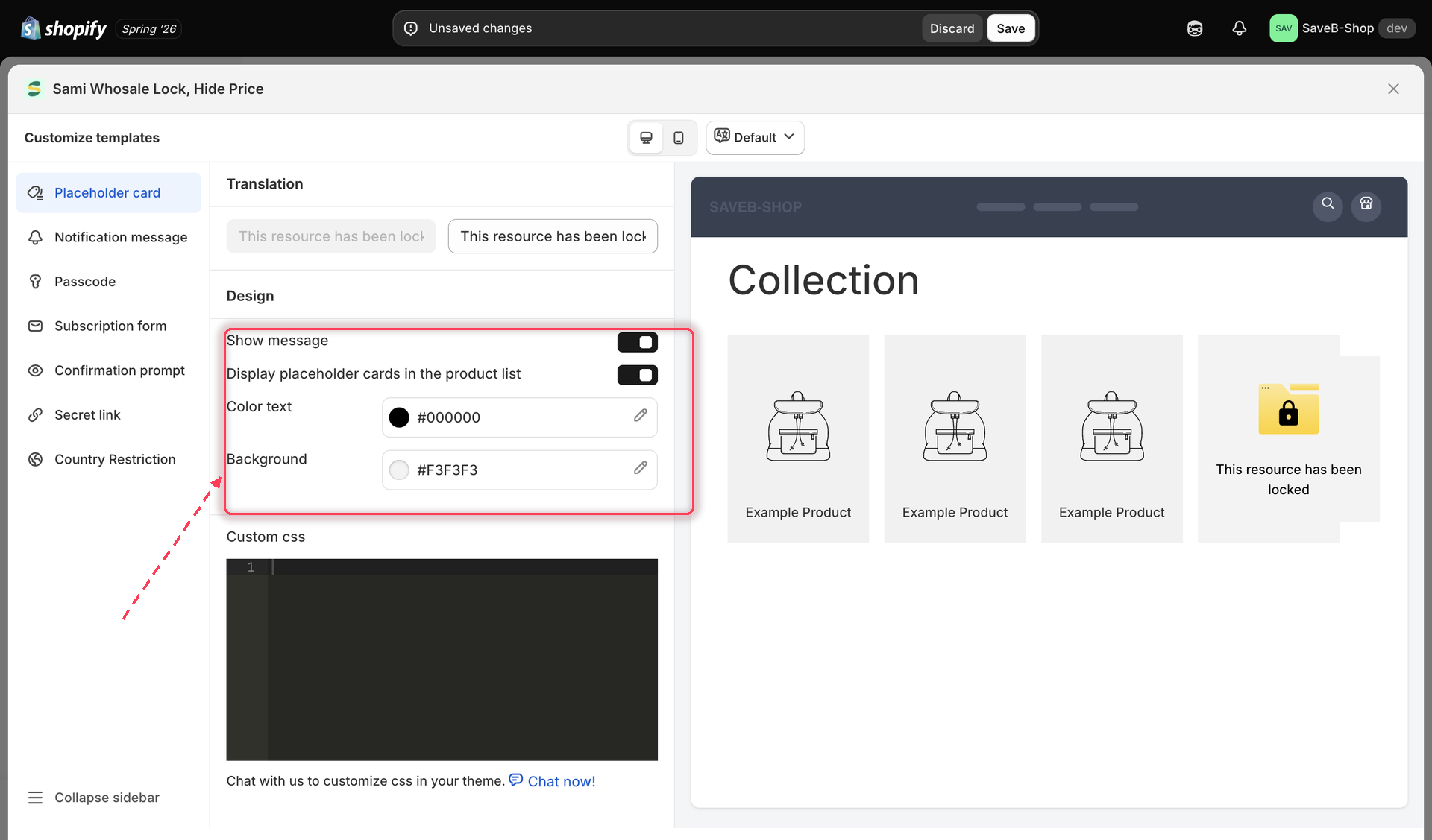
Select **Placeholder card** in the sidebar to style what shoppers see in place of a locked product when it appears in a list, such as a collection page.

<figure><img src="https://27754559-files.gitbook.io/~/files/v0/b/gitbook-x-prod.appspot.com/o/spaces%2FF4qMYopXntYz9YgUqZSo%2Fuploads%2Fgit-blob-4ae43d76a3e145d26e61671a2a7f06574f16df20%2Fscreenshot-design-placeholder-card-colors.png?alt=media" alt="The Placeholder card screen selected in the Customize templates panel, with its own settings and preview"><figcaption><p>The Placeholder card screen controls how locked items appear in product listings.</p></figcaption></figure>

## Per-lock custom CSS

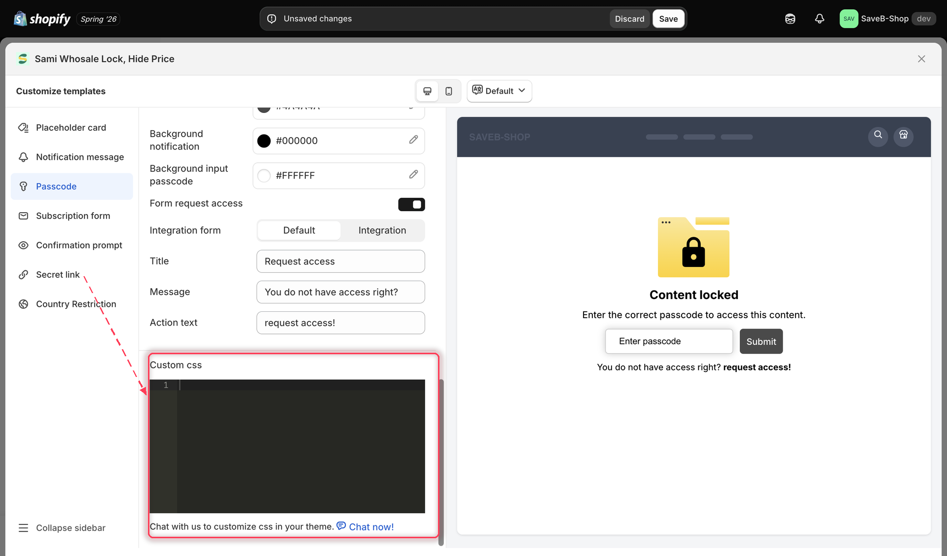
At the bottom of the **Design** section there's a **Custom css** editor. Anything you put here applies to this one lock's widgets only — it's a good place for a small tweak your theme needs (a font size, a margin) without touching your theme's own stylesheet.

<figure><img src="https://27754559-files.gitbook.io/~/files/v0/b/gitbook-x-prod.appspot.com/o/spaces%2FF4qMYopXntYz9YgUqZSo%2Fuploads%2Fgit-blob-8c860f63a6b526791561c51795ebac74a30407ae%2Fscreenshot-design-per-lock-custom-css.png?alt=media" alt="The Custom css editor at the bottom of a lock&#x27;s Design section"><figcaption><p>Each lock has its own Custom css editor for one-off styling.</p></figcaption></figure>

## The live preview panel

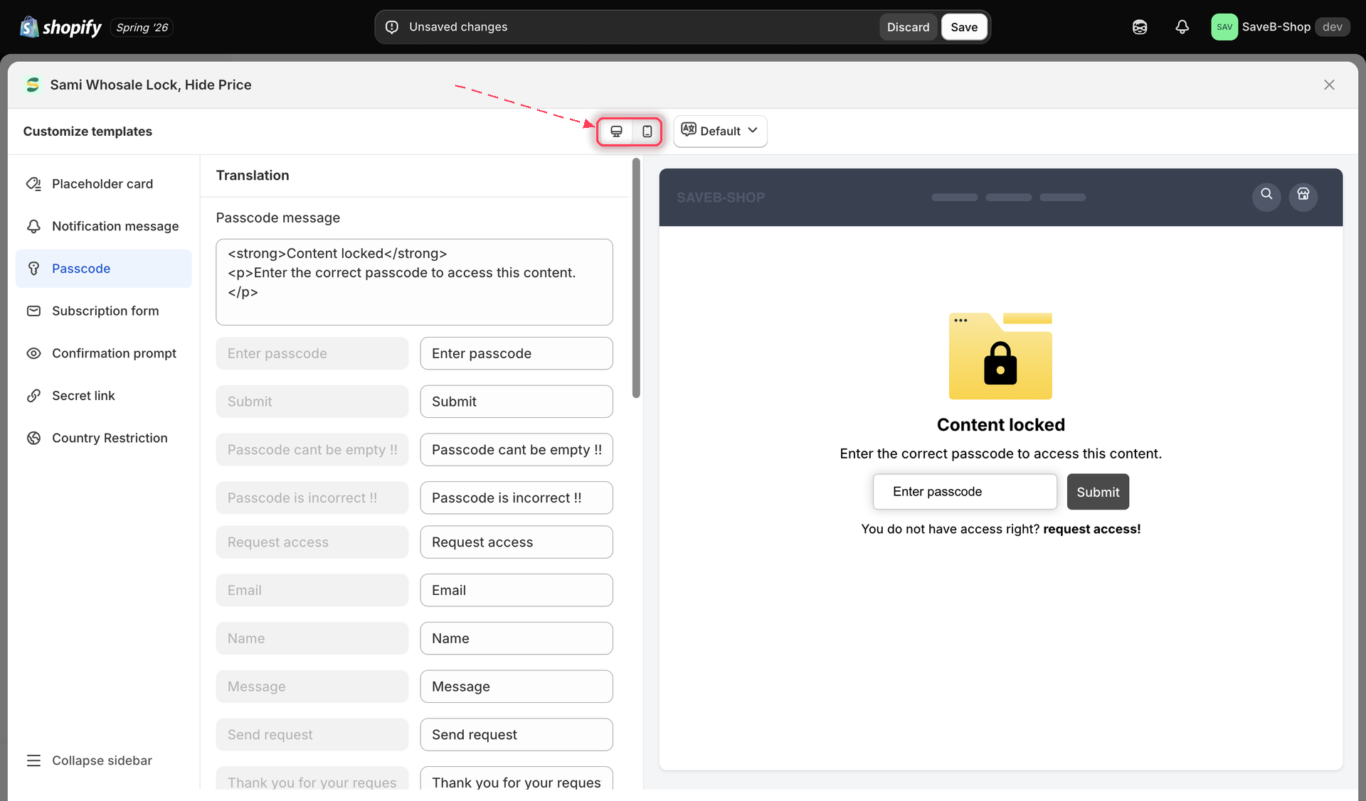
The right-hand column of the **Customize templates** panel always shows a live, storefront-styled preview of whatever screen you have selected — your color and style changes appear instantly, without saving. At the top of the panel, a **Desktop preview** / **Mobile preview** switcher lets you check how the same screen renders at each size.

<figure><img src="https://27754559-files.gitbook.io/~/files/v0/b/gitbook-x-prod.appspot.com/o/spaces%2FF4qMYopXntYz9YgUqZSo%2Fuploads%2Fgit-blob-2c8451e9b6db036d2edf741bd3b8056a72146a51%2Fscreenshot-design-preview-device-switcher.png?alt=media" alt="Desktop and mobile preview toggle at the top of the Customize templates panel"><figcaption><p>Switch between desktop and mobile preview to check both layouts before saving.</p></figcaption></figure>

Because this whole panel lives inside one specific lock's editor, the preview always reflects that lock's own settings — content, rules, and design — not a generic sample.

## Related docs

* [Translate lock messages](/b2b-lock-password-protect/design-and-customization/translate-messages.md)
* [Passcode](/b2b-lock-password-protect/access-rules/passcode.md)


---

# Agent Instructions
This documentation is published with GitBook. GitBook is the documentation platform designed so that both humans and AI agents can read, navigate, and reason over technical content effectively. Learn more at gitbook.com.

## Querying This Documentation
If you need additional information that is not directly available in this page, you can query the documentation dynamically by asking a question.

Perform an HTTP GET request on the current page URL with the `ask` query parameter, and the optional `goal` query parameter:

```
GET https://docs.samita.io/b2b-lock-password-protect/design-and-customization/colors-and-templates.md?ask=<question>&goal=<endgoal>
```

`ask` is the immediate question: it should be specific, self-contained, and written in natural language.
`goal` is optional and describes the broader end goal you are ultimately trying to accomplish on behalf of the user. GitBook uses it to tailor the answer towards what is most useful for that goal.

The response will contain a direct answer to the question and relevant excerpts and sources from the documentation.

Use this mechanism when the answer is not explicitly present in the current page, you need clarification or additional context, or you want to retrieve related documentation sections.