
Device targeting
Show a countdown on desktop only, mobile only, or both.
Device targeting is the last control in the Display position section. It decides which devices a countdown renders on.
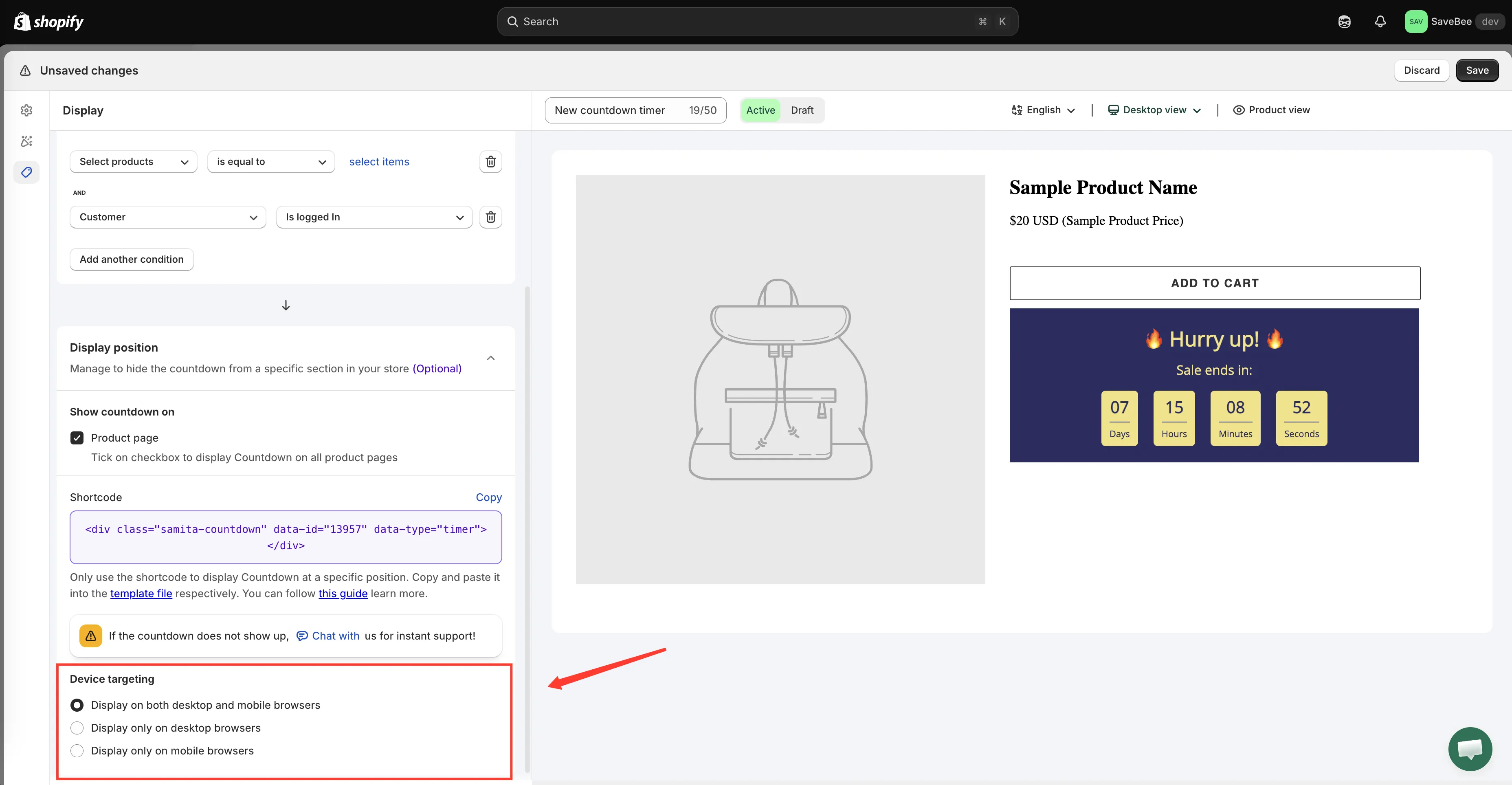
Device targeting, at the bottom of the Display position section.
The three options
Section titled “The three options”| Option | Renders on |
|---|---|
| Display on both desktop and mobile browsers | Everything. The default |
| Display only on desktop browsers | Desktop browsers only |
| Display only on mobile browsers | Phones and mobile browsers only |
When to narrow it
Section titled “When to narrow it”Leave it on both unless you have a reason not to. Most of your traffic is likely mobile, and a countdown that only runs on desktop reaches the smaller half of your audience.
Desktop only is worth it when a countdown genuinely doesn’t work on a small screen — a wide banner design that wraps badly, or a delivery message long enough to push the Add to cart button off the first screenful. Fixing the design is usually better, but restricting it is a reasonable stopgap.
Mobile only suits a countdown built specifically for a phone: a compact bar that would look lost across a desktop layout.
Cart countdowns have no device targeting
Section titled “Cart countdowns have no device targeting”A cart countdown’s Display tab carries Action after time expired in place of the position and device controls. A cart countdown always renders on both. See When the cart timer expires.
Checking it
Section titled “Checking it”The reliable test is a real device. Narrowing your desktop browser window changes the layout but doesn’t necessarily change what the app treats as a mobile browser, so a countdown set to mobile only may still not appear in a narrow desktop window — that’s expected.