
Bar content and elements
The six elements a bar can hold, how to order them, and how groups make one banner say two things.
The Content panel is the first icon in the builder’s rail. It holds everything the bar says.
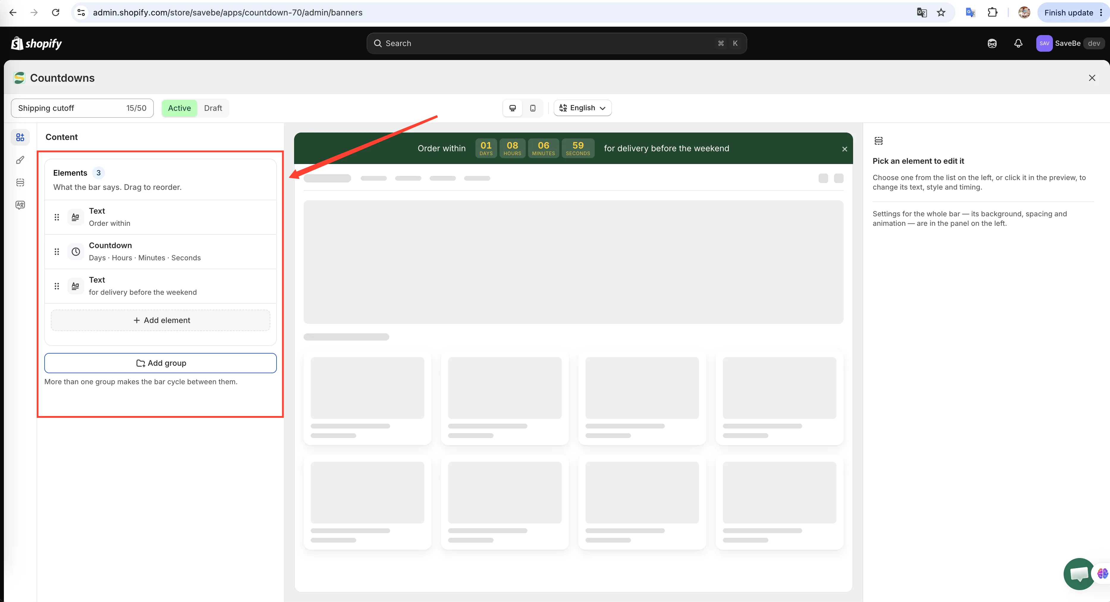
Elements run left to right in the bar, in the order they sit in this list.
Adding and ordering
Section titled “Adding and ordering”- Add element opens a menu of the six kinds. The new one lands at the end of the list.
- Drag the handle at the left of a row to move it. The bar follows the order here.
- Hover a row for the duplicate and delete buttons.
- Click a row to open its settings in the column on the right.
The six elements
Section titled “The six elements”The message. Set the words, the size, bold, italic, underline, and a colour of its own.
Leave the colour empty and the text follows the bar’s own text colour, so restyling the bar carries the message with it.
Countdown
Section titled “Countdown”A live timer inside the bar. It has three modes:
| Mode | What shoppers see |
|---|---|
| Count down to a date | Everyone sees the same time remaining |
| Fixed minutes per visitor | Each shopper gets their own clock when they arrive |
| Daily recurring | Runs on chosen weekdays between two times |
You also choose which units show (days, hours, minutes, seconds), whether the unit captions show under the numbers, and what the captions say. Leave a caption blank to use the English default.
When the timer ends decides what happens at zero: hide the banner, keep it at zero, or restart it.
Button
Section titled “Button”A label plus an action:
| On click | What it does |
|---|---|
| Open a link | Sends the shopper to a URL |
| Scroll to a section | Jumps to a part of the current page, by CSS selector |
| Apply a discount code | Applies the code to the shopper’s cart |
For a link you can also turn on Open in a new tab, which leaves your shop open behind it.
The rest is styling: shape (square, rounded, pill), font size, size preset, bold/italic/underline, background, label colour, and a border.
Discount code
Section titled “Discount code”The code itself, shown in a dashed outline. Turn on Copy on click and the shopper copies it by clicking it — no selecting and no typing.
Style it with a border style, corner radius, and its own colour.
A logo or badge. Paste a URL, or upload a file and the field fills itself in. Set the height and alt text.
Alt text is what screen readers announce and what shows if the image fails to load.
Line break
Section titled “Line break”Nothing to look at. Everything after it starts a new line, so a long bar can run in two rows instead of one squeezed one.
Drag it between two elements to split the bar where you want.
One element, two screens
Section titled “One element, two screens”Open any element except a line break and its Style section starts with Device settings — three icons: an eye, a desktop, and a phone.
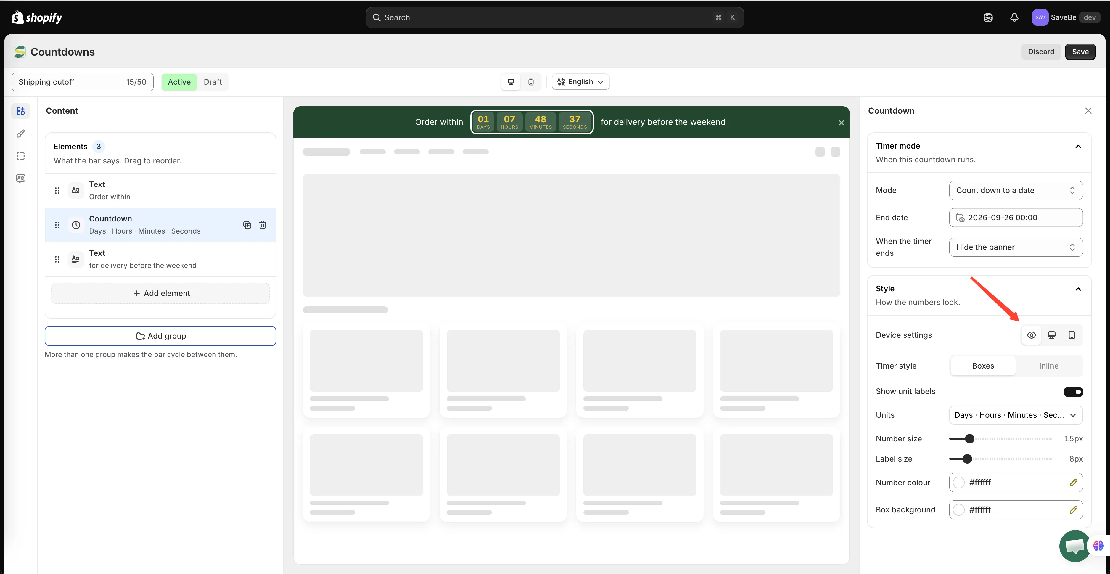
Device settings sits at the top of Style, and everything below it follows the icon you pick.
The eye is the ordinary case: what you set applies to both screens.
The desktop and phone icons narrow the settings below them to that one screen. Pick the phone, drop the font size to 12, and only phones get 12 — desktops keep what the eye set. Everything in Style splits this way: font sizes, a countdown’s number and label sizes, its colours and which units it shows, an image’s height, a button’s shape and size, a discount code’s border and colour.
Picking a screen also reveals a Hide on desktop or Hide on mobile toggle. That’s how you drop an element that doesn’t fit a phone — a long sentence, an image — without building a second banner. It stays on the other screen.
A line break has no Style section, so it keeps a plain Show on control instead: Both screens, Desktop only, or Mobile only.
Groups: one banner, two messages
Section titled “Groups: one banner, two messages”Under the elements list is Add group.
One group is the ordinary case. Add a second and the bar cycles between them — the first group shows, then the second, then back again. Each group holds its own elements, so one banner can alternate between “Free shipping over $50” and “Sale ends tonight”.
How fast they change, and whether they cross-fade or slide, is in Animation and groups.