
Design a countdown
Change colors, fonts, backgrounds, borders, and spacing so a countdown matches your store.
A template gives you a starting look. The Design tab is where you make it yours — or where you rebuild it entirely, since every part is editable.
Countdown timers and estimated delivery dates get a full Design tab. Stock and cart countdowns have fewer options, and keep them inside the Settings tab instead.
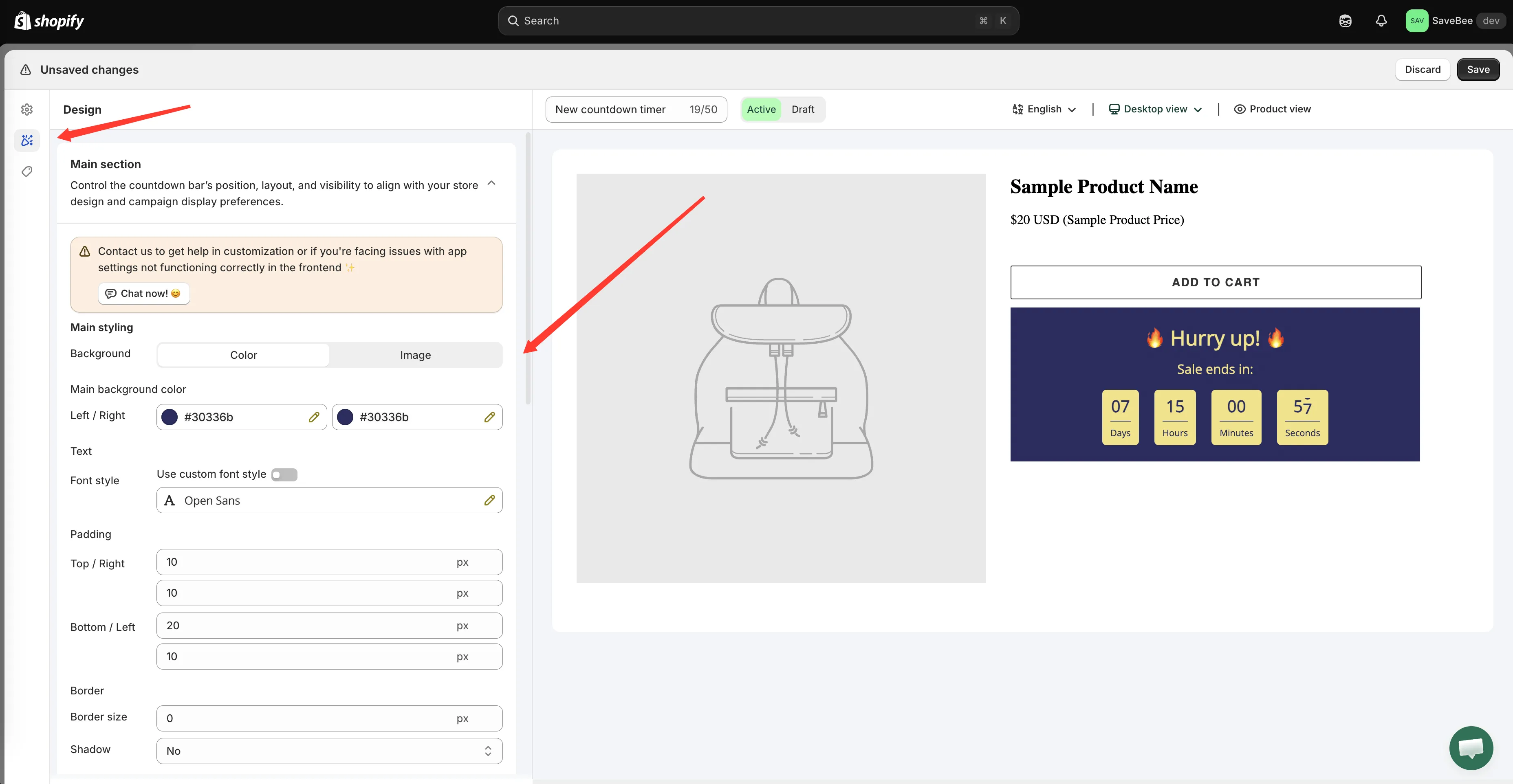
The Design tab, with the preview updating as you change settings.
Switching template
Section titled “Switching template”You’re not stuck with the design you picked at the start. Open the templates picker from inside the builder and choose another — the seasons are tabbed across the top: Default, New year, Valentine, Summer Sale, Moon Festival, Halloween, Black Friday, Christmas, and Winter Sales.
Switching template replaces the design. Your text, timing, and conditions are kept.
Countdown timer design
Section titled “Countdown timer design”The timer’s Design tab has four sections plus custom CSS.
Design Main Section
Section titled “Design Main Section”The countdown’s outer container — the panel everything else sits inside.
| Group | Controls |
|---|---|
| Background | A solid colour or an uploaded image. With colour you get a Main background color with separate Left and Right values, so a flat fill is one colour on both and a gradient is two |
| Overlay image | Darkens an uploaded background so text stays readable over it |
| Text | The font for the whole countdown. Turn on Use custom font style to pick a font family and weight |
| Padding | Space inside the panel, set as Top / Right and Bottom / Left |
| Border | Border size, radius, style — Solid, Dotted, or Dashed — and colour |
| Shadow | Yes or No |
Element styling: Title and Subtitle
Section titled “Element styling: Title and Subtitle”The Title and Subtitle each get their own font, font size, colour, and margins. This is where you make the title dominate and the subtitle recede, or bring them closer together.
Design Timer Section
Section titled “Design Timer Section”The digits themselves.
| Group | Controls |
|---|---|
| Font | Timer font size for the numbers and Label font size for the words underneath |
| Border | Size and style of the box around each unit |
| Color | Number color, Data text color for the labels, Background color for each unit’s box, Dot color for the separators, and Border color |
| Padding | Space inside each unit’s box |
Setting a background and border on the units gives you the boxed look; leaving both clear gives you plain numbers on the panel.
Button
Section titled “Button”If you’ve turned the button on, it gets its own border (radius, size, style), colours (background, text, border), and padding.
Design Mobile Section
Section titled “Design Mobile Section”Separate font sizes for phones, described in the app as “Optimize countdown appearance and layout for mobile devices to ensure a smooth and responsive user experience.”
You can set mobile-specific sizes for the Title, Subtitle, Timer number, and Timer label, plus mobile padding.
This section is worth a minute on every countdown. A title that reads well at 25px on desktop is usually too big on a phone, and four timer units at desktop size often wrap or overflow.
Estimated delivery date design
Section titled “Estimated delivery date design”A delivery date’s Design tab is split to match its two parts:
- Design Main Widget — the message: fonts, colours, size, borders, spacing.
- Design Process Widget — the Ordered → Dispatched → Delivered bar: icons, colours, and spacing.
If your layout is Message only or Progress bar only, only the relevant half matters.
Stock and cart countdown design
Section titled “Stock and cart countdown design”These two have their design controls inside the Settings tab.
Stock countdown offers Alignment, separate colours for the message, slider, stock figure, and background, and an Animation — None, Flash, or Pulse.
Cart countdown offers position, colours for the message, timer, and background, borders, and fonts.
Custom CSS
Section titled “Custom CSS”Every type ends with a Custom CSS (Developer Zone) box for anything the controls don’t cover. See Custom CSS.
Practical advice
Section titled “Practical advice”Borrow from your theme. A countdown in your brand colours looks like part of the store; one in template defaults looks bolted on. Your theme’s accent colour is usually the right background.
Contrast matters more than colour. The numbers are the point — make sure they’re readable against whatever is behind them, including at the small end of the size range.
Check it on a real page. The preview shows the countdown alone, on its own background. Your product page has a price, a button, and images competing with it.
Check it on a phone. Use the Design Mobile Section rather than accepting whatever the desktop sizes do on a small screen.