
Create a highlight
Step-by-step guide to creating a highlight block in Sami Product Labels.
A highlight block is a grid of feature items — each with an image, a title, and a description — that you place on your product pages to showcase benefits and selling points. The editor has two tabs: Design (content and styling) and Placement (where and to whom it appears).
-
Open the Highlights tab
Section titled “Open the Highlights tab”In your Shopify admin, open the Sami Product Labels app, click Extra Features in the app sidebar, then switch to the Highlights tab.
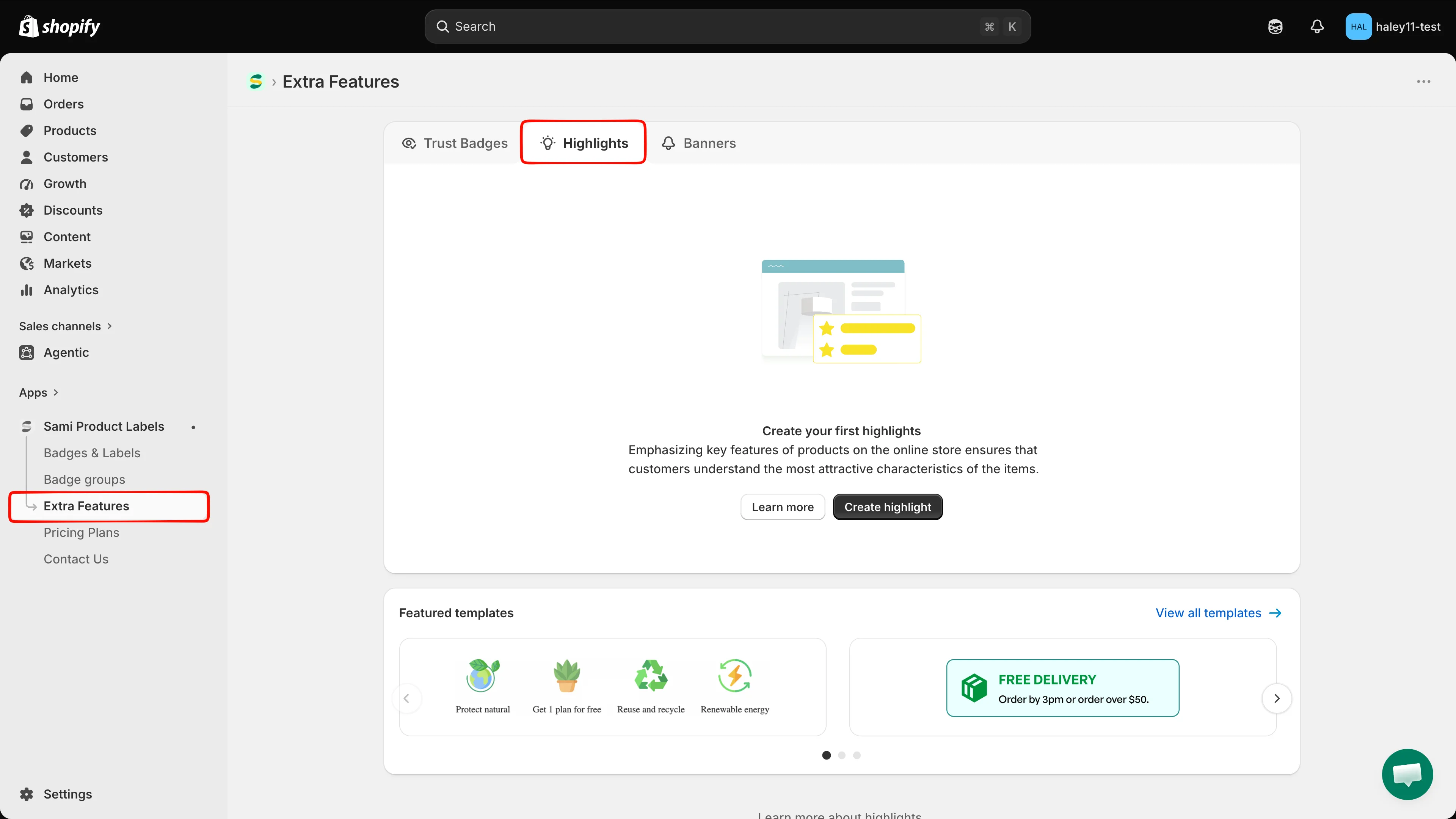
The Highlights tab lists every highlight block you have created.
-
Click Create highlights
Section titled “Click Create highlights”Click Create highlights. The full-screen editor opens on the Design tab.
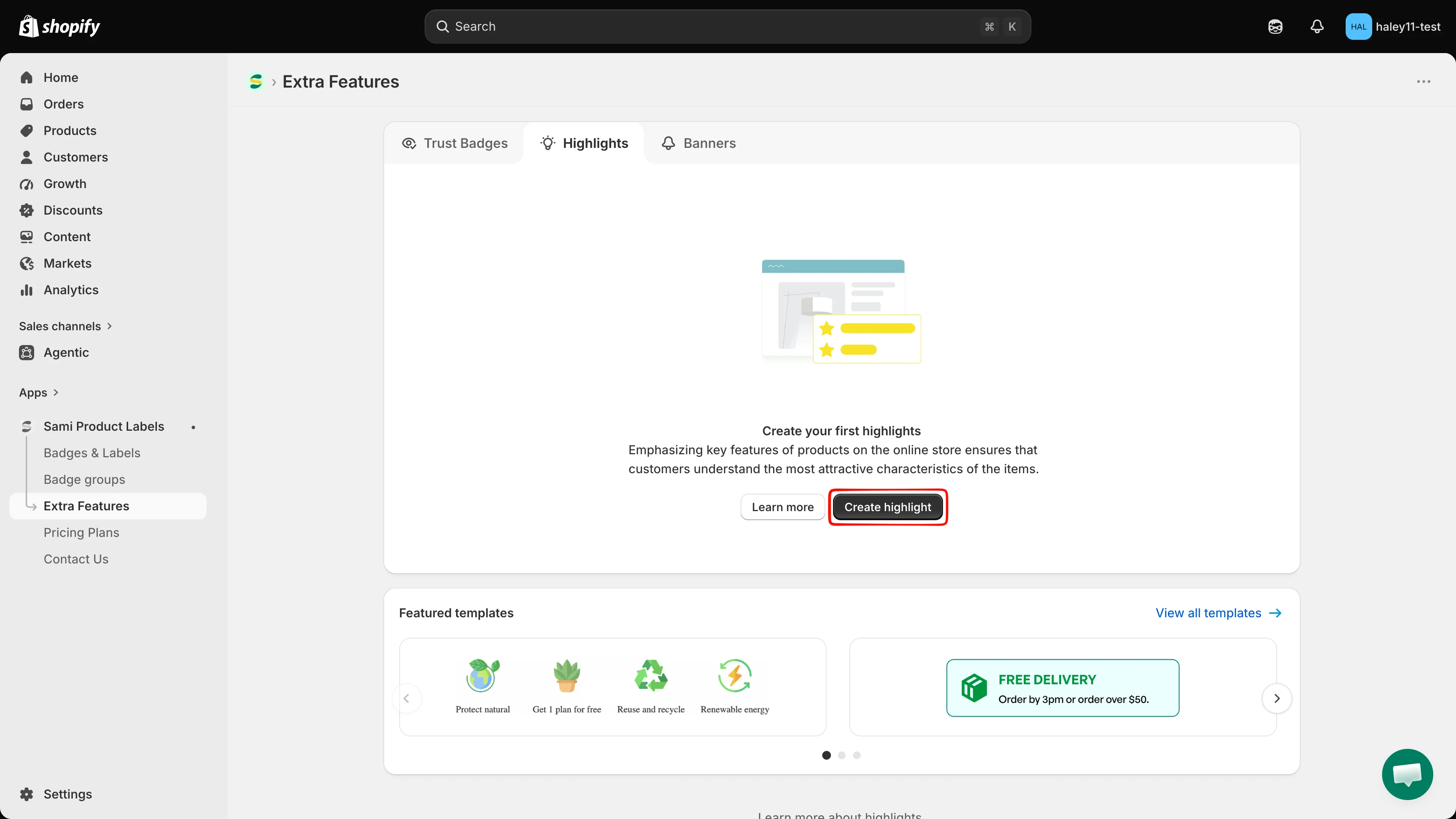
Create a highlight from scratch, or start from a featured template.
-
Name the highlight
Section titled “Name the highlight”The name field sits above the preview. Replace New Highlight with a name of up to 50 characters. This name is internal — it identifies the block in your list and is not shown to customers.
-
Add a heading and description
Section titled “Add a heading and description”In Content & Badges, fill in Title and Description — these are the heading and intro text for the whole block, for example “Why Choose Us”. Both are rich-text editors with bold, italic, underline, emoji, alignment, and an HTML view (
</>), and both are per-language, so the label shows the active language, for exampleTitle (en).Both are optional; leave them empty to show the items only.
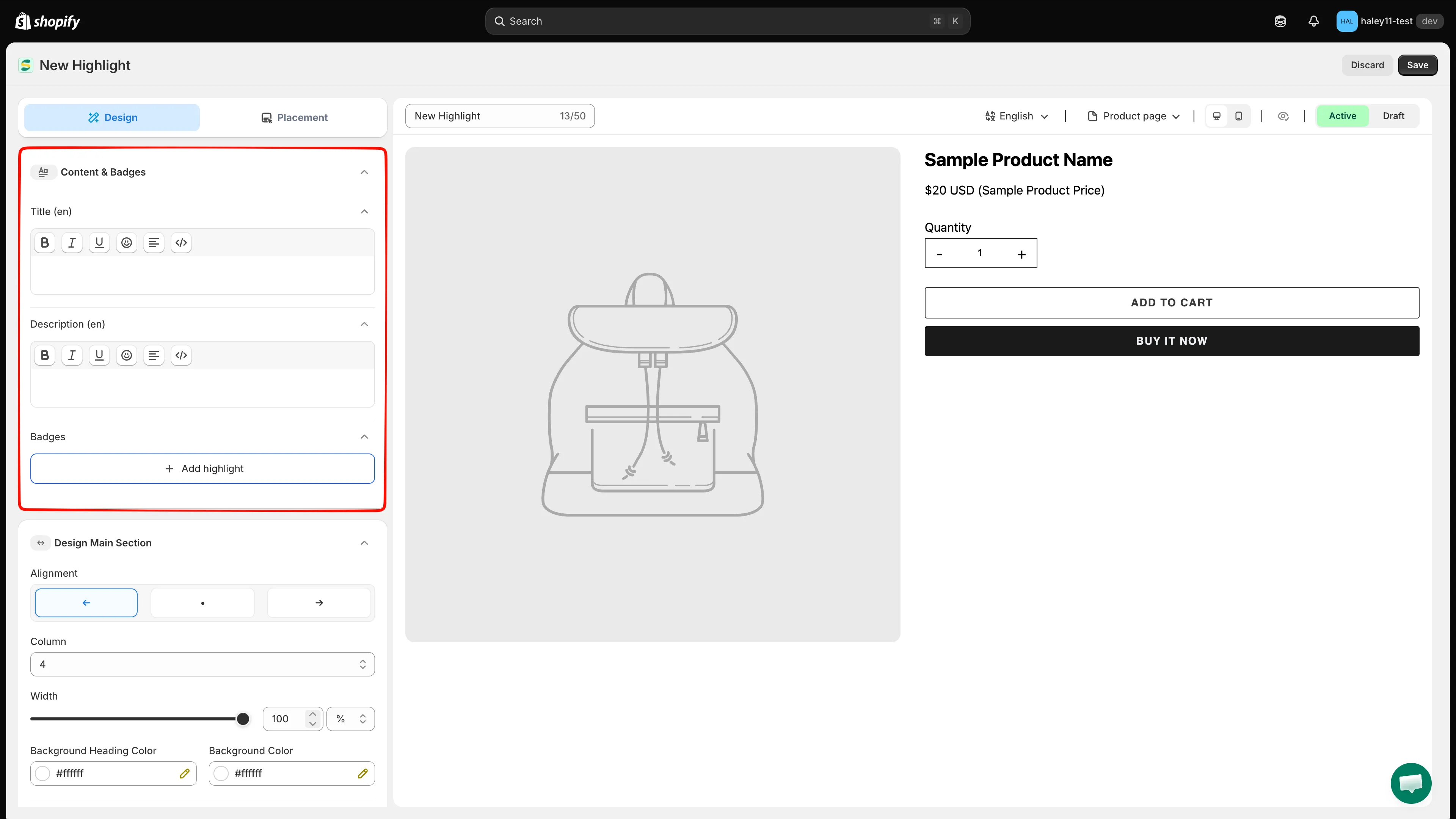
The block heading and description are rich-text fields, edited per language.
-
Add highlight items
Section titled “Add highlight items”Under Badges, click Add highlight, then choose:
Option What it does Select badge image Opens the image picker to add one or more items. Line break Inserts a break so the following items start on a new row. In the picker, the Library holds 1,800+ images. Search by name, or narrow the list with the Images, Free Labels, All colors, and Latest filters (Clear resets them). Click the images you want, then click Select Image. You can also switch the source to Design your Images to use your own, or click Edit with AI to modify the selected image.
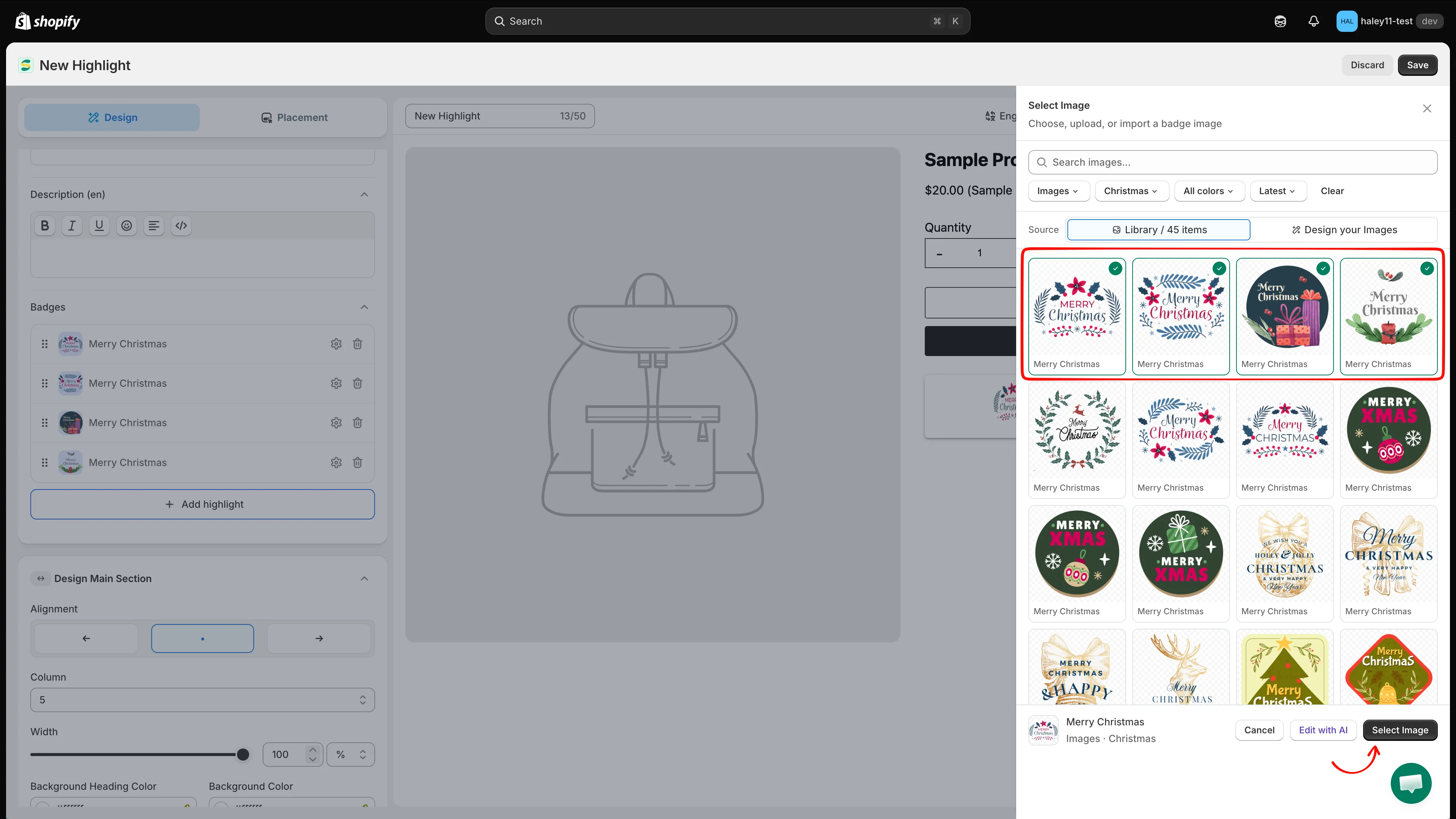
Filter or search the library, then pick the images for your highlight items.
-
Write the title and description for each item
Section titled “Write the title and description for each item”Each item appears as a row in the Badges list. Click a row’s gear icon to open its panel, where you can set:
- Image — click Change to swap it for another one.
- Title — the short heading for that feature, per language.
- Description — up to 250 characters, per language.
Use Delete in the panel to remove the item, and drag a row by its handle to reorder the grid.
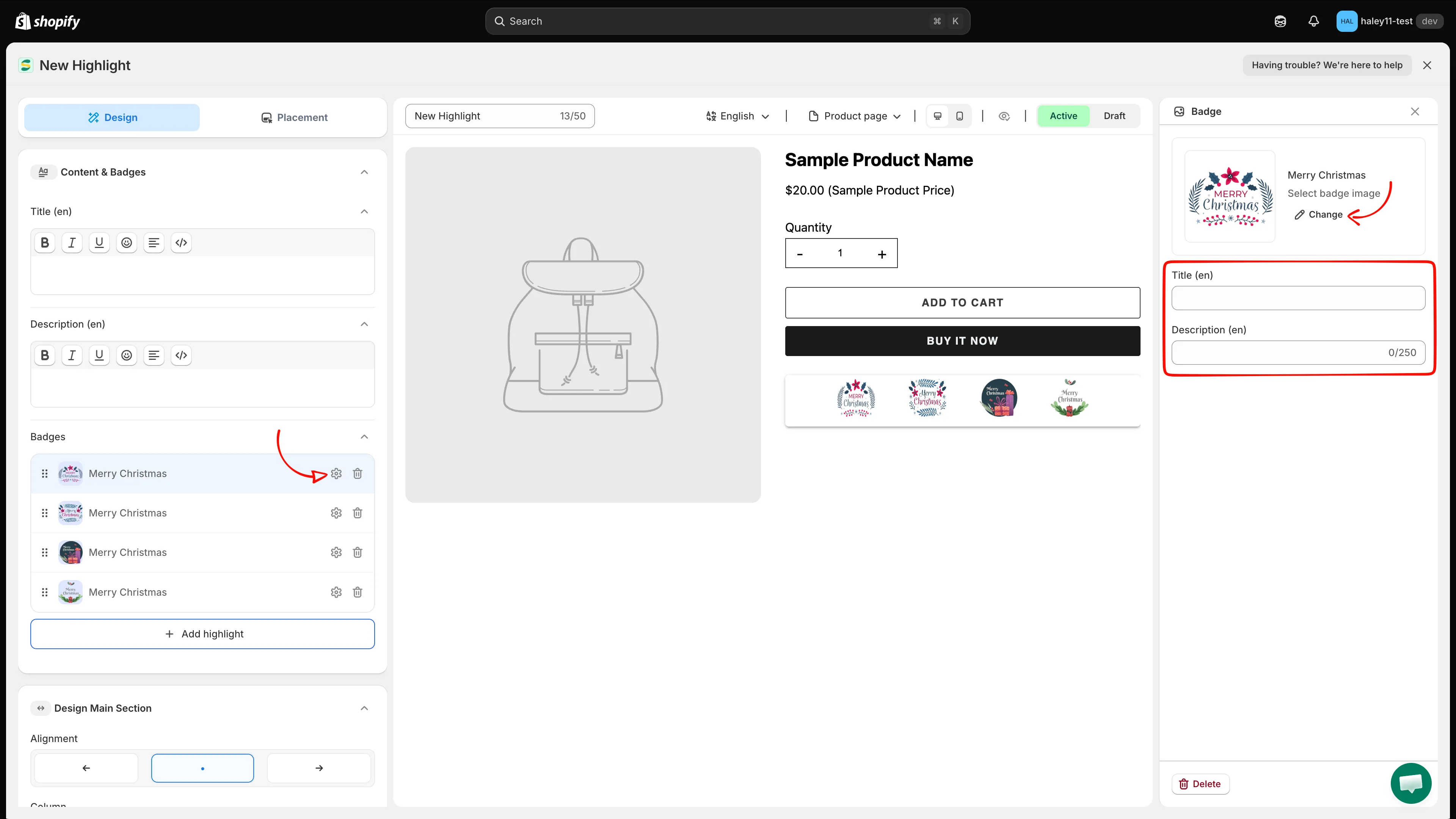
Each item gets its own image, title, and description.
-
Set the grid and block styling
Section titled “Set the grid and block styling”Open Design Main Section to control the block as a whole:
Setting What it does Alignment Left, center, or right. Column How many items appear per row. Width The block width, in %orpx.Background Heading Color Background behind the heading and description. Background Color Background of the items area. Margin / Padding Spacing outside and inside the block. Border & corners Border style, color, and corner radius. 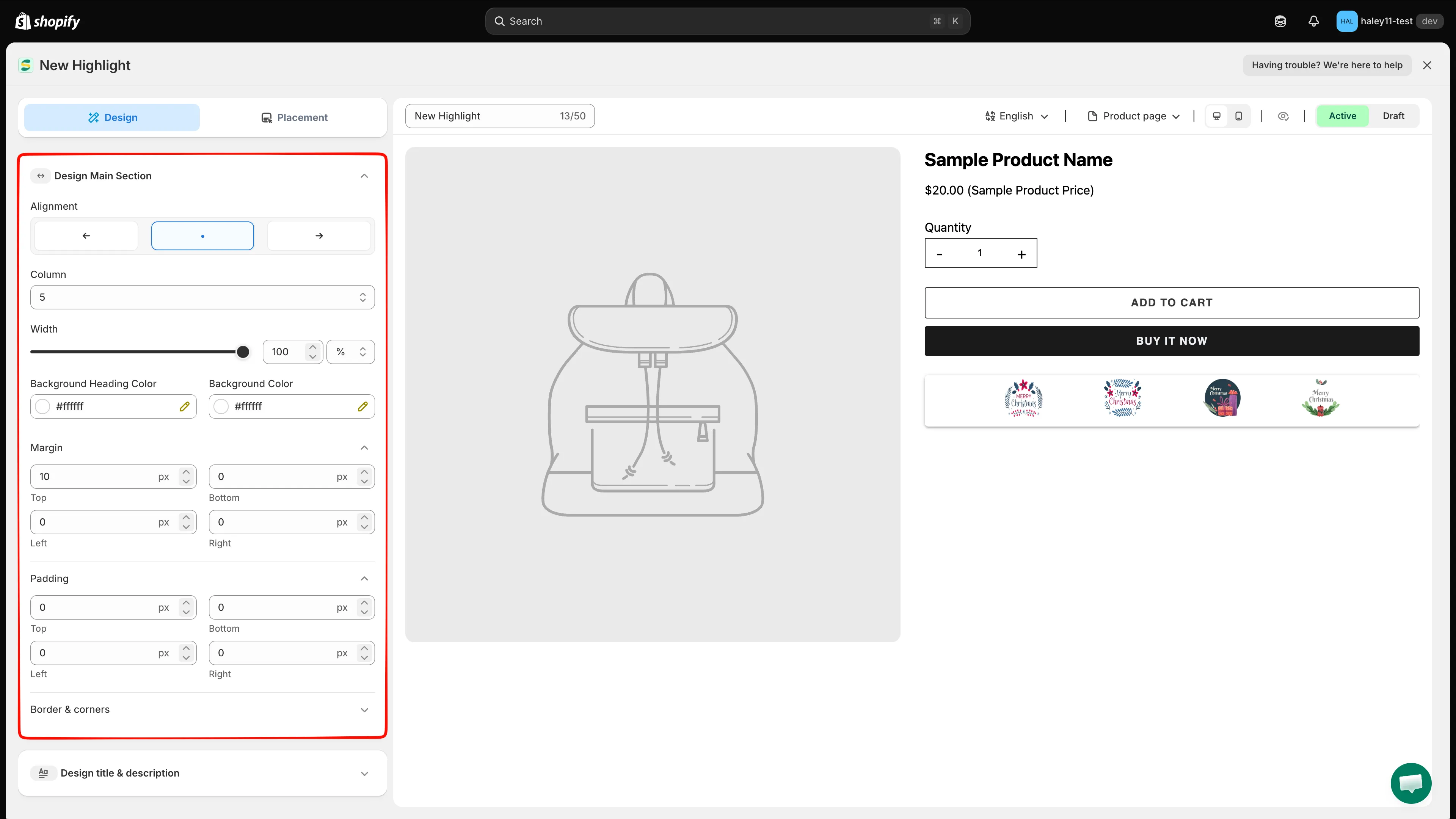
Design Main Section controls the grid and the block container.
-
Style the highlight items
Section titled “Style the highlight items”Open Design Badge to style the items themselves:
Setting What it does Alignment How each item’s content is aligned. Style Four image styles: monochrome, monochrome on a card, original color, and original color on a card. Background Color Background of each item. Size Width and Height of the image, in pxor%(50 px by default).Positions Where the image sits relative to the text, for example Image Position Top. Margin / Padding / Border & corners Spacing and border for each item. Title / Description Font, color, size, and line height for the item text. 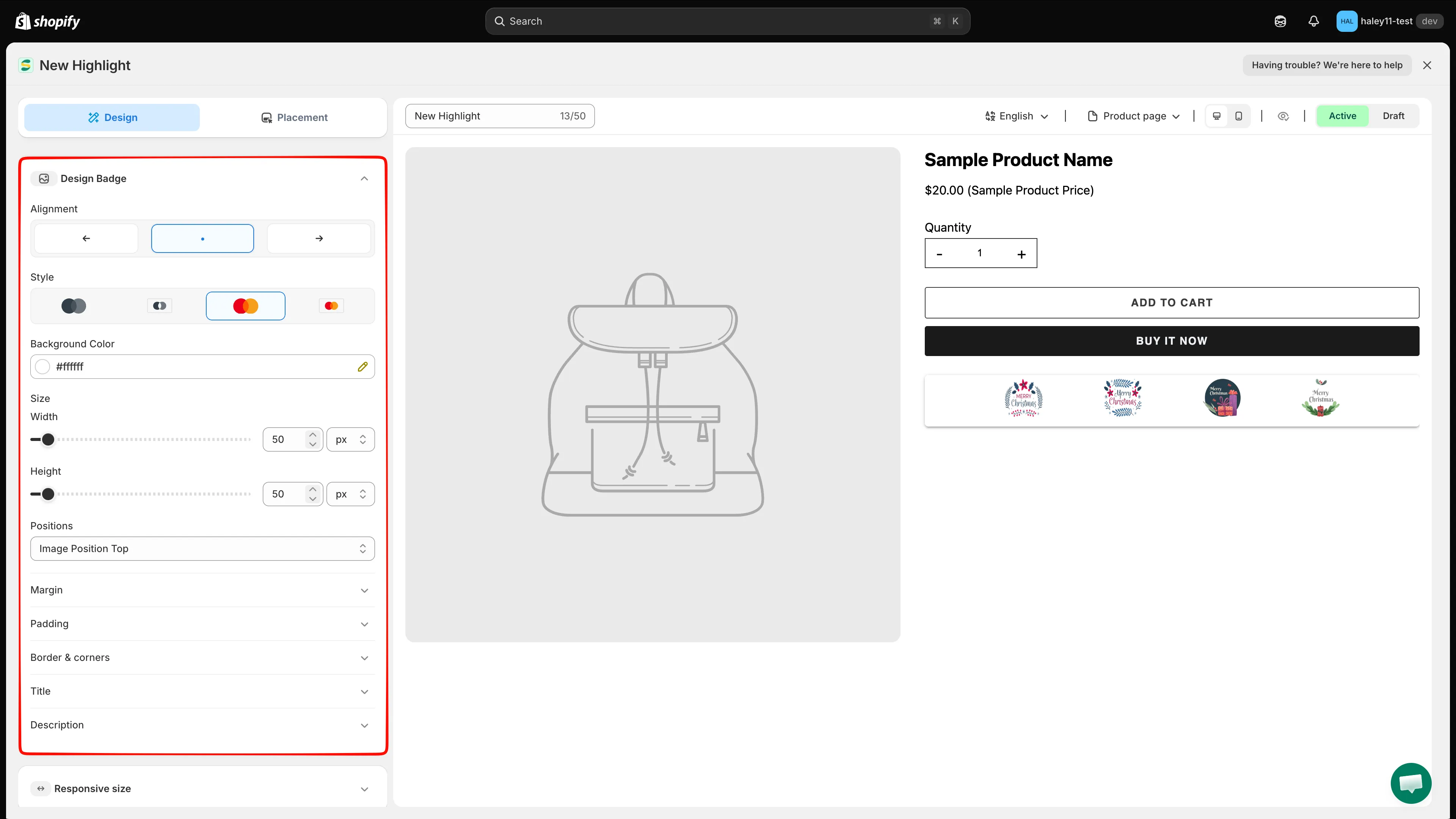
Design Badge styles the individual highlight items.
-
Style the block heading (optional)
Section titled “Style the block heading (optional)”Open Design title & description. Design Title and Design Description each have their own font, color, size, and line height for the block-level heading and intro text.
-
Set responsive sizes and custom CSS (optional)
Section titled “Set responsive sizes and custom CSS (optional)”- Responsive size — override the sizing on tablet and mobile.
- Advance Section — add Custom CSS (Developer Zone). The CSS reference below the editor lists the selectors you can target, such as
.samita_highlight_container; click one to insert it.
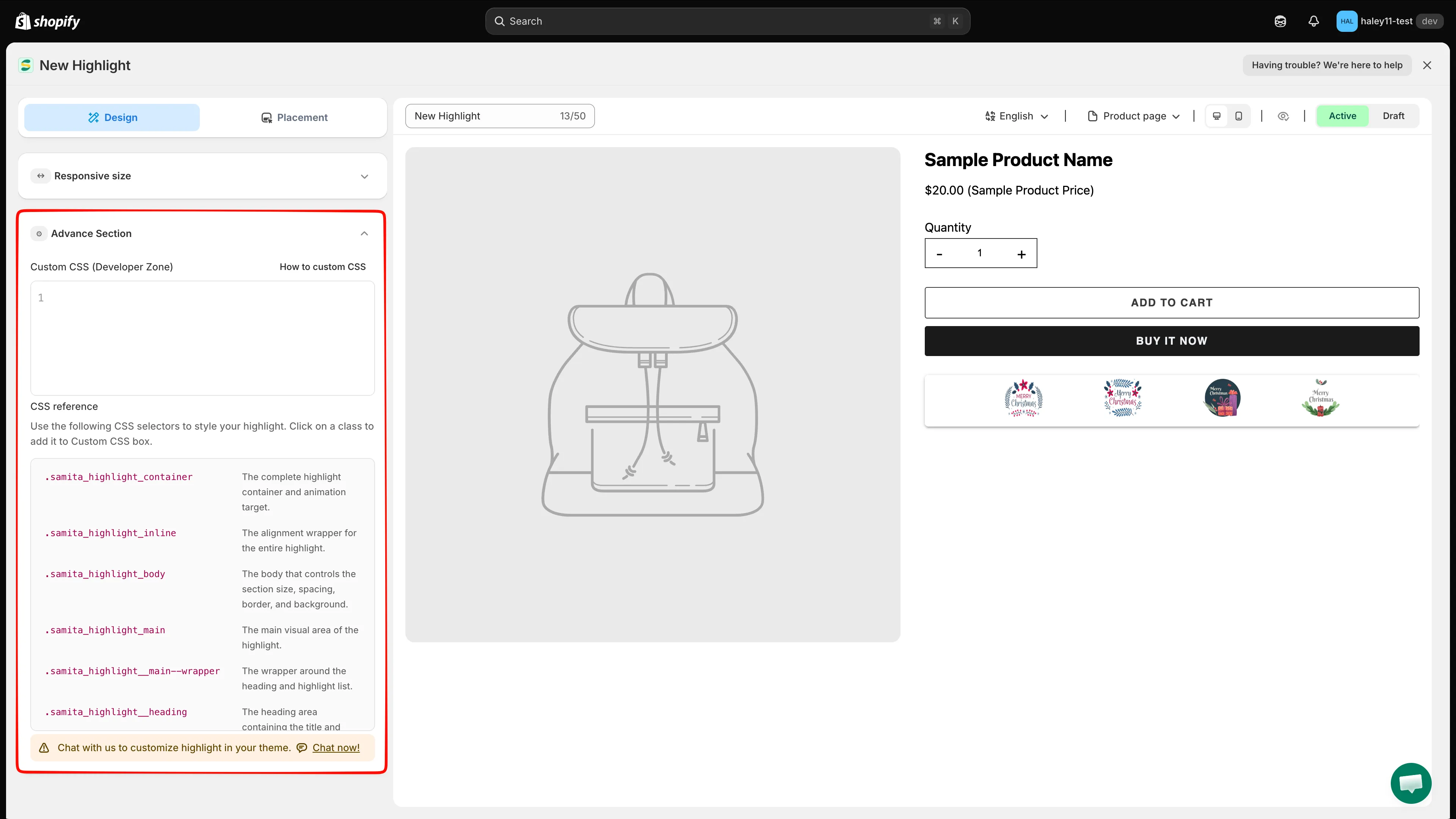
The CSS reference lists the selectors available for custom styling.
-
Choose where the highlight appears
Section titled “Choose where the highlight appears”Switch to the Placement tab:
- Product page — turn on to display the block at the app’s built-in position on every product page.
- Shortcode — copy the snippet and paste it into your theme to place the block at an exact position.
- Conditions — Product, Customer, Page, Language, and Country conditions narrow down who sees the block and where.
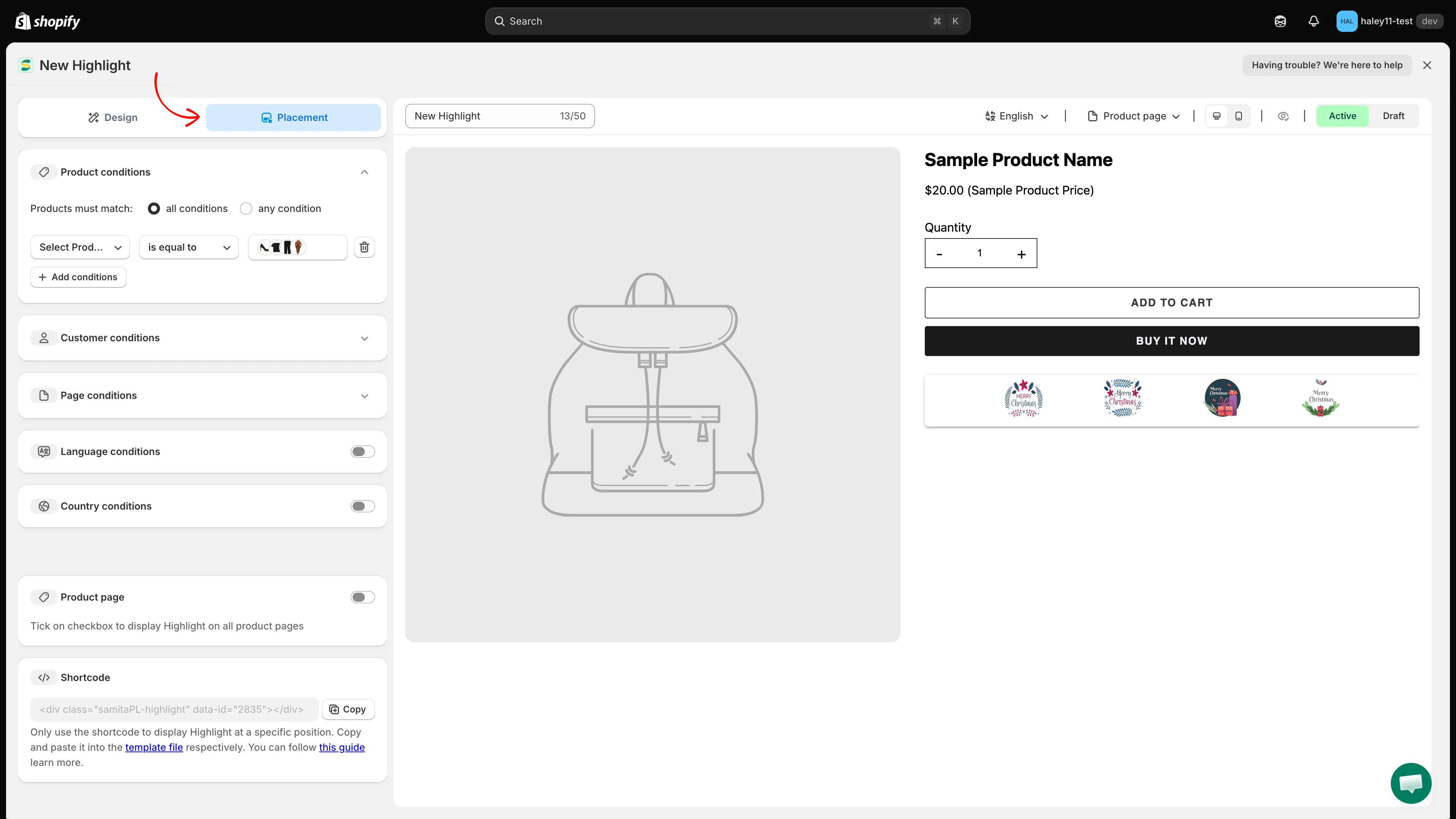
The Placement tab combines display conditions, the product page toggle, and the shortcode.
-
Preview and save
Section titled “Preview and save”Above the preview you can switch the language, choose which page to preview, toggle desktop / mobile, and hide the sample product with the eye icon. Set the block to Active or Draft, then click Save in the top right. Use Discard to drop unsaved changes.
Next steps
Section titled “Next steps”- Place a highlight with shortcode — position the block at a custom location in your theme.
- Target highlight display — control which pages and customers see your highlights.
- Highlight overview — what highlights are and when to use them.
- Create a trust badge — add payment and security icons to your product pages.