
Design and looks
Pick an offer's look, add modules like a timer or upsells, set colors and fonts, and control how variants and prices show.
Bu içerik henüz dilinizde mevcut değil.
The Design tab sets how the offer looks to shoppers. Start with a look, then fine-tune colors, add extras, and decide how prices show. The preview on the right updates as you change things.
Product page offers have every section below. Cart offers (Order discount, Free shipping, Spending goals and Free gift) have Look and Colors and fonts only; their cart texts are in Placement under Customize.
The Look gallery shows the ready-made designs for this offer type. Each card has a preview, a name and a one-line description. Looks marked ★ Recommended are good starting points. The line under the heading says which look the offer is using now.
New offers start with the look set for their type in Settings › Looks. Changing the look here only changes this offer.
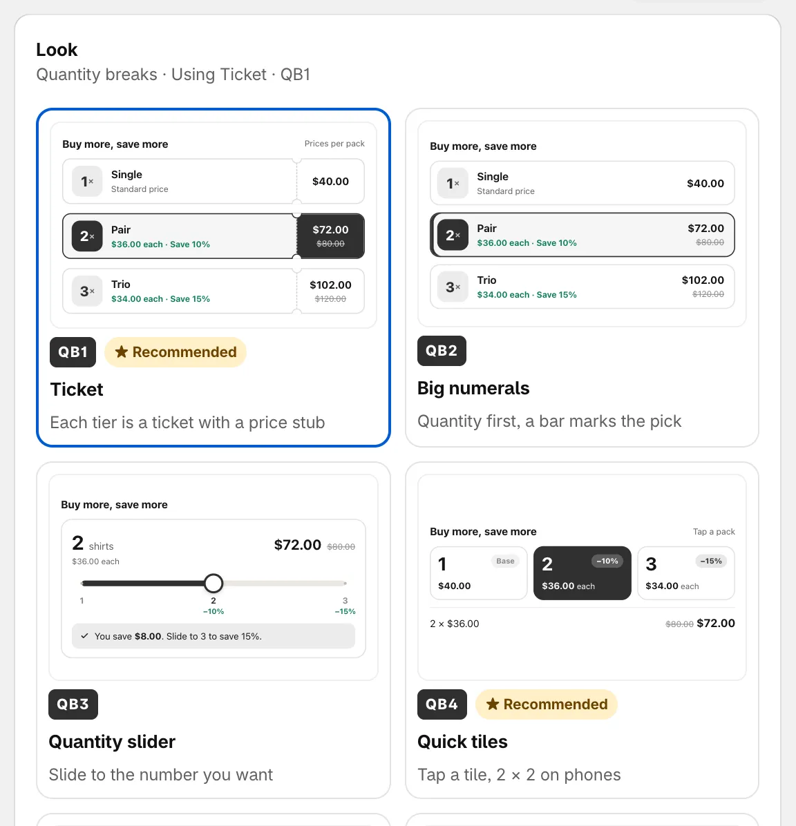
Pick a look for the offer block.
| Offer type | Looks |
|---|---|
| Tiered discount, Custom offer | Ticket ★, Big numerals, Quantity slider, Quick tiles ★, Savings ring, Receipt |
| Buy one get one, Cheapest item free | Deal tickets ★, Pair, Tray |
| Buy X get Y | Deal tickets ★, Pair, Add-on switch ★ |
| Flash sale | Countdown ring ★, Running band ★, Big price tag, Night panel |
| Complete the bundle | Switch list ★, Fanned set, Formula |
| Order discount, Free shipping, Spending goals | Segment bar ★, Goal ring, One line, Reward tickets |
| Free gift | Gift envelopes ★, Gift carousel, Cart line |
Every type except Free gift also has Classic: The earlier block styles, like table, cards, offer card and price row. Pick it if you prefer a simpler block.
Block style (Classic only)
Section titled “Block style (Classic only)”With Classic, a Block style section lets you choose the layout:
- Tier table — one row per tier.
- Option cards — tiers side by side as cards.
- Offer card — the product with its add-on. Buy X get Y and Complete the bundle only.
- Price row — the price with a discount tag.
Modules
Section titled “Modules”Modules are Extras inside the offer block. Switch a module on to add it, and click its arrow to open its settings. Most modules have their own looks to choose from at the top of their settings.
| Module | What it adds | Offer types |
|---|---|---|
| Countdown timer | Timer inside the offer block, synced with the offer end. See Schedule and timer. | All product page types |
| Gifts by tier | Add a free gift to chosen tiers. | Tiered discount |
| Mix with other products | Shoppers pick other products to fill a tier. | Tiered discount |
| Checkbox upsells | Add-on products shoppers tick to add with the tier. | All product page types |
| Savings summary | Shows how much the shopper saves. | All product page types |
| Low stock alert | Shows “Only 3 left” when stock runs low. It only works for variants that track inventory in Shopify. | All product page types |
| Scratch-off | Hide one tier behind a scratch card. Shoppers scratch or tap to reveal the deal. | Tiered discount, Buy one get one |
| Sticky add to cart | Bar at the bottom while shoppers scroll. | All product page types |
| Badges | Sale badge on images and “Most popular” on tiers. Off by default on Flash sale, Buy X get Y and Complete the bundle. | All product page types |
When five or more modules are on, the block can get long. A tip offers Use compact looks, which switches the modules to looks that take a single line each.
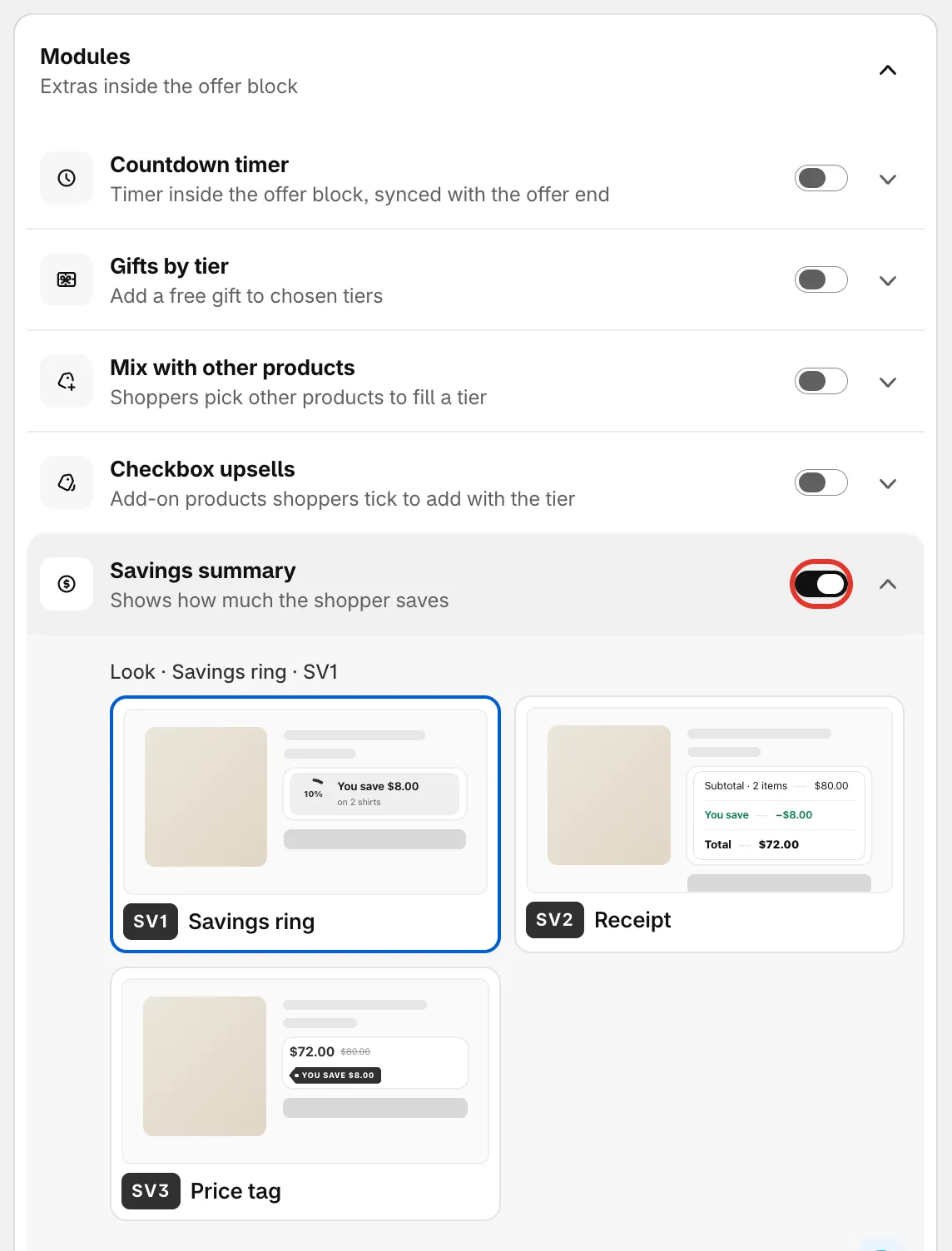
Switch modules on and open each one to set it up.
Colors and fonts
Section titled “Colors and fonts”For product page offers, this section starts with the Block title, the line above the block. Suggest cycles through ready-made titles. Title style sets it Centered with lines, Centered or Left.
Color scheme has two modes:
- Preset — pick a ready-made scheme. Brand uses your brand colors. A preset sets the whole look, so it also resets font, corners, spacing and any colors by part.
- Custom — set Accent, Text and Box background yourself. Box background colors the whole offer block. Custom also gives you:
- Font — Use the theme font, Inter or Serif.
- Alignment, Corner radius and Space between tiers.
- Colors and text sizes by part — pick a Part (Block title, Tiers, Prices, Gifts or Upsells) and set its colors and sizes. Reset to the color scheme undoes these.
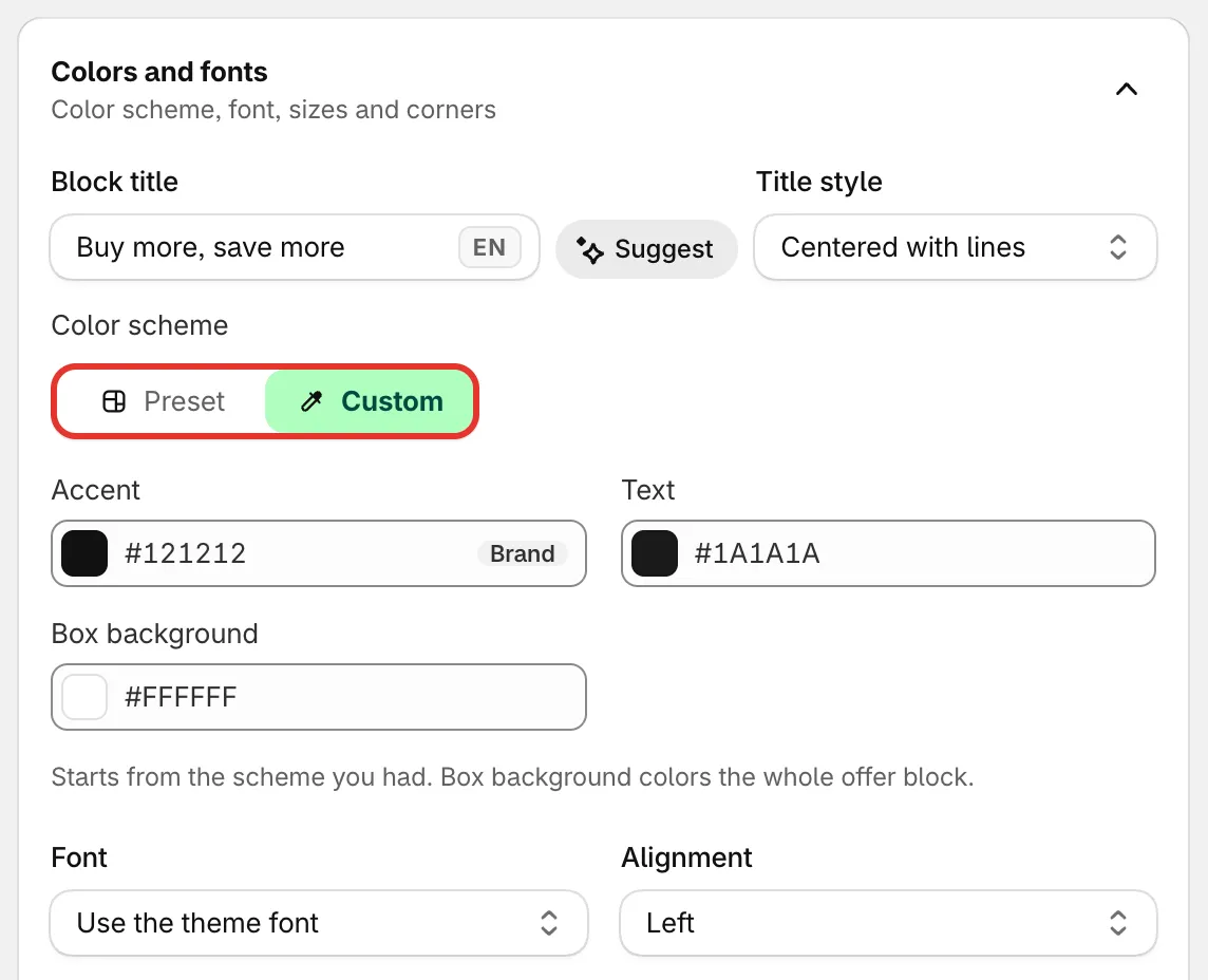
Block title and color scheme.
Variants and pricing
Section titled “Variants and pricing”Product page offers have a Variants and pricing section with three groups. Which options appear depends on the offer type.
Variants
- Let shoppers pick a variant for each item — A 3-item tier shows 3 pickers, e.g. 2 × Black and 1 × White. Then choose the Picker style (Dropdown, Color swatches, Image swatches or Pill buttons), and whether to show pickers on 1-item tiers too.
- Hide the theme’s variant picker — Avoids two pickers on the product page when the block has its own.
- Hide sold-out variants.
Price display
- Show the price per item — e.g. $34.00 each next to the tier total.
- Use the product’s compare-at price — the crossed-out price uses the compare-at price set on the product instead of its regular price.
- Hide the crossed-out price — Shoppers see only the price they pay.
- Update the theme’s product price — The price above the block follows the selected tier. Not on Flash sales; they set the price through the Discounted price on product page placement.
- Show the total in the Add to cart button.
- Show prices without decimals.
- Round prices — Adjusts the discount so prices in the block end the way you pick: Don’t round, End in .99, End in .95 or Whole numbers. The discount at checkout is adjusted the same way, so shoppers pay the rounded price. Available on Flash sale, Tiered discount, Buy one get one and Cheapest item free.
Cart
- Skip the cart and go straight to checkout — the block’s add to cart sends shoppers straight to checkout.
- Add to cart button in the block — for bundles, mix & match and a variant per item, which add from the block: Same style as the theme’s button or Offer accent color.
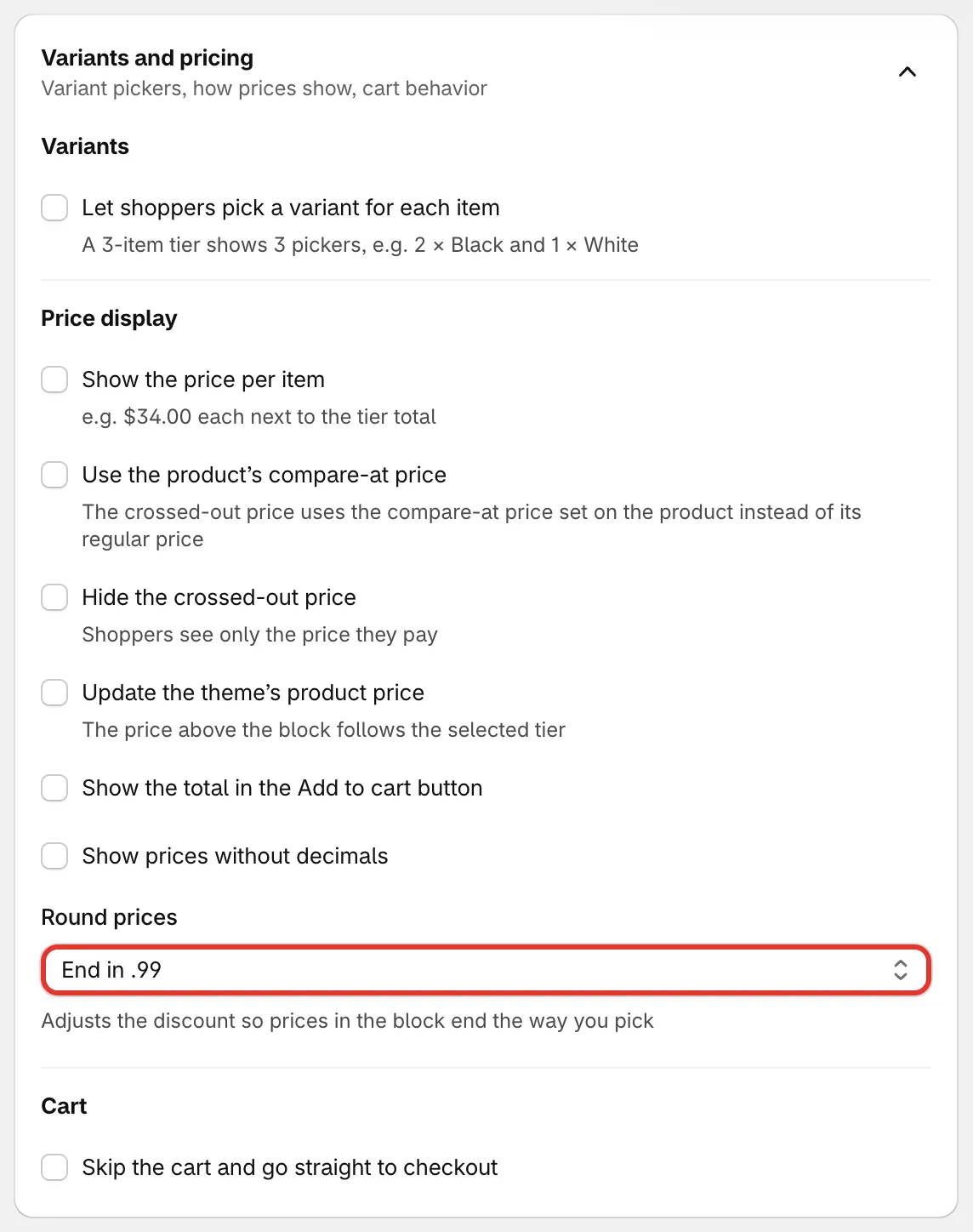
Variants and pricing.
Custom CSS
Section titled “Custom CSS”Custom CSS is For developers, your own styles for the block. CSS you add here Applies to this offer on your store, and right away in the preview. Below the field, a list shows the block’s class names with what each one styles; click one to add a rule for it.
For styling the countdowns, popups and banners instead, see Custom CSS.