
設計與位置
設定銷售彈出視窗的樣式,並決定它在桌機與行動裝置上浮動的位置。
Design 分頁控制銷售彈出視窗的外觀與顯示位置。它分為背景、位置、大小和字體,最後還有一個自訂 CSS 欄位。
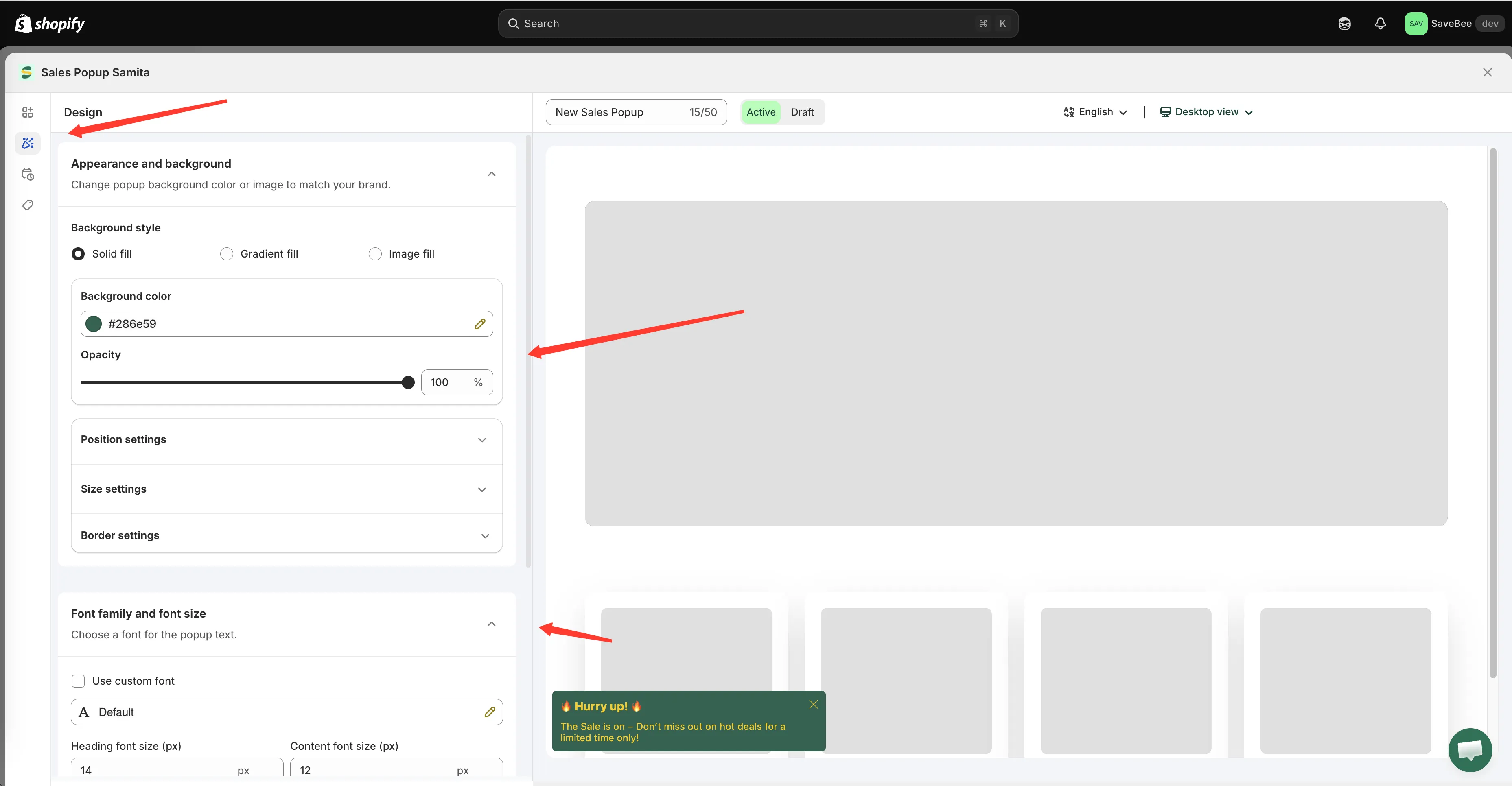
Design 分頁,旁邊是彈出視窗預覽。
Appearance and background
Section titled “Appearance and background”Background style 提供三種填色:
| 樣式 | 您要設定的內容 |
|---|---|
| Solid fill | Background color 和 Opacity |
| Gradient fill | Gradient color 1、Gradient color 2 和 Opacity |
| Image fill | 上傳的圖片:PNG、JPEG 或 JPG,小於 1 MB |
此外還有 Border settings:Border style(Solid、Dashed、Dotted)、邊框粗細、圓角、顏色,以及 Box shadow 切換開關,另外還有 Padding 和 Margin。
Position settings
Section titled “Position settings”彈出視窗浮動的位置。桌機與行動裝置分別在各自的分頁中設定。
Desktop
Section titled “Desktop”- Show on desktop:開啟或關閉桌機顯示
- Desktop position:Top left、Top middle、Top right、Bottom left、Bottom middle 或 Bottom right
- Animation type:Slide from top、Slide from bottom、Slide from left、Slide from right 或 Fade in-out
- Margin top/bottom (px) 和 Margin left/right (px):讓它與螢幕邊緣保持一點距離
Mobile
Section titled “Mobile”設定項目相同:Show on mobile、Mobile position、動畫和外距。
Bottom left 是預設值,也是最安全的選擇。它不會擋到您的頁首、購物車,以及大多數佈景主題放在行動版商品頁面底部的固定式加入購物車列。
在決定採用其他位置之前,值得先確認:
- Bottom right 在許多商店中會與即時聊天小工具重疊。
- Top 位置可能會遮住公告列和固定式頁首。
- Mobile margins 比桌機的外距更重要,因為彈出視窗可放置的空間小得多。
Size settings
Section titled “Size settings”| 設定 | 選項 |
|---|---|
| Popup size | Small · Medium · Large |
| Image size | Small · Medium · Large |
| Use different size for mobile | 解鎖 Mobile popup size 和 Mobile image size |
只要大小超過 Small,就建議開啟行動裝置選項。Large 的彈出視窗在手機上可能會遮住大半個螢幕,這是讓顧客來不及閱讀就關閉它的最快方式。
Font family and font size
Section titled “Font family and font size”- Use custom font:選擇字體系列與粗細,或沿用佈景主題的設定
- Heading font size (px) 和 Content font size (px)
讓字體與佈景主題一致,通常能讓彈出視窗感覺像是商店的一部分,而不是外加上去的東西。
Custom CSS
Section titled “Custom CSS”分頁最後的 Custom CSS (Developer Zone) 欄位可輸入純 CSS,套用於這個彈出視窗。其他地方的注意事項在此同樣適用,請參閱自訂 CSS。
將彈出視窗放入頁面中
Section titled “將彈出視窗放入頁面中”預設情況下,彈出視窗會浮動在頁面上方您所設定的位置。如果您希望它位於頁面內,例如放在某個區段中的固定位置,可以使用 Display 分頁中 Custom location to show popup 下的短代碼:
<div class="samita-sales-popup" data-id="12345"></div>複製後,貼到佈景主題編輯器中的 Samita Countdown 應用程式區塊。步驟與倒數計時器相同,請參閱使用短代碼放置倒數計時器。