
Storefront Notifications
Choose how the app's success and error messages appear on your storefront — as a toast, a popup or a banner — with your own design and colors.
When customers add products to the cart, change the app’s cart drawer, check out, or apply a discount code, the app shows a short success or error message on your storefront. Storefront notifications lets you choose how these messages look.
There are three styles:
- Toast — a small message in a corner of the screen.
- Modal — a popup in the middle of the screen with an OK button. It stays until the customer closes it.
- Banner — a bar at the top or bottom of the screen.
Steps to manage
Section titled “Steps to manage”-
Open Storefront notifications
Section titled “Open Storefront notifications”From the app, click Add-on Features, find Storefront notifications and click Customize.
-
Choose the default style
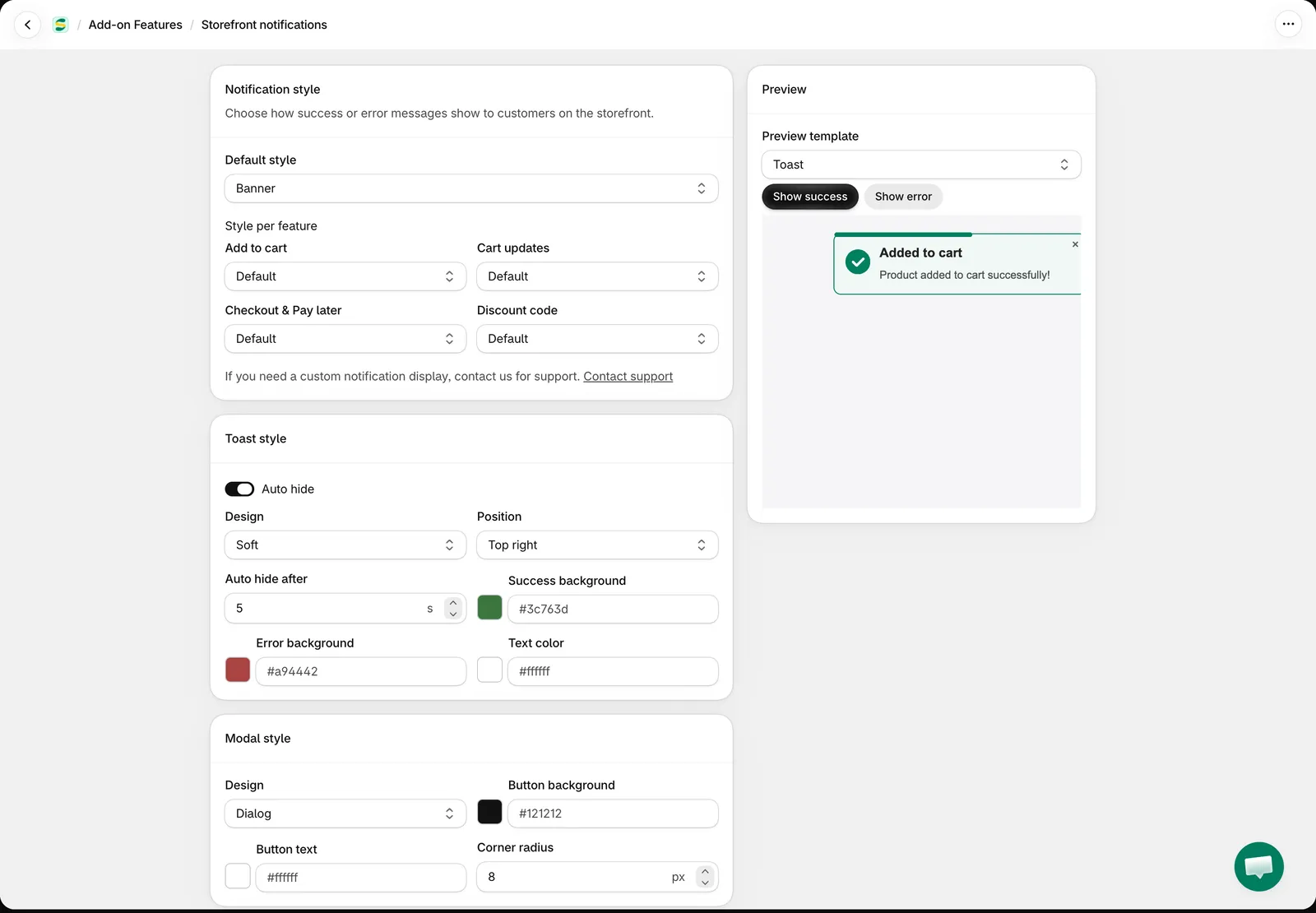
Section titled “Choose the default style”In Notification style, choose the Default style: Toast, Modal or Banner. Every message uses this style unless you choose another one for its feature in the next step.
-
Choose a style per feature (optional)
Section titled “Choose a style per feature (optional)”Under Style per feature, keep Default or choose another style for a group of messages:
- Add to cart — products the app adds to the cart: from product pages, Quick Buy, the Quick Order Form or the app’s Wholesale cart drawer.
- Cart updates — changes in the app’s Wholesale cart drawer, such as updating the cart or saving or deleting an address.
- Checkout & Pay later — checkout errors, and the success and error messages of Pay later orders.
- Discount code — messages of the app’s discount code box, for example when a code is accepted or is not valid for the items in the cart.
Example: keep Toast as the default style and choose Modal for Checkout & Pay later, so customers don’t miss the Pay later confirmation.
-
Customize each style
Section titled “Customize each style”Set the look of each style in its own section. Leave a color empty to use the default look.
Toast style
- Auto hide — on by default. Turn it off to keep each toast on screen until the customer closes it.
- Design — Classic, Card, Soft or Pill.
- Position — Top right, Top left, Bottom right or Bottom left.
- Auto hide after — from 2 to 30 seconds. The default is 5.
- Success background, Error background and Text color.
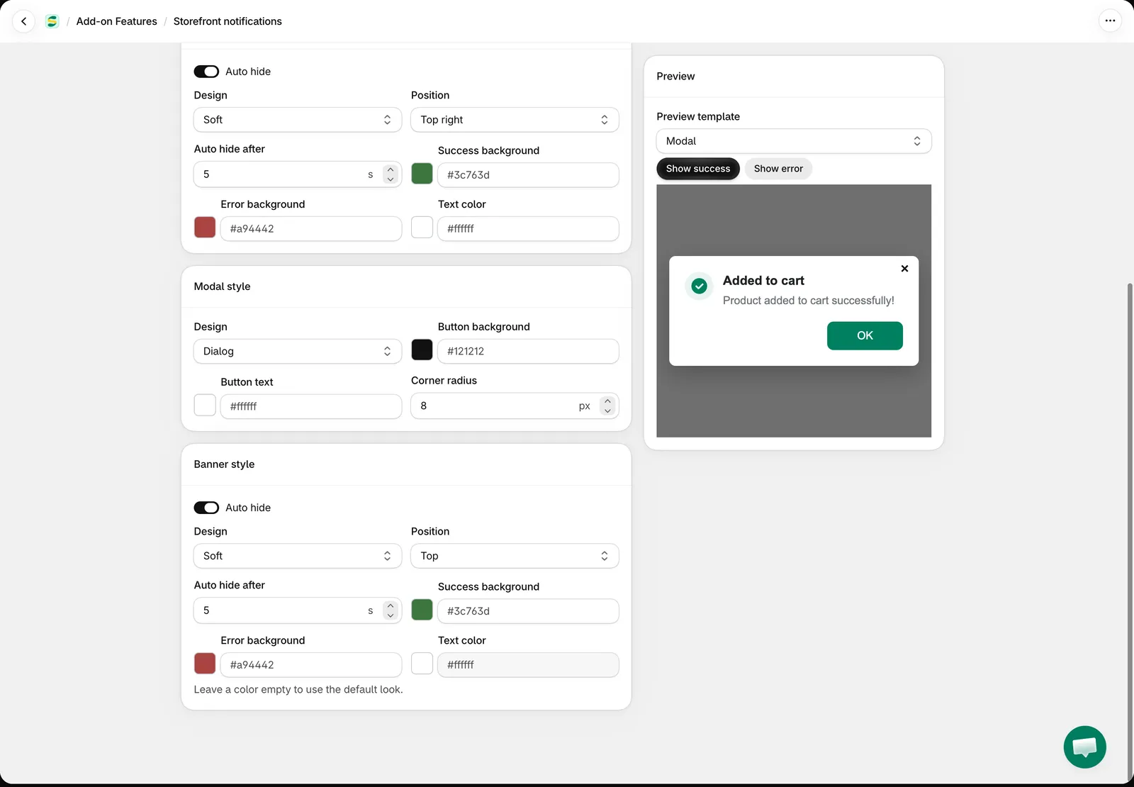
Modal style
- Design — Classic, Card or Dialog.
- Button background and Button text — the colors of the OK button.
- Corner radius — from 0 to 40 px.
Banner style
- Auto hide — on by default. Turn it off to keep the banner until the customer closes it.
- Design — Classic, Soft or Floating.
- Position — Top or Bottom.
- Auto hide after — from 2 to 30 seconds. The default is 5.
- Success background, Error background and Text color.
-
Preview and save
Section titled “Preview and save”In Preview, choose a Preview template, then click Show success or Show error to see that style with your settings. The preview uses the same templates as your storefront.
Click Save.
Good to know
Section titled “Good to know”- Customers close a Modal with OK, the × button, by clicking outside it, or with the Esc key. A modal never closes by itself.
- Up to five toasts can be on screen at a time. When a sixth one arrives, the oldest is removed.
- Only one modal and one banner are shown at a time. A new message replaces the one on screen.
- When a Pay later order succeeds and the success message is shown, the app clears the cart and reloads the page. With Modal, the page reloads when the customer closes the popup, so the message can be read first. With Toast or Banner, it reloads after a few seconds.
- The text of the messages is edited like other storefront text. See Edit and translate content for some of the app’s features.
- Need a different notification display? Click Contact support in the Notification style section and our team can help.
Need support?
Section titled “Need support?”If you do encounter any difficulty while proceeding these steps, don’t show any hesitation to contact us promptly via the email address [email protected].