
Brand colors
Read your brand colors from your live theme, adjust them, and use them in every editor of the app.
Det här innehållet är inte tillgängligt på ditt språk än.
Brand colors are twelve colors the app reads from your live theme. New offers start in them, and every editor offers them as a Brand color scheme, so what you add to your store matches it. This page shows how to sync, adjust and save them.
Set up your brand colors
Section titled “Set up your brand colors”-
Open Brand colors
Section titled “Open Brand colors”Click Settings in the app menu. Brand colors is the first tab.
The line under the description says where the colors come from, for example “Synced from Dawn on Nov 3, 2026.” The app reads your live theme the first time you open it, so the colors are usually filled in already.
-
Sync from your theme
Section titled “Sync from your theme”Click Sync from theme to read the colors of your live theme again, for example after you changed your theme’s colors.
The line now reads Synced just now from your theme’s name, Save to keep these colors. Nothing is saved yet.
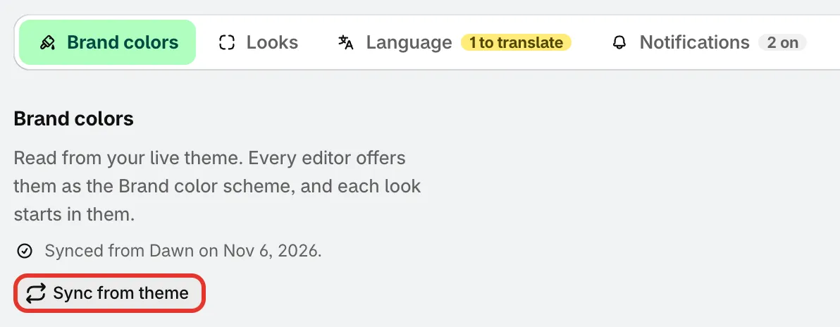
Sync from theme reads the colors of your live theme.
If the app can’t read your theme, it shows The last scan couldn’t run and keeps the colors from the last scan, or default colors. Check that your store has a published theme, then sync again.
-
Adjust any color
Section titled “Adjust any color”Click a color to change it with the color picker, or type a hex code. A color you changed shows the theme’s own value under it, such as Theme: #1F3A2E, and the line under the colors counts how many differ from your theme.
The preview next to the colors updates as you go.
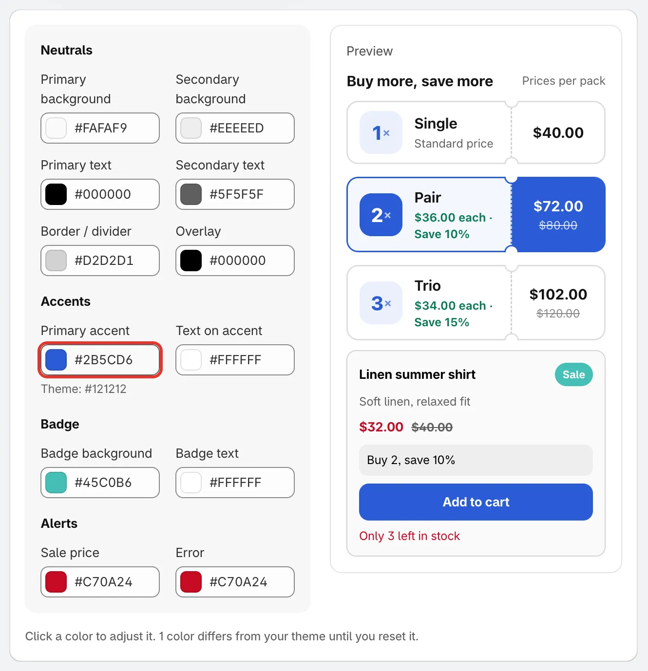
The colors in four groups, with a live preview.
-
Click Save in the bar at the top of the page. The app confirms with Settings saved. Click Discard instead to drop your changes.
The twelve colors
Section titled “The twelve colors”| Group | Colors |
|---|---|
| Neutrals | Primary background, Secondary background, Primary text, Secondary text, Border / divider, Overlay |
| Accents | Primary accent, Text on accent |
| Badge | Badge background, Badge text |
| Alerts | Sale price, Error |
In the preview, the product card uses the backgrounds, text and border colors, the Sale badge uses the badge colors, the price uses Sale price, the Add to cart button uses Primary accent and Text on accent, and the low-stock line uses Error.
Go back to your theme’s colors
Section titled “Go back to your theme’s colors”Once a color differs from your theme, a Reset to theme colors button appears next to Sync from theme. Click it to put every color back to your theme’s values, then click Save.
Where the app uses them
Section titled “Where the app uses them”- New offers. Offer templates and the looks you pick in Looks are drawn in your brand colors. The Brand colors button in the offer templates gallery and on the offer editor’s Design tab opens the same colors.
- Color schemes. The offer, sale popup and banner editors list a Brand scheme next to the other color schemes.
- Countdowns. The Brand colors button on the countdown editor’s Design tab puts your brand colors on the countdown.
- Color pickers. Every color picker in the app shows your brand colors as swatches, marked Brand, and a color that matches one of them is tagged Brand.